
Writing about 20 underrated sports uniforms from college football, NFL, MLB, NHL, and NBA. One uniform at a time.
You may know your college football mascots really well and knew immediately before clicking on today’s article that it was San Jose State. Perhaps you’re thinking, “no way should this team be included in this series” but hear me out. This program doesn’t have a lot going for it. They’ve spent a grand total of 5 weeks in the AP Poll over the last 50 years. They only have a handful of players in the NFL right now and I couldn’t name the most famous alums from the program–and that’s after a brief look through their history.
This program could use some positive press!
I genuinely like the San Jose State uniforms in a somewhat patronizing little conference type of way. They remind me of being younger and playing NCAA Football on PlayStation while taking a small program like the Spartans from nothing to national power.
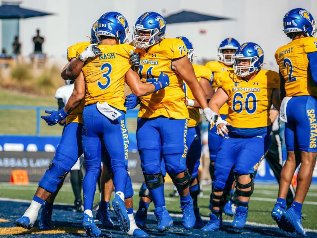
The colors pop.
Big script down the pants, it’s terrible, but again for a small program I’m allowing it. I like the blue-yellow-blue pattern here and the SJSU blue really pops. They even have a diacritic accent on the front of the jersey for San Jose.
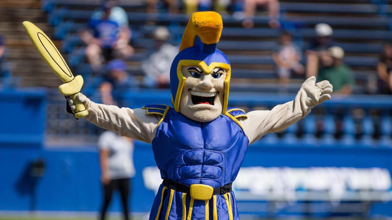
The spartan logo is fine, arguably more fun than Michigan State at least. The spear across the top looks cool. Plus, look at that shiny blue helmet! If anyone cares, San Jose State is one of the remaining Under Armour programs, as well. They signed a new deal that began in 2023 and will last through the 2027 season.

It’s very high school looking. I kind of mean that as a pejorative but they’re also not bad, just a little rinky dink. But in an endearing way.