The 2018 season was quietly one of the best in recent memory for college football uniforms. No, not because of Notre Dame’s Yankee-inspired offering from the Syracuse game which we can confirm caused Under Armour stock to plunge 4%* for being so absurd. Sure, we’re still in the throes of Black for Black’s Sake, random gray, American flag themes, camouflage, monotone leotards, and white-out efforts from all across the country. However, this past fall saw many programs hearkening back to their past, embracing brighter colors, and even getting a little weird.
We’re also nearing the peak of alternate helmet mania. The following Power 5 teams wore at least 4 different helmets during the 2018 season: Baylor (6), Texas Tech (6), Oklahoma State (11), TCU (4), West Virginia (4), Duke (4), NC State (4), Indiana (4), Minnesota (4), Northwestern (9), Purdue (4), Arizona (8), Arizona State (10), Colorado (4), Oregon (5), Oregon State (4), Utah (8), Washington State (10), Kentucky (6), Missouri (11), and Vanderbilt (4).
In contrast, the following Power 5 teams wore only one helmet all season long: Kansas State, Texas, Clemson, Maryland, Michigan, Penn State, USC, UCLA, Alabama, Auburn, Georgia, and Tennessee.
Anyway, here are my 30 favorite uniforms from 2018 worthy of mention. Click on the team name for a picture, unless there’s an inset.
30) Texas A&M – I miss this look and want it back. I actually liked Adidas revamp for A&M when it came out but it already looks dated to me. A return to their roots is entirely welcome.
29) Georgia Tech – The blue jerseys and white pants were worn only once in their inaugural Adidas season. It’s their best look, in my opinion. Unfortunately, Tech thinks they’re cool for wearing white jerseys all the time.
28) Duke – The Blue Devil face transforms this uniform from wanna-be Colts uniforms to something a lot cooler. Duke should probably try something different for their uniforms and move away from something so traditional.
27) Nebraska – The slightly off-white pants really make this throwback worth it. It’s hard to imagine how Nebraska could go even more plain and look good but they did it.
26) Oklahoma State – My favorite color scheme for the Cowboys (orange-white-black) with the giant chrome Pistol Pete helmet logo. A modern classic.
25) Washington – I’ve only liked Washington in their traditional uniforms and think they’ve whiffed on a bunch of different looks. Except here.
24) West Virginia – The sharpest look for the Mountaineers. They rotate a lot through a bunch of different looks each year and I’m always a fan of this road offering.
23) UCF – If you’re a school that can legit pull off space uniforms you have to do it. Plus, citronaut on the collar!
22) Virginia – The Cavs updated uniforms in recent years have been quite good. This may be the best of the bunch.
21) UAB – Fortune favors the bold and I applaud the effort. You have to do it for the children.
20) Purdue – A sneaky futuristic looking uniform that works well for the Boilers. I think we’ll see more uniforms using this kind of template in the future.
19) Arizona State – Sparky never should’ve never left us. This is a billion times better than anything they’ve worn since modernizing their logo and uniforms.
18) Kansas – A World War II inspired uniform with a sheet metal rivet-clad Jayhawk logo? Yes, yes, yes.
17) Missouri – It was a great year for throwback, lovable helmet logos.
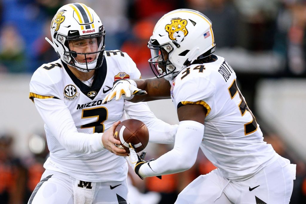
Ornery tiger logo ftw.
16) South Carolina – Something about the script helmets makes this look so charming. The Gamecocks often drown their uniforms in either black or garnet. This feels balanced and really sharp.
15) San Jose State – The Spartans should play better wearing these bold colors. Such a good look is being wasted out on the west coast.
14) BYU – The white helmet on top of blue jersey and pants spices up this royal shade for the Cougars.
13) Cal – Under Armour has not pulled off a better throwback uniform to date.
12) Buffalo – Maybe my favorite helmet of the year gave the Bulls magical powers on their way to a 10-win season.
11) Air Force – This looks like the most Air Force-y uniform imaginable. They look fast and sleek.
10) Pitt – These throwbacks are so nice the Panthers should be fined every time they don’t wear them.
9) LSU – The Bayou Bengals do not show off enough of their purple. These are fantastic and should get a whole lot more recognition.
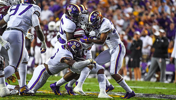
Purple reign.
8) USF – The annual “SoFlo” uniform for the Bulls is a treat for the country each time around.
7) Colorado State – The Rams normal uniforms are drab and unmemorable. These are a million times better and unlike any other program in the country.
6) Missouri – Haters want to hate, let them. These were impressive in the Columbia sunshine.
5) Oregon State – Old-school Benny the Beaver helmet logo on the best uniforms in the Pac-12.
4) ECU – This is what LSU should look like if they had the guts. Love the yellow facemask to pull it all together.
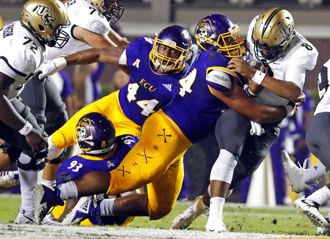
Bones and swords on the pants!
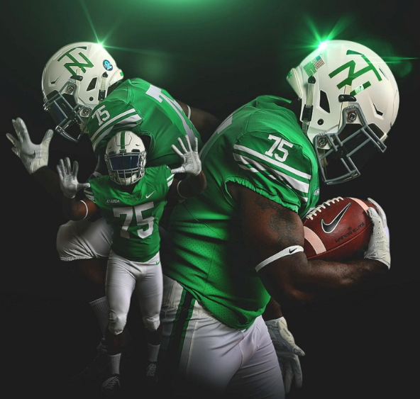
3) North Texas – These “Mean” Joe Greene throwbacks hold a special place in my heart.
2) UTEP – Hands down, the greatest uniform in college football that people don’t know about.
1) Tulane – In recent years, the Green Wave did an about face with their uniforms. For years, they stifled their sky blue.
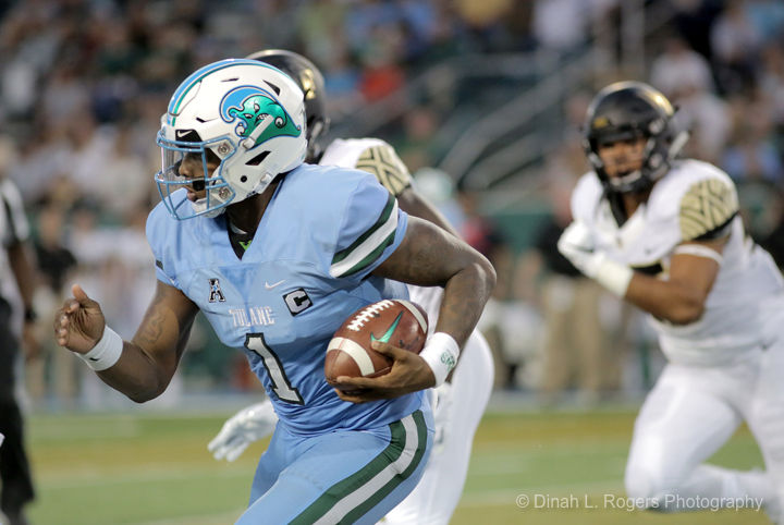
Angry Wave™ takes the top spot.
For most of this century the Tulane football team was largely covered in olive green and white with minimal blue. Since 2017, they’ve embraced their lighter shade. This past season they wore the sky blue pants with white jerseys (a tremendous look too) and opened the season with all-sky blue uniform below a white Angry Wave helmet.
*Just trust me.


Finally, an article worth discussing!
Duke needs to be higher. Those helmets are awesome and the jerseys with the faded blue look great.
Love the UAB helmet, but the jerseys…no thanks.
I think Buffalo has the best helmet of the bunch. That color of blue stirs something inside me.
Overall, I am putting the black and yellow Mizzu as the #1. I love the entire uniform/helmet being 2 colors, with one accounting for about 80%. The overall design is sharp and the helmet logo is perfect for the 2 color scheme. I would prefer if it weren’t yellow, I don’t care for yellow (clearly somewhere our tastes differ greatly). Take that jersey, and throw that Tulane blue or LSU purple at it, and you’d have the perfect uniform. Or even something like the UTEP Orange and Navy.
When you say CSU’s uni’s are unlike any other team in the country. I am pretty sure they stole that color pattern from Miami. No, not da U (although they have an orange jersey green helmet combo), and not quiiiite the Dolphins.
Re Colorado State I believe the Canes have only worn orange jerseys with green helmets a small handful of times in their history. The Dolphins have never worn a green helmet. I really think the Rams own that particular orange/green look. Or at least they should!
All the orange/green I saw with da U was also orange pants, no white pants. Too much.
Even the weird internet alternate helmets for the dolphins are their turquoise. They never really get too close to green. Which is why it’s clear CSU stole the color scheme from the cheerleaders.
I also think the somewhat flatter orange goes better with green. I like bright orange with purple, a la Clemson, but I like that CSU style orange with green.
Wow, I was truly impressed by some of these. Here are some that stood out to me:
GA Tech — those just have a classy look to them
UAB — I can’t decide if I like them or not, but I like the unique combo
Buff — those helmets!
Pitt — I agree 100% with E
USF — I wouldn’t want to see those every game, but terrific for once a year
UTEP — very nice
I’m not feeling the love for Buffalo’s helmets — they look like something I would’ve thought was awesome in like 6th grade but, now that I’m a fully-realized 33-year-old human, that satin blue & black is trying to hard to be COOL.
North Texas — big fan
San Jose State — the look is wasted out West? What about Pitt, your #10? Let the Spartans have their fun…
Cal — might be my favorite helmets
UAB — y’all do it up! Bold. Ditto for SoFlo.
ASU — definitely needs to switch to the retro look full-time
Okie St. — I prefer the throwback Pistol Pete uniforms to the modern alternates.
LSU — with colors like purple & gold these folks need to step up their uniform game. solid traditional whites but with their home & road jerseys being the same, the Tigers need to slip in more alternates.
BYU’s royal blue uniforms are the best GD uniforms in the country and it’s an absolute crime that they don’t wear them every single game.
#3 is the best one
#8 is hideous
I think #8 is hideously wonderful — the sorta uniforms you can wear to the clubs in Ybor City after playing in Raymond James Stadium!
Mizzou sucks at everything. Field is ugly (Top 3 ugliest). All of their unis are hot garbage. Their whole closet is Shamrock Series uniforms. (The throwback helmets in #17 are pretty cool, but they ruin it with the tiger striping on the biceps)
Thanks for putting all of these together. There are some definite winners, although, I notice that many of the ones I like (and some I liked during the year that didn’t make your list) are throwbacks. I propose that we do an entire season where everyone wears only one uniform, their traditional/throwback look. It’d be like the 75th anniversary NFL uniforms. Who’s with me?
Cool idea!
We need polls on these uniform articles, dude — especially the ones you designed, we’d have a way to rank them all!