In the modern world of sports it has become a lot more common place for an athlete to develop his or her own personal logo. Things in this area of sports-business started to explode in the 1990’s and they have gone to an entirely new level over the past 20 years. Today, nearly all of the big stars in the world’s most popular sports have their own logos.
Here are the 10 best in the world:
#10 J.J. Watt
If you’re like me you may see “JL” in this logo. Obviously, it’s supposed to be a mirrored “J” but I’m deducting points because that’s not super clear and these things should be nothing but obviously clear for marketing purposes. The logo is also supposed to form a “W” for Watt’s last name, which again doesn’t immediately look right. I feel like this is missing one big tweak to make it better.
#9 Jack Nicklaus
This logo was created in the late 1960’s to match Nicklaus’ “Golden Bear” nickname. It’s been around forever so anyone with a passing knowledge of golf should recognize it. Even though Nicklaus has plenty of business ventures in which he uses the logo if you’re under 30 you likely have no memory of him actually playing golf. That’s why the bear logo is usually accompanied by his signature these days.
#8 Roger Federer
Roughly 3 out of every 4 athlete logos created over the past decade uses initials in a way that promotes this ‘broken letter’ style. Think of someone like Kevin Durant and his logo. No one has done it better than Federer, though. If you think this looks like it belongs on a bottle of cologne that’s because the original design–with help from his wife–was for just that originally. Roger lost this logo when he left Nike but reportedly owns it again.

#7 Penny Hardaway
This logo makes me happy and sad. It’s makes me smile because it’s so amazingly 90’s and you can just hear Chris Rock’s voice through Lil Penny in the Nike commercials. It also makes me sad that Hardaway was a shell of himself by 28 years old and his career (and logo) never took off like it truly deserved.
#6 Arnold Palmer
This logo was created in 1961 after the reigning best golfer in the world began building his Arnold Palmer Enterprises, Inc. business. That foray into the world market would go splendidly well for Palmer and he created maybe the best multi-color personal logo in the world.

#5 Ken Griffey, Jr.
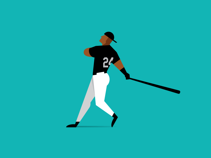
For some this is in the running as the best logo ever. There’s so much to like, from showing Junior’s silky smooth lefty swing and his backwards hat. My only gripe is that it’s a difficult logo to draw and it’s quite often mirrored incorrectly to make it look like Griffey was a right-handed batter.
#4 Tiger Woods
Nike’s first logo for Tiger Woods was probably one of the worst efforts in sports history. Their second effort that he still uses on the course today was much, much better. It’s not super flashy but strong and distinctive. Woods also has a sweet new logo for his foundation and occasionally uses his Frank the Tiger logo on his apparel which is amazing in its own right.

#3 LeBron James
It seems like LeBron has been in our lives forever and that this logo has been around just as long. However, it was Nike’s second effort after James signed with the Miami Heat. His previous logo incorporated his #23 and it didn’t work anymore as he switched to #6 with Miami. This new logo has become iconic with the “LJ” letters and crown for his King James nickname.

#2 Greg Norman
The Australian golfer’s business portfolio is legendary and his shark logo–primarily used on his clothing and apparel line–has been among the best in the world since he worked with Reebok in the early 1990’s. There have been fewer things cooler in golf than Norman in his signature straw hat with the Shark logo.
#1 Michael Jordan
The goat logo for the goat player. Debuting in 1988 it’s since evolved way past the game of basketball and sneakers to be a lifestyle brand across the world. Today, it’s the symbol for numerous athletes and athletic programs while being the logo that drives an absurd $1.6 billion net worth for Michael Jordan.
Take this personal sports logo quiz from ESPN and let’s see how much of an expert you are. I got a 93% and missed one question.
Griffey was so cool. Who is today’s equivalent?
Good question. Not sure there really is one, which is kinda baseball’s problem these days. Seemed like for a brief period that maybe Bryce Harper was going to step into that role as “really cool guy who played baseball and was an idol to the youth” but it feels like he’s fallen off.
Mike Trout is a hell of a player but is about the furthest thing away from cool or a big personality. Maybe Vlad Jr. or Tatis Jr have that edge and coolness? And they have the “Jr” connection too, but both are quite a way from becoming transcendent icons like Griffey was.
I don’t think it has to be limited to baseball. My first instinct was to suggest Steph Curry, but I don’t think he’s all that “cool.” (And I’m a hip dad, so I definitely know what “cool” is.) Or, maybe a Mahomes or Lamar Jackson if their careers stay on the track they’re on.
Ahh gotcha. Mahomes is a good call. Jackson too. Maybe Kyler Murray as well if he keeps it up. To me, Curry’s kinda a square off the court but his ability certainly is unreal.
It’s hard to tell these days with TikTok and the like. I think Giannis is pretty high up there for new age popularity rankings and having a big reach among the youth (of which I’m not apart of either!)
Mahomes is too goofy. Curry is too corny. Giannis is a great call. Maybe Tim Anderson if his past year and a half are an indication of what is to come.
I disagree on Curry. He is definitely cool.
Puig’s the coolest. It’s just a shame he’s crazy.
My Young & Cool Athletes List
Patrick Mahomes
Lamar Jackson
Saquon Barkley
Deshaun Watson
JuJu Smith-Schuster
Luka Doncic
Jayson Tatum
Zion Williamson
Alphonso Davies
Arike Ogunbowale
You forgot to include homeboy Brian Kelly on the young and cool list
https://www.ndinsider.com/football/how-notre-dame-coach-brian-kelly-became-a-meme-by-posing-for-a-photo/article_0de8c147-ca0b-5468-9896-2f5d9251506a.html
Major oversight on my part, my bad.
For MLB, Tatis and Ronald Acuna are both fantastic and very young/promising.
Griffey and the Jumpman are far and away my favorites because you can just picture the athlete at his peak, while also being very sharp logos.
Jumpman has basically transcended this list. It has become so ubiquitous that I was surprised when I saw it #1. I hadn’t even thought of it as a personal logo. It’s gone so far beyond meaning Jordan to me, it’s just a giant sports business logo like the swoosh (unless it’s on a pair of Jordans, then I associate it with MJ).
I would replace JJ Watt with TB12. I think JJ’s is weak. It makes me think of lacrosse. TB12 does a great job of combining the letters and numbers into a smooth logo. I hear JJ it takes me a minute to figure out who that is. Not the case for TB12, LJ, RF, TW.
Last thought. Lotta golf on here. Any thoughts why? I don’t think of golf as being at the forefront of innovation or marketing. Maybe because they don’t have team jerseys and can wear their own stuff?
I was out a month or 2 after the Tiger Woods “incident” and saw a lady wearing a hat with his logo…I told her I was impressed that she was sticking with him despite the world being against him. Unfortunately, she had no idea what the logo meant and immediately got super embarrassed. I don’t know if that’s impressive that the logo still had power over people to want to wear it because they liked the look or terrible that the logo couldn’t portray what it meant to represent. It’s better than LeBron’s regardless.
Also, Hardaway’s is terrible. It looks like an old Cleveland Cavs secondary logo. I’ve never seen that in my life and am almost sure that you made a mistake and put the wrong logo up.
This athlete logo was on my favorite hat.
Josh Adams scored a TD in Buffalo this past Sunday, so happy.
Did you write this because of Chase Claypool’s “Mapletron” logo??
#1 logo now.
https://twitter.com/ChaseClaypool/status/1306690151087775766?s=20
Holy crap that’s good.
I just saw that yesterday on Twitter and immediately went to the site and bought a shirt. Awesome logo.
Weird that I’ve never really seen or paid attention to the LBJ logo. Personally, I think it sucks. The letters are much too short, should be stretched out on the ends and probably the crown too. Junior’s craps all over that.
LeBron James might have a Top 10 logo, but I seriously doubt he has the #1 spot for those initials.