If you think football is dying at the high school level don’t try to create a series looking at the best uniforms because it feels like the amount of programs never ends. According to the latest information, there are over 16,000 high school football teams in the United States. Put another way, there are 123 times more high school uniforms to judge than there are just in FBS college football.
Clearly, I didn’t review them all. But, I think I got some of the best. Feel free to submit uniforms in the comment section. Especially if they are from small towns across America or in states where football isn’t particularly big.
Our list starts today:
#27 Vanden High School
Location: Fairfield, California
Mascot: Vikings
Enrollment: 1,744 (public)
The first school up are the Vanden Vikings from Fairfiled, California located almost smack dab between San Francisco and the road to Sacramento. They compete in the California Division 3-AA level and are the defending state champions following a 14-13 win over Aquinas of San Bernardino in 2021.
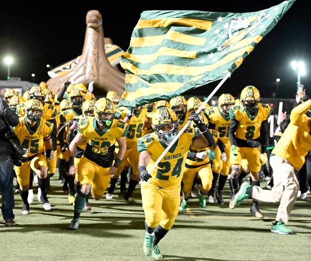
With yellow as their main color and green contrast, plus a touch of grey, they have a scheme similar in feel to North Dakota State. Their primary athletics logo is the Minnesota Viking, although the best feature of their look is a front-facing Viking emblazoned on their wide helmet stripe. Like many schools, they will mismatch their colors but mostly stick to all-yellow, all-green, or all-white jersey/pants combinations.
#26 Douglas McKay High School
Location: Salem, Oregon
Mascot: Royal Scots
Enrollment: 2,319 (public)
Next up are the McKay Royal Scots from the Oregon capital city of Salem. They were playing in the 6A state level but will be dropping down to the 5A level for the upcoming 2022 season. The school was built in 1979 and uses primarily royal blue and green with use of gold in the past, as well.
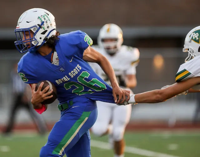
Obviously, this is a fantastic mascot. I’m guessing the thinking here is that Douglas McKay (former mayor of Salem and later a state senator) for whom the school is named after was Scottish? Either way, the use of the tartan pattern inside their “M” helmet logo is top notch.
#25 Bishop Gorman High School
Location: Las Vegas, Nevada
Mascot: Gaels
Enrollment: 1,450 (Catholic, co-ed)
To be fair, Bishop Gorman probably didn’t deserve to make our rankings based off their 2021 uniforms. Like many of the wealthy/nationally recognizable programs they have a bevy of alternate uniforms and color combinations that when taken in together keep them on our list.
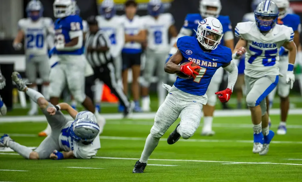
They have a sharp all-orange alternate, an all-white with blue helmet look, a more traditional all-blue uniform donned with an orange helmet, an orange-blue-orange Florida Gators look, an all-black uniform with orange helmet set up, and that same look but with dark blue instead of black. They are opening up the bank with that Fertitta money in Vegas.
Their most commonly worn uniform in 2021 was today’s inset picture of white helmet, royal blue jersey, and white pants. For Gorman’s standards, pretty tame but still quite professional and crisp. The jerseys and pants have a subtle camo-like pattern and the school patch on the right chest is a nice touch.
Next up: A school from Idaho(!) and a pair from Ohio.

Swear to God, if a team with even a hint of maroon makes this list, I’m cancelling my subscription.
BRB, lemme check…
FINAL ANSWER:
Zero maroon teams.
May I submit for heated discussion:
Menominee MI, mascot: maroons
Their uniforms look about as retro as feasible, they’re in the upper peninsula of Michigan, AND they run the single wing. This team is pretty damn tough, but to the point of unis…. maybe not so much
No, they trash. Get out.
Edit: Should have said – “Menominee’d you to shut up, they trash. Get out.”
https://youtu.be/_i3NHFWGYko
Gotta show some love to a #45 slinging dimes in the state finals though.
Are these plain white helmets like a prison team?
Opposing teams are intimidated by their #GRIT
Can’t argue with that.
Well, it is the UP…
My HS had pretty nice home uniforms back in the day. A very deep purple, gold pants, plain gold helmets with a purple facemask. Very simple look and purple is an under utilized uniform color.
It was Maine HS FB, so there wasn’t enough money for stripes or anything. But we did have numbers…I think. They’ve added some more “flash” to the uniforms since (those underarm gold stripes ND briefly had on their white jerseys, and gold collars), which I don’t think look as good.
The away uniforms sucked. They were a completely different material. Kind of old, loose, mesh, and didn’t even have the same set of numbers.
Grandpa Juicebox talking to his grandchildren – “We were so poor, we couldn’t afford stripes”
(Just making an educated guess on your gender)
Here’s my HS:
They’ve adopted black heavily (used to be an interesting cherry maroon and gray) but dropped down to 7-on-7 in New England and I’m not even counting it as football anymore.
That’s a pretty sharp looking jersey and helmet.
I like the logo. I’d like to see that on the chest like a hockey sweater. The shield would look like a navy and red version of the Golden Knights.
I’ve been dying for an alternate uniform designed like a hockey team. Numbers on the back and sleeves. I am sure there’s a rule that requires big numbers on the front, but ND in particular could do a lot there. We could steal the hockey teams’ straight up with script Irish or blocky Notre Dame, or could do a shamrock, interlocking ND, or even the leprechaun.
Another one I’d like to see, that was admittedly inspired by the uninspiring Yankee Stadium shamrock series unis, would be jerseys that look like the baseball team with buttons down the middle.
On a related note. As I was trying to find out some images to edit for the baseball concept, there are a ton of the 18S (or was it OFD) uniform concepts floating around the interwebs, mostly on pintrest it seems. There are some really good designs there, vastly superior to most alternates we’ve had.
That was a great series.
That was a fun time.
Oh, the crest is on the hockey sweaters. Old color scheme (with black creeping in) and the old crest:
New color scheme after the school completely re-branded, including new crest:
These with the new crest are awesome. Having the full front to do whatever you want with is so great, especially for fan jerseys. Would be really fun to see football jerseys with fake laces at the neck.
This is my old high school in Wright Wyoming. When I played it was the inverse of this picture except for the black pants those were still black but had a gold stripe down the side.
the helmet was black too but with a white panther instead of gold
Looking forward to seeing my high school team, the mighty Carroll Dragons of Southlake TX, higher up the list. Best mascot, check. Best use of green, check. Best logo, check.
Can confirm.
Great logo with a dragon in Texas, but the dragon could use a bit of an update. Looks kind of like a 5th grader drew it.
A clearer look for everyone:
5th grade charm, IMO.
Looks like it should be burninating the countryside, burninating the peasants.
Trogdor auto-rec
Logo is the same now that they’re a nationally known school as it was when I went there, when it was still a small town 3A school. It is the original design, as far as I know. It could be updated, sure, but it’s got a classic look