On Wednesday morning, Notre Dame football unveiled their 2022 Shamrock Series uniforms to be worn in Las Vegas against BYU on October 8th. There is an official uniform teaser video as well as a highly produced spoof of The Hangover featuring head coach Marcus Freeman, tight end Michael Mayer, defensive end Isiah Foskey, plus former Notre Dame players Mike Golic Sr. and Mike Golic Jr. that is well worth your time.
Featuring yet again, another amazing hoodie worn by Freeman. On to the uniform itself and our grades!
HELMET
It appears the team will wear their standard gold helmet with these uniforms.
𝗩𝗜𝗩𝗔 𝗟𝗔𝗦 𝗩𝗘𝗚𝗔𝗦
The glimmering gold of Las Vegas meets the Golden Dome in @NDFootball‘s 2022 #ShamrockSeries uniform.@UnderArmour | #GoIrish pic.twitter.com/4M3SfWPTcK
— The Fighting Irish (@FightingIrish) July 27, 2022
Some guys CAN handle Vegas
Feel It. October 8 pic.twitter.com/HdzdAOaCDs
— Notre Dame Football (@NDFootball) July 27, 2022
JERSEY
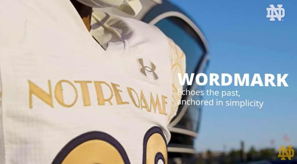
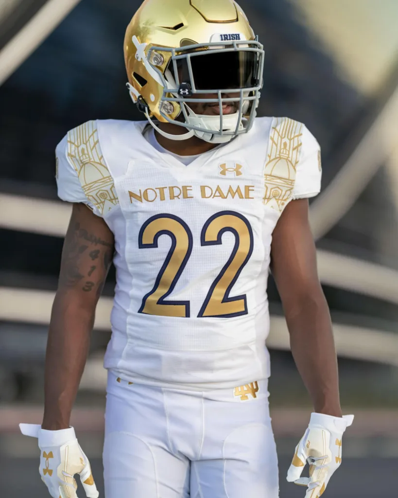
The front of the jersey features an Art Deco wordmark across the chest in gold with gold numbers outlined in blue. More on this in a bit.
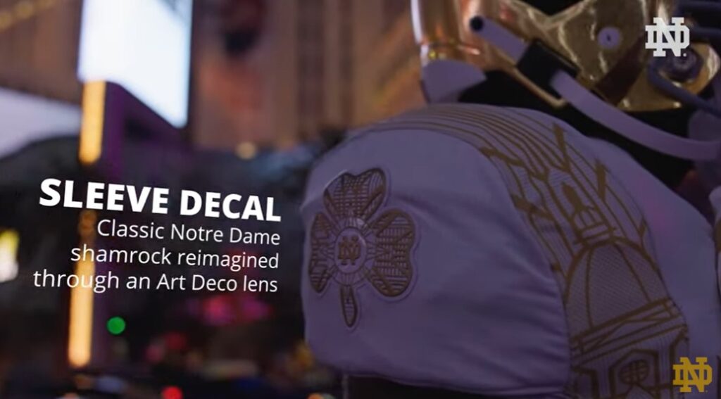
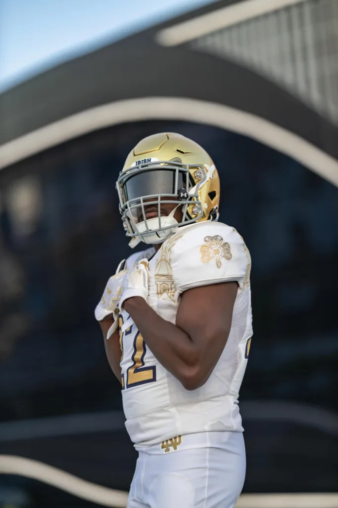
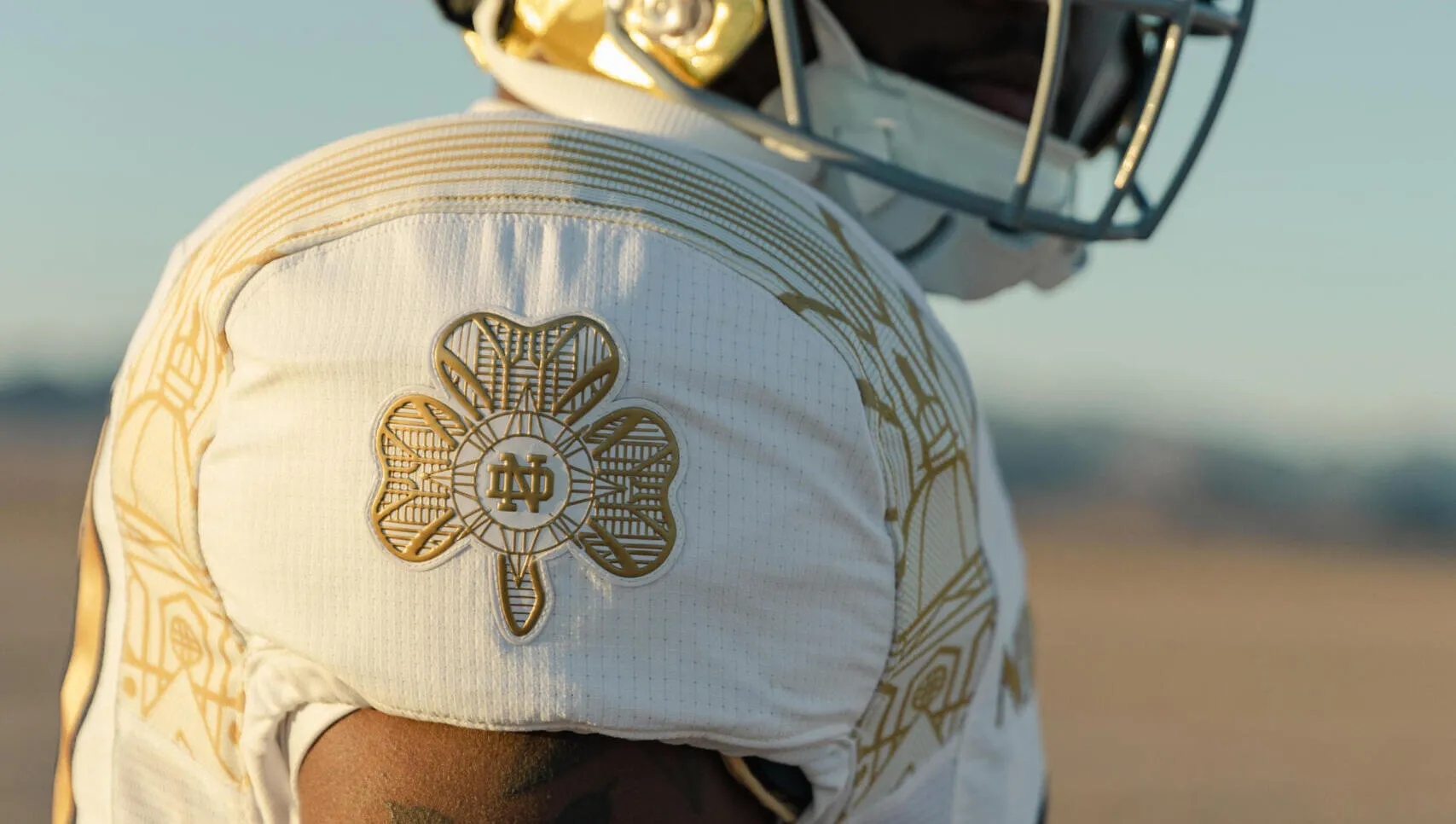
The shoulder sleeves feature a very cool Art Deco-stylized shamrock behind the Notre Dame monogram, again in all gold. This is the best part of the unveiling.
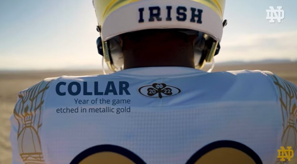
The back of the collar features another shamrock with the year of the game inside of it. Again, also in all gold.
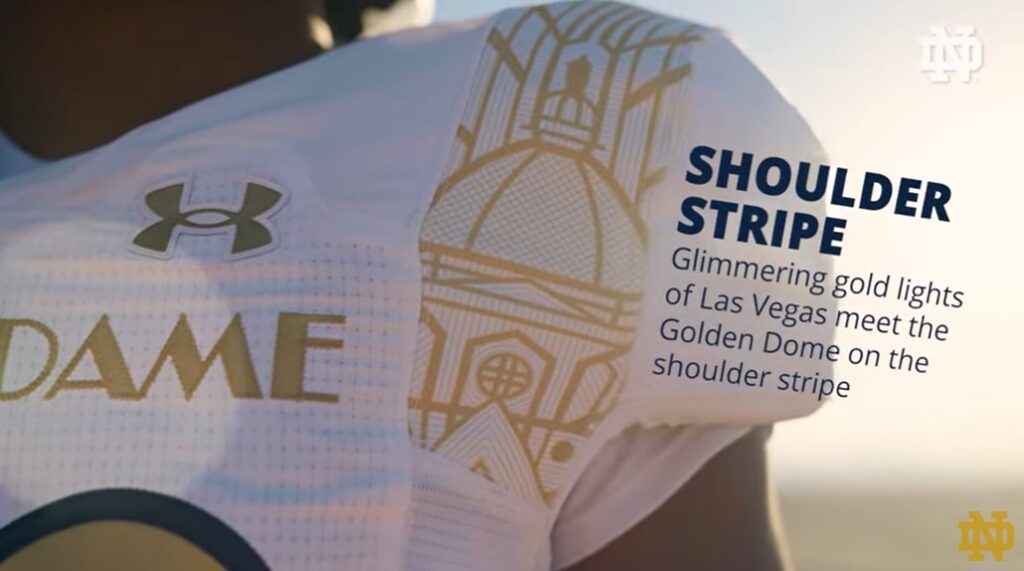
The most bold aspect to the jersey and uniform as a whole are two large shoulder stripes running across the front and back of the armpits featuring the golden dome in an Art Deco background.
PANTS
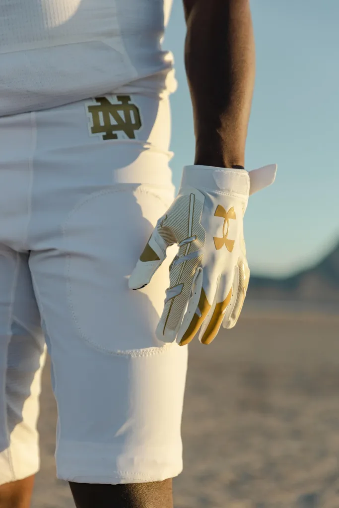
Despite an opportunity to extend the design to the pants, instead Under Armour and Notre Dame have decided to wear simple white pants only adorned with gold logos on the front hips.
SOCKS/CLEATS
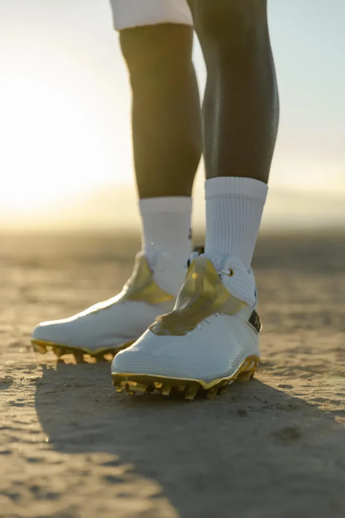
If the promo videos are any indication, the team will be wearing all white socks with white and gold cleats. For the most part, the uniform as a whole has an emphasis on being white and clean.
Final Grade: B
Notre Dame came close to something special but missed by a bit. They seemed to have wanted an “icy white” looking uniform and on television at least that’s what we will see. This uniform will look extremely bright and white inside Allegiant Stadium. In that regard, it will look cool with the all white with the gold helmets.
However, the details will be far too flushed out to see clearly, which to be fair, is a pretty common theme with most alternate uniforms these days anyway.
For me, the golden dome stripes are terrible in the worst way. Among the worst decisions in Shamrock Series history. It’s one of those designs that you will be able to make out a little bit during games, but it’ll be just a blob of gold from a distance. And up close in person, no thanks.
Without that ambitious striping this whole uniform set is so, so much better. I don’t understand the idea to come out with a clean look and then put that on the shoulders from front to back. Weird.
Also, if you want to pick more nits the Art Deco style precedes the popularity of Las Vegas and is kind of a weird fit. But it’s Notre Dame’s new thing in recent years so I get trying to ram that in, as well.
Overall, these will look crisp during the game. I’m a little surprised they didn’t opt for a green and gold color scheme (seems more Las Vegas-y to me) for a twist on the 2013 Shamrock Series uniforms (still the best to date) which feels like a missed opportunity. Instead, these look like the football version of the basketball team white and gold uniforms from recent seasons.
Interestingly, they used the blue outline on the numbers. The more I see it the more it stands out in a bad way. I’m assuming there may be some NCAA rules about making the numbers visible for officials because otherwise why include that blue and break up the entire uniform?


That’s my favorite part, it makes the numbers visible which is important to me while watching.
Outline looks too thick to me. I think it would look nicer with a thinner outline.
It’s much too bold, IMO, and looks completely out of place with the rest of the jersey/pants. I think it’s the worst part of the ensemble.
I like the idea of shifting the shoulder stripes to the pants (although I love shoulder stripes in general, so I’m fine with that aspect even if the details won’t be obvious from a distance). That plus 86’ing the number outline or at least dialing it back from 11 to a 4 or 5 would be aces.
The Art Deco thing immediately jumped out at me, too. Seems like if they had a Shamrock Series in Miami, NYC or Chicago, that would make more sense.
It’s relatively non-descript, but maybe use the font on the famous sign?
And maybe use the scripty “Fabulous” font to replace the regular “Irish” on the back of the helmet.
I guess we can be happy they didn’t try to actually go full-Vegas on us and do something totally garish.
I was a little worried we’d see clubs replace shamrocks somewhere or trim made out of dice or card suits, so I was happy to see neither of those things.
Yeah, schools often go half-way with “themes” which this is a good example. Going full Vegas theme would be bad.
This is why I always recommend not worrying about any sort of theme and just create a new uniform without ties or meaning.
What if they put the shoulder striping/Art Deco stuff down the side of the leg? Might have been too busy, but that’s Vegas baby!
I think you’re right this will look good on TV/in person under the lights, but just kinda another blah Shamrock Series edition of a “kit”.
Also, like I said in the other article, the numbers and coloring (even though not exact) give me Georgia Tech vibes. Also, from watching the video of Mayer and Foskey, the way the back of the jersey looks with the huge number looks bad.
Might not have been as clean or thematically what they were going for, but would have been sweet to use the font on the new ND turf for these jerseys.
I thought they would do this. Move that from the jersey to the pant legs and it’s so much cleaner.
Totally agree. I love the design, but it just looks small, out of place, and disruptive.
Another thing they could have done with it is make an underlayer with that shoulder stripe design, similar to what they did on the Purdue SS games in Indy.
I apparently have a new annual tradition: eagerly refreshing this website for this article after the uniform has dropped. Enjoyable as always!
UA has often gone with intricate dome stenciling. I always wonder how much they consider how these look from 50 yards away.
I know, it’s a feature of modern design that bugs me. Small intricate details are fine. But on football uniforms it has to be big and bold.
I like it. Half the purpose is to sell jerseys that people will wear and see up close (the actual designs). And half the purpose is to look good 50 yds away (the colors and broad shapes).
I think these will look good from a distance. Clean white with some barely noticeable gold accents that might make the helmet pop even more.
I’d love from a purely aesthetic point of view to get rid of the number outline. But I’m very glad it’s there and thick as seeing the numbers is actually what I care most about.
Is this the look they were going for ?
https://th.bing.com/th/id/OIP.8lGba3yiP0_-Gg_aggSUlQHaKM?w=204&h=281&c=7&r=0&o=5&pid=1.7
!!!!
Speechless ?
Missed opportunity with the Elvis biopic coming out. Could have had some excellent cross-media marketing happening.
My initial thought was this:
Point being, they may have strayed a little too far toward:
https://encrypted-tbn0.gstatic.com/images?q=tbn:ANd9GcTblex-cI9LaSCdNK-aC5Ppev2Ro8EYrE9dFw&usqp=CAU
Regardless, they took a gamble, and we will have to see if it pays off.
Question for the admins/writers of this site – Does wordpress allow for tagging articles? For example, I wanted to go back and look at all the other Shamrock Series uniforms. A quick and easy way on some sites, would be to have a tag at the bottom (or top) of the article, which would then bring up all other articles with that tag. I know it would be a pain to go back through and do it for all of the old articles, but I think it would be nice, especially for some of the “limited” series that have occurred – Uniform Concepts, Whatifs, How Did This Happen, Coach Rankings, Best HS Uniforms, etc.
Yes, we have tags but we don’t use them consistently enough.
Here’s the best uniform history:
http://www.caglaze.com/NDU.html
If it’s possible, I’d be willing to volunteer some manpower to go back and tag previous articles
That would take dozens of hours!
1) Didn’t say I’d be good at it
2) Given the ~10 years of reading here and, previously, OFD, seems like a fair contribution
3) I only ask for a free year’s worth of 18S Premium Access
The fire hoodie game continues:
Ain’t no fun
When UA won’t sell none
Caleb Downs to Bama. Sad
From this list and looking at the ON 3 predictions to ND:
S Caleb Downs .9947And then using 247 sports class calculator to add in the predictions that are above 50% plus Novosad we end up with a class ranking of:
294.08 with 24 commits. Minich would be the lowest ranked recruit in the class. This would have put us #5 in 2021 and 2022, #6 in 2020 and #3 in 2019.
Currently our class ranking is sitting at 276.27 The 2013 class with Redfield and Jaylon Smith finished at 280.01 and the 2008 class with Michael Floyd and Dayne Christ finished at 297.39.
To break 300 (and have the best class in the modern era) we would have to add another mid range 4 star or better plus the projections above.
It will be interesting to see how this cycle finishes out.
And I still think the final rankings will be more like 2019 with the top 100 players more spread out this year among various teams so I think we’d be closer to 3rd than 5th or 6th.
The M’Pemba visit in November will be huge for ND.
Yea it would be nice to finish with one those top 50 players that we aren’t really in the lead for right now. (I think Georgia has the slight lead currently.)
Yes, I think M’Pemba would be the one to pull late, if he comes to the Clemson game (as kinda expected/hoped he will) and is swayed by it.
They just offered a Kansas State commit RB, guessing that’s a move on from Love.
Purely a guess but, I’m wondering if they’re looking at that kid as a slot receiver? (5’8″ 155lb.) Perhaps they’re moving on from Hanafin?
Yea, like I said in my comment below. I was thinking something similar.
I think it’s got to be because of Hanfin moving on and I was wondering if it’s more to move Love into that spot (like Deebo Samuel).
Gotcha, points to you both, that makes sense.
Other than the Leftrechaun in 2012, I’ve liked all the Shamrock series uniforms. Some more, some less, but no outright rejections. I like this one as well. However I think the 2013 white uni’s with the Green had a better look than these. I do think the shoulder stripe would have looked better as a leg stripe, and that the blue outline of the numbers is a bit thick, maybe could have used green there along with the blue stripe on the glove?
That’s a big white space between the back numbers and the collar shamrock. Are we getting nameplates for this game?
Fingers crossed.
Amen. Would you do the names in blue or gold? I could see an argument either way (the lawyer in me is a curse). Either would work. I think I lean blue to add reinforcement to the blue number outlines and let the names really pop.
I’d probably go the same as the numbers. There’s also blue on the back “IRISH” bumper of the helmets, too. I wouldn’t love it, but that’s what I’d do.
So you’re saying nameplate letters in gold with blue outlines? I hadn’t considered that. Yeah, I agree, that would probably be best.
I know nameplates are a galvanizing topic, but I think, visually, overall impact, they’d complete these uniforms.
Correct!
What’s with the new Dylan Edwards offer?
Does that mean they are pessimistic about Love or Hanafin? I know they’ve sold Love on a Debo Samuel role – which is more WR than RB (but a combo role). Could Love be slotted in more at WR if Hanafin is not coming and Edwards be the 2nd RB in the class?
That’s what I want to think anyway since Love would be a big pickup (and so a big loss not to get).
I have the opposite opinion of E with these – I think the uniforms are great, but I’m not a big fan of MF’s hoodie
I like both, and decided that this is 80’s pimp style. White vehicles with gold rims, White bathrooms with gold/brass fixtures, etc…
Keeley visiting Alabama….ugh.
Yea no word other than that he is visiting that I’ve seen but obviously that would be devastating loss – to lose your one 5 star commit at a premium position (not to mention to lose him to one of the teams you are trying to close the gap on).
I realize we are ND fans and so there is a lot of the Charlie Brown/Lucy pulling the football away kind of angst but I think we should be pretty confident that Freeman can close with Keeley.
The biggest concern might be NIL – which at this point would be a really bad sign since it could indicate that ND can’t really compete with the big boys on NIL (to be fair, things will take a few years to balance out when everyone has had a chance to get NIL stuff going).
Oy, with Bama you have to worry about more than just NIL. I read Saban has been talking to him on the phone and Keeley might visit for a game in the fall too. They got the $ but also the results of producing a lot better and more NFL players and can almost guarantee a national title if you go there. Can’t blame anyone for being intrigued in that when that program wants you and is hot on your trail.
It would be a bad loss for ND. I think you’re right in the aspect that Freeman will give the Irish a fighting chance (no pun intended…ok maybe a little). Like if ND doesn’t get Keeley, then there was just no way it was ever in the cards that he was going to actually enroll once his profile became top-10 nationally. That doesn’t really make me feel too much better about the situation, but I guess it’s something.
Sucks to be reminded of it, but that’s the place in the food chain right now. Can steal some other programs commits, but vulnerable to get poached for a Southern kid by the biggest/best progrum of all time.
We have also offered two new edge players this week. One from CO and one who is a Tennessee commit. Not a great sign.
I’ve said this before, but I think we got a guy like Freeman at the wrong time, historically. Finally land that high impact, 110% effort recruiter. But right as the landscape of recruiting is changing and NIL is turning everything on its head. If we’d had a guy who could recruit like him even 5 years ago, we could really have closed the gap. But now, I’m just holding my breath for us to lose a few key members from this class at the last minute. Hope it doesn’t happen, but…