We’re into the top 40 today. In case you missed the topic, we’re counting down the best alternate, secondary, or old primary logos in Division 1 sports. Let’s continue the fun…
All logos and information are courtesy of SportsLogos.Net.
#40
Rice
Type: Secondary
Years: 2007-2017
You can go in a lot of different directions with an owl mascot and in the past Rice has done just that. Today, they keep things pretty subdued with an Old English stylized “R” that is recognizable but boring. This giant owl head–based on an old and cluttered primary logo–is right in my wheelhouse for cool logos in the intimidating owl category.
#39
Long Beach State
Type: Secondary
Years: 1992-2013

In normal circumstances a script wouldn’t make this list but we have to make an exception for Long Beach State’s decision in 1992 to bring us this iconic look. Using this on their yellow basketball jerseys is among the coolest looks in hoops history. In recent years, the school has dropped the “the” from this logo and they’ve also introduced a more futuristic “Beach” typeface to uniforms. But, this is the OG typeface.
#38
UConn
Type: Primary
Years: 1959-60
The most meme’d sports logo in college, nay, the most meme’d logo in all of sports. You look at this and you wonder how it ever got approved but you also wonder how they ever could live without it.
#37
Quinnipiac
Type: Secondary
Years: 2017-Present
You may recognize Quinnipiac for its independent political polling. In sports, the school just won their first National Championship in any sport with a 3-2 overtime victory in hockey against Minnesota. They used to be called the Braves and in 2002 switched their nickname to the Bobcats. Their logos are okay if a little high school-ish except for this really sharp tartan patterned secondary crest created 6 years ago.
#36
Oregon State
Type: Primary
Years: 1961-1998
Oregon State has created a handful of logos over the past 70 years and with each new iteration they seemingly try to hide the beaver teeth more and more. Not back in the day! This Benny Beaver logo goes back to 1951 in various different looks and is still a lightly used secondary logo to this day. It is one of the best in the Pac-12.
Notre Dame just joined The Association of American Universities, a group of large research colleges that the Big Ten wants all members to be part of. There are functionally no benefits of being a member other than “prestige” and both Syracuse and Nebraska have been kicked out for not being sufficiently large research universities.
I’m very dubious about joining a cool kids table where the only benefits are looking cool and there’s a possible downside that they may, in the future, decide to kick you out to make themselves seem cooler. It does, however, remove the second biggest hurdle to Notre Dame joining the Big Ten though. More to come, probably ¯\_(ツ)_/¯
Nebraska and Syracuse are both double the size of ND. Maybe they have a smaller amount of research happening?
There are a few smaller schools than ND, so rates per student or per faculty has something to do with it, but the AAU is publicly fuzzy on what their exact rules are, and kind of only publish guidelines. Nebraska fought their removal tooth and nail, but ultimately they were removed primarily because their accredited medical school was under a different administrative structure, so while Nebraska always counted those grants and associated research when the AAU found out and stopped including them they fell out of compliance.
Weird organization.
It’s possible that inclusion helps with some grant applications, so maybe it’s relatively low cost and provides some positive value to the University, I’m just naturally suspicious of prestige chasing. Especially when you’re the University of Notre Dame. It’s not like the missing piece around the school is that it’s missing some prestige.
https://www.aau.edu/who-we-are/our-members
Looks like Between the PAC and the BIG, a good portion of the membership is covered.
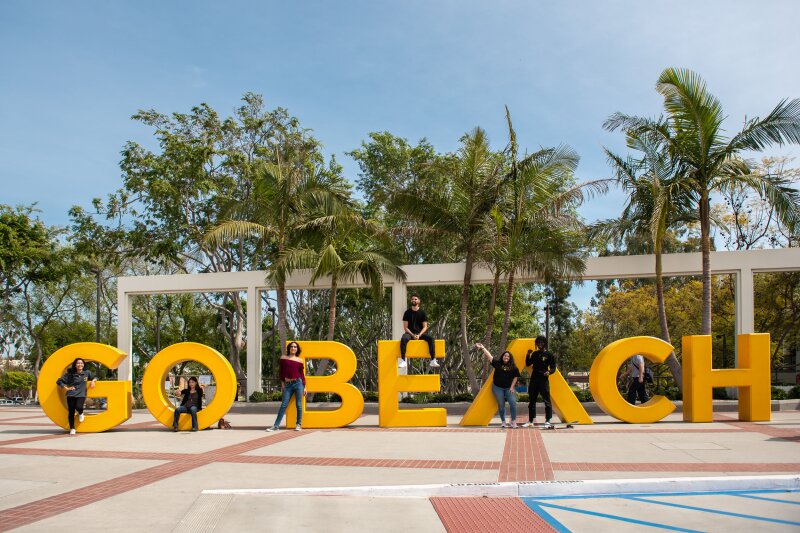
#39, Beach Please!
I’m going to throw out a guess that the University of Delaware has at least 1 logo in the top 5 (not sure if there’s only 1 per school)
And I wouldn’t be surprised if the state of Delaware has 2 of the top 5.
Zero from Delaware.
If I had to guess what you’re referencing…
1970-2001 Delaware State primary
1987-199 Delaware primary!??
Take your pick with the Delaware looks, but 67-87 is a GD masterpiece
https://www.sportslogos.net/logos/view/65757681967/Delaware_Blue_Hens/1967/Primary_Logo
Only 5.3 stars out of 10!!
J/K that is a good logo.
The Husky looks like a sock puppet, and that OSU Beaver is awful. The honorable mention list beats both of them out, no questions asked.
Don’t hurt Benny’s feelings, look how happy he is!
Husky was my exact fave against Alabama 2012, miami 2017, michigan 2020… I know that pain buddy
OK I was mostly joking about saying that I would go through and list all the ones that the honorable mention Arizona logo was better than, but it is in the same genre and so much better than the Rice one here that I feel compelled to comment.