We are inching closer to the top half of our logo countdown. But first, the next 5 offerings from the ranks of Division I college athletics. As always, all logos and information are courtesy of SportsLogos.Net.
#35
Drexel
Type: Secondary
Years: 1999-2012
For many years Drexel used a walking and snorting dragon in a sweater as a primary logo. In 1999, the school went through a pretty extensive re-branding which brought us this Puff the Magic Dragon fire-breathing logo. Their primary logo has a more complete version of this dragon sitting atop a bunch of script. I prefer this smaller version with just the neck and head. Drexel has also brought a more vibrant colored version of this logo since 2012.
#34
Kansas State
Type: Alternate
Years: 1964-1989
In recent years, Kansas State has been using a lot of pale purple apparel (say that 3 times fast) combined with dark purple for some of the freshest looks in college. They are also bringing back a lot of older Wildcat logos, particularly this adorable flag-waving Willie the cat. Check out this lavender bomber jacket from Homefield, sheesh. Is he happy? Is he insane? Either way, he’s a great logo.
#33
DePaul
Type: Alternate
Years: 1975-1999

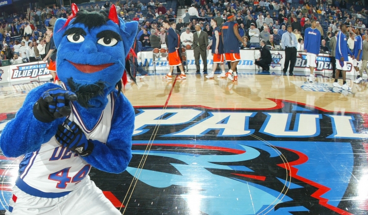
DePaul have changed their logo twice this century and they were both similar and sharp new modern designs. Our countdown will feature a few sport-specific logos and the old Blue Demon above was often used sitting on a basketball hoop. Their primary logo even had that plus the Blue Demon script running through the net. I rather enjoy this version with the demon seemingly floating in a sitting position.
#32
North Dakota
Type: Primary
Years: 1976-1999

North Dakota has been at the forefront of logo and nickname controversy in college sports. Formerly the Fighting Sioux, the NCAA basically made the school change their nickname and in 2012 they switched to an interlocking “ND” logo (similar to our Irish) and in 2016 they officially re-branded to the Fighting Hawks with their 4th logo of this century. This simple yet striking Sioux logo that was used for nearly 25 years really stuck out as being well done.
#31
Kennesaw State
Type: Secondary
Years: 1990-2012
Variations of this logo were used for many years at Kennesaw State. They had a secondary logo with just the owl head inside the “O” which is great, and their primary logo for a long time was the exact design above except with the Kennesaw State script above the owl head. We don’t have many logos in the top 50 countdown that feature script but this is one of the exceptions.
Great list of 35-31. Can’t complain about any of these! North Dakota is still the Fighting Sioux to me. Give it another 20 years and the NCAA will be having the Fighting Irish changing their name as well. The will say that the mascot is teaching “stereotypical, misleading and too often, insulting images of American Immigrants” that it doesn’t belong in a “enlightened culture of higher learning”.
You know Leprechauns are mythical, right?
Yep, but it has already started. May not even take 20 years.
As late as 2013 Dan Snyder said he would never change the name of the Washington Redskins, 7 years later in 2020, it became the Washington Football Team.
What happens 10 or 15 years from now NBC is telling ND that they don’t want to partner with them because their mascot is offensive, or the SEC puts a ban on playing any team with an offensive mascot. (There are only three SEC teams that have a person related nickname The Commodores, Volunteers, and soon to be Sooners. None of those are deemed offensive, yet.)
This isn’t the 1930’s. Notre Dame doesn’t have the clear Catholic vision it once had. Get the right money sources to put pressure on them, and they will cave. Football independence was born out of necessity, is kept because of tradition, but will disappear due to the financial losses incurred if pressure is applied. If Football independence can be subjugated to dollars, so can the mascot.
How can we take a study seriously when this wasn’t the #1 most offensive mascot?
(I’d be absolutely shocked if ND ever drops the nickname, mascot, etc).
And it named OSU’s Pistol Pete #3 creepiest, which is absolute trash.
I genuinely hope you lose sleep over this
Nope, not an administrator at ND. It is just one of those things that seems inevitable in the way society is trending.
Those all rule. K State one in particular is a beaut.
That k state logo vs the uconn fail husky… an LSD fever dream that I’d love to watch. If those teams squared off, I’m convinced thered be 5 field goals, 3 safeties, and wrong way touchdown, and a missed down by the refs.
The Blue Demon hooper (in different colors):
Consummate Vs
More like the Blue Demon pooper….
DREXEL MENTIONED! I liked the older primary logo, but that’s likely nostalgia talking
I like that one! But, does he need to visit the chiropractor?