
The countdown breaks into the top 30 today. Now we’re really going to start seeing some fun and interesting logos. Even more than the previous submissions.
A reminder that all logos and information is courtesy of SportsLogos.net.
#30
Ohio State
Type: Primary, Dark
Years: 1987-1991
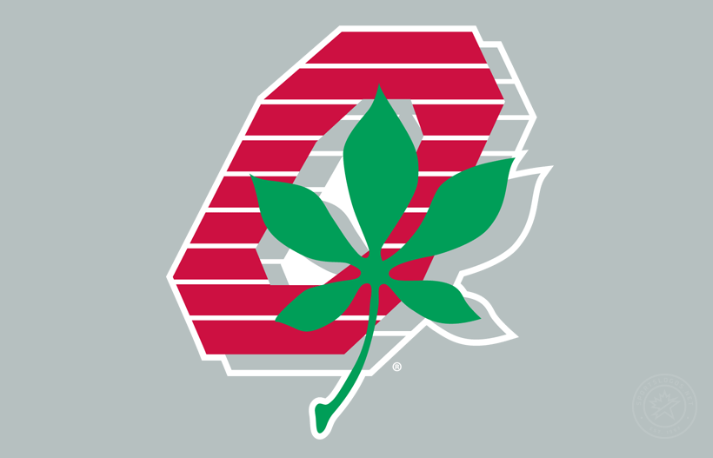
Ohio State made a small tweak to their current primary logo and has been using the same design for over 30 years. I think we can admit it’s quite overrated. For a few years, the Buckeyes used this italicized drop-shadowed truly intriguing logo with the buckeye leaf front and center. The primary logo was on a background and this gray background was used often and does a good job using the school colors.
#29
Central Connecticut
Type: Secondary
Years: 1994-2010
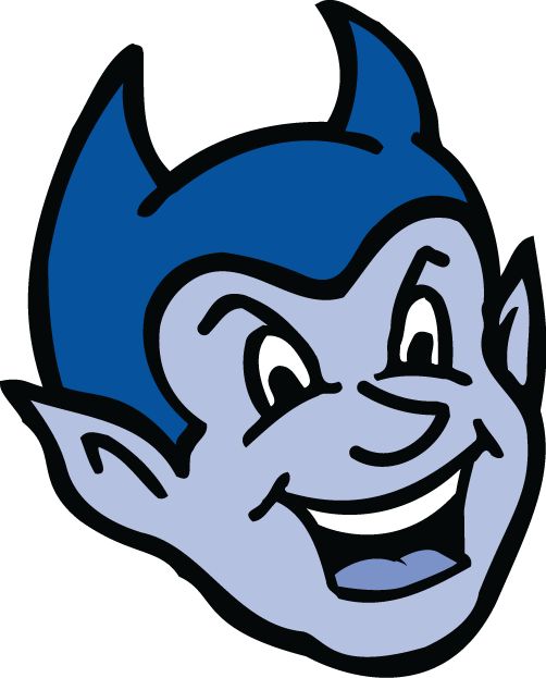
When I saw this logo I thought for sure it was created in the mid-1960’s while taking some inspiration from Eddie Munster. Instead, I found it fascinating and hilarious that this head was a creation of 1994. Their primary logo had this devil running with a long pitchfork. Today, CCSU has a very generic looking logo (not too different from my local SUNY school) and it’s completely devoid of all charm present in this smiling little child devil.
#28
St. John’s
Type: Secondary
Years: 1994-2003
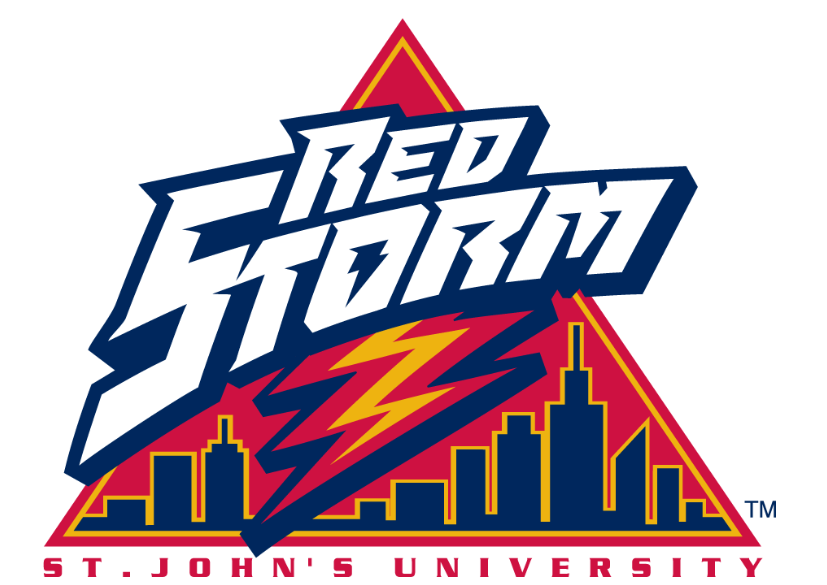
For many years St. John’s were known as the “Redmen” and well that had to be changed. Thus enters one of the best nickname changes in college history with the unveiling of the “Red Storm.” The school brought yellow as a secondary color, introduced a horse, lightning bolt, and skyline as part of their new look. Everything about the new St. John’s re-brand was awesome. The official logo from this period even had storm clouds. I like this secondary version which is very similar–peep the lightning bolt inside of the letter “O” as well.
#27
Nebraska
Type: Secondary
Years: 1972-1986
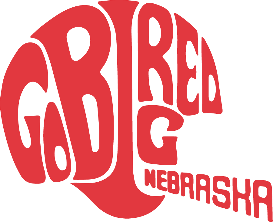
Outside of a 10-year period where Nebraska scrawled “Huskers” in black across their logo, they’ve kept the solitary “N” as their primary mark for the last 50+ years. But don’t sleep on their secondary logos, they have some of the best in the nation! Look no further than this amazing word mark football helmet logo. It’s creative and I love the logos that scream out that they were created in a certain era. You just know this was a creation of the early 1970’s without having to look it up.
#26
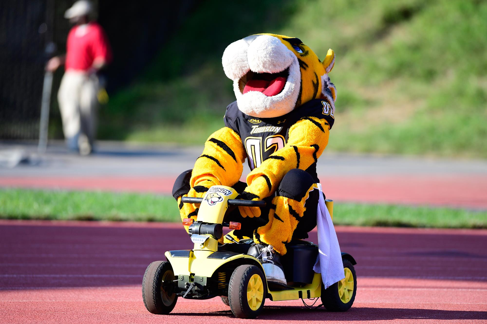
Towson
Type: Primary
Years: 1985-1995
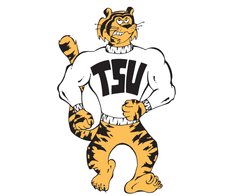
One of the sad things about this countdown is how many schools currently have high school-like generic logos that are inoffensive but lack so much character. Towson is one of those schools. They had 30 or 40 years of absolute banger school logos in all varieties and today not so much. This strutting and sweatered tiger logo above was the school’s primary logo for 10 years! He’s freaking awesome and I feel bad that this Towson offering isn’t ranked higher on the list.


If you crossed out the “St John’s University” bottom part and told me it was a current WBNA logo, I would 100% buy it.
And the Towson logo looks like he’s on his way to deliver a beatdown to Garfield.
I think for the national perception tOSU has to be really careful with anything that has a buckeye leaf sticker on it. Marijuana may be much more mainstream now than it was 25 years ago, but a plain depiction of a buckeye falls awfully close in looks, enough so that you can find news stories about police pulling people over for the buckeye leaf. Wouldn’t surprise me that they went to the current logo to eliminate the leaf.