

The top 20 begins! If you’ve missed the previous entries in this series go to our search bar and type in “Alt Logo” to get caught up. Today, a couple of SEC teams join the fun, plus a couple of smaller schools and one menacing pirate.
All logos and information courtesy of SportsLogos.net.
#20
Florida
Type: Primary
Years: 1979-1994
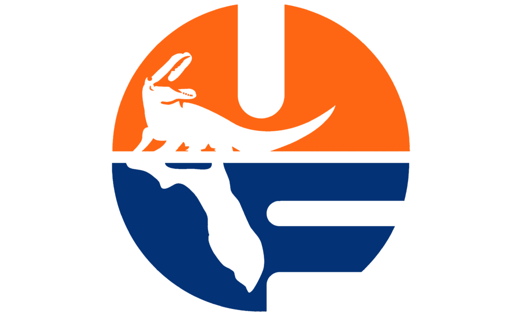
The gator head logo that Florida has used for the last 30 years is well known. I wasn’t old enough to remember how it was received but I would bet it’s one of the most recognizable logos in college sports to this day. I need to stump for the previous primary logo that is lost to history now and absolutely rocked. This would look tremendous on the chest patch on the football jerseys. Florida has used 8 throwback or alternate helmets in recent years and never brought this throwback logo in the mix. How sad.
#19
Auburn
Type: Alternate
Years: 1945-1983
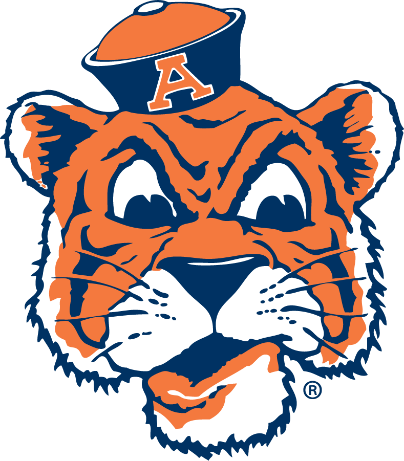
Several other schools have used this exact same tiger with sailor hat logo throughout history including LSU, Missouri, Princeton, Pacific, Idaho State, and Occidental. There seems to be controversy about who created the logo and which school used it first–research seems to indicate it was Occidental, actually. However, Aubie wearing the sailor hat has always felt like the right school for the logo.
#18
UMass-Lowell
Type: Secondary
Years: 1994-2006
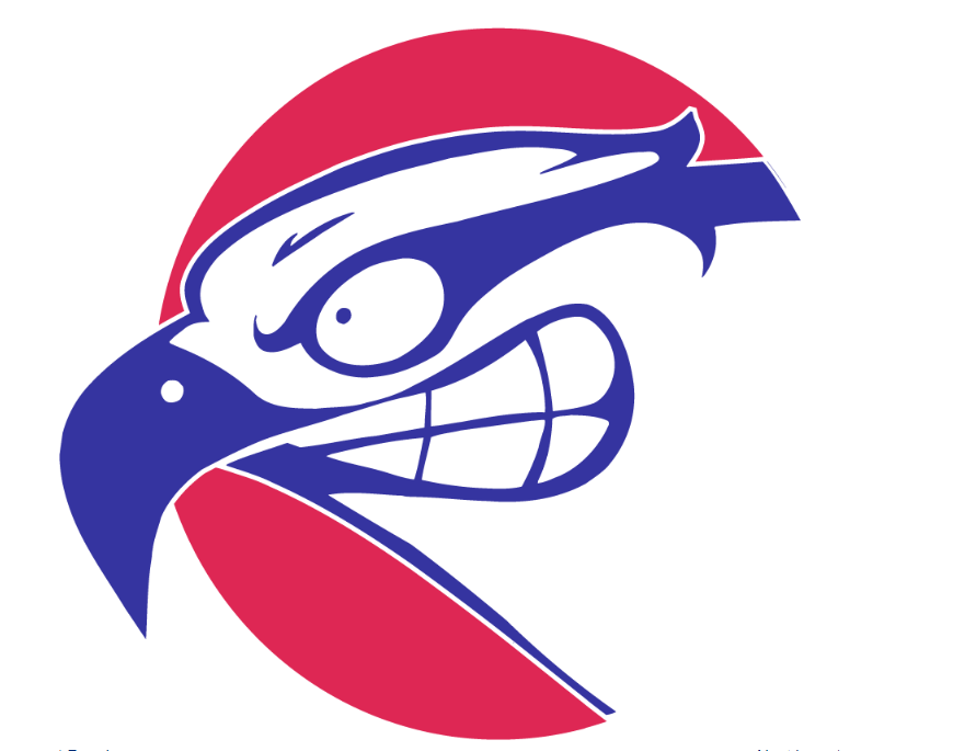
No, not the Minutemen in Amherst, this logo comes from UMass-Lowell to the northwest of Boston. Originally called the Chiefs, the university changed their name to the River Hawks in 1991. A few years later, Lowell debuted this absolutely unhinged and crazed hawk is such an original and memorable logo.
#17
East Carolina
Type: Secondary
Years: 2014-Present
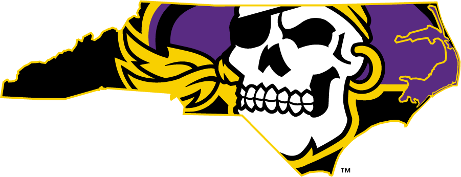
For years East Carolina wasn’t maximizing their branding across the collegiate landscape. Then 2014 happened. The school finally embraced a skeleton pirate logo and they’ve done a complete 180. While their primary logo has this pirate head in front of crossed bones, the ‘Pirate State of Mind’ above has to be one of the best modern logos of this age. It is this logo that the school has used at midfield on their football field in recent years.
#16
Loyola
Type: Primary
Years: 1994-2000
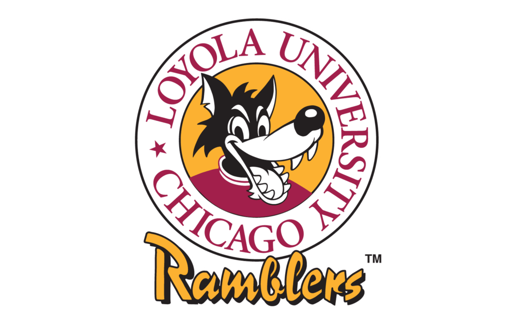
Up until 1990, Loyola used a hobo for a logo although not very often in any official capacity. Starting off this decade, the Ramblers updated things to create a new wolf logo and in 1994 they peaked with the design above. This looks like the Big Bad Wolf from the Disney cartoon. And while I don’t usually like so much script, the circle works well and the “Ramblers” is in an unusual but memorable font.


I like the ECU midfield logo, but I feel like it’s excessively long. Damn thing stretches like 15-20 yards in either direction (or seemingly so). I guess it’s cool since it stands out and all but I could stand for it being a little less extra
I fully admit, I love a huge midfield logo.
Too much. Also makes me twitch that, by appearance, doesn’t look like state is centered on the 50.
Personally I think they should make it bigger, go goal line to goal line
Colorado State and Wyoming already include their state outlines across the entire field.
All the world is but a mid-field logo
Love it. But I’m also a sucker for any time a state school puts the state itself at midfield, I wish more did it. Yeah even Colorado and Wyoming
This reminds me of a few years ago, when current events necessitated an updated logo:
And yet you gave us the horny wolf logo….
Unguardable because he smells so bad.
Local sandwich chain, which rules as a logo and a sandwich maker:
Neither logo includes a bindle, so are these guys really hobos, though?
That’s a high class hobo, or a HCH as they are known on the streets.
We’ve got this
Reply fail’d
I assume there’s no menu and they just give you something.
WE LAY IT ON THICC
That UMass-Lowell logo looks like it’s been edited by the Sickos Committee. Absolutely amazing
Totally unrelated to logos, but I just heard that Lambert cancelled his official to PSU so he could take a visit to Harvard. Lol. Mostly just posting this because it’s funny, but also probably bodes well for us.
That’s good news after Carter Nelson chose to stay near home at Nebraska earlier today. The offensive board is pretty short now outside of Guerby.