
We are into the top 10 of the summer’s most anticipated college sports logo countdown. If you were wondering if Notre Dame would feature on any of these articles, fear not. Today, the leprechaun gets to shine.
As always, all logos and information courtesy of SportsLogos.net.
#10
BYU
Type: Primary
Years: 1957-1982
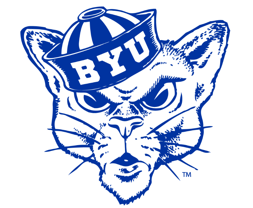
The abhorrent 1999 re-brand from BYU has been discusses on this website and across college sports and is one of the worst jobs done by a major university. And they kept it for 12 years! They have now moved back to their “Y” in an oval as a primary logo which is solid. This cougar in a sailor hat logo is one of those that doesn’t seem possible it was created over 65 years ago. That is a badass logo.
#9
Wofford
Type: Primary
Years: 1985-1987

I had a close friend attend Wofford in the early 2000’s and I remember teasing them about how boring their logo was at the time. From 1987 to 2015, Wofford chose to use a bland gold block “W” logo with no charm whatsoever. Before and since, the school has used amazing and fun terrier logos. For example, the above terrier logo was only used briefly and was dubbed the “space dog.” I love it, and call it batdog.
#8
Old Dominion
Type: Secondary
Years: 1986-2002

Currently, ODU has a very amateurish create-a-logo lion with a bunch of text sprawled across it. It’s been 20 years and their branding doesn’t stick out at all. Once again, we have a school that used to have a great logo that they’ve turned away from. For nearly a quarter century, Old Dominion used the above fancy, dare I say royal, logo and the primary version featured an oval around it making it resemble a Canadian beer from the 1970’s.
#7
UMBC
Type: Secondary
Years: 2001-2010
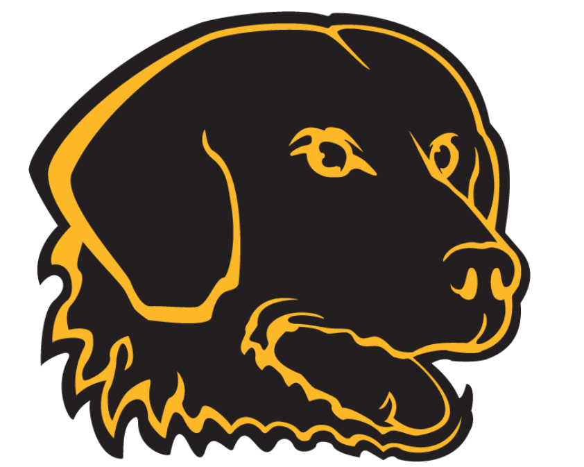
Look at this Good Boy™ staring into the distance. When UMBC put themselves on the map with their upset of No. 1 seed Virginia in the 2018 NCAA Basketball Tournament they were already close to a decade past this retriever logo. Back in the day, the main logo of the school was this striking back and yellow pup surrounded by block lettering on the top and bottom. As a stand alone logo, it looks great and is instantly recognizable. It’s worthy of being a clothing company logo.
#6
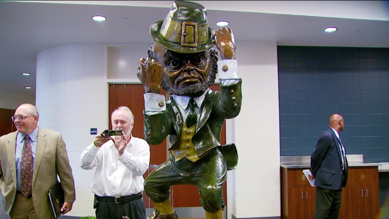
Notre Dame
Type: Secondary
Years: 1967-1990
Ted Drake designed the Notre Dame leprechaun, even getting an early drawing on the cover of Time magazine in 1964. A few years later Drake created the standard leprechaun logo (and the Chicago Bulls logo!) that Notre Dame has used as an iconic secondary logo and the one you’re probably visualizing in your head right now. The colors were darkened on that logo 8 years ago but otherwise it remains the exact same. Drake also created this wonderful cream and green leprechaun that’s always had a soft spot in my heart.


Would love a Shamrock Series design with that darker green and cream as the main colors….Maybe some gold and white outlays in there. That would look sick at night.
That Leprechaun reminded me of a big plastic cup i used to have in the 80s. No idea where we got it.
#9 is gonna be no from me, dawg
#7 is a good boy, though