Maybe there is hope for Under Armour after all.
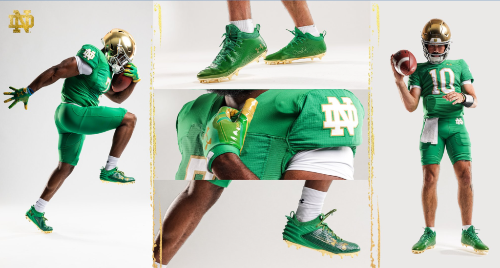
On Sunday, Notre Dame sent out a teaser for the Ohio State game with the #IrishWearGreen hashtag alluding to some sort of Jerry Maguire movie reference and possibly new green jerseys. This Monday morning, the Fighting Irish definitely committed to the bit with a full comedic video reveal that’s actually really funny and well done, plus oh yeah all new green uniforms.
You had me at hello.#IrishWearGreen | #GoIrish☘️ pic.twitter.com/2qyCus58bH
— Notre Dame Football (@NDFootball) July 31, 2023
Our long national nightmare of the blue numbers is officially over!
JERSEYS: A+
This is pretty much the perfect green jersey for Notre Dame in my opinion. Finally, we get to see the 2002 green jersey rise from the dead and get a second chance at life.
It doesn’t appear that the shade of green has been altered very much–although removing the blue numbers automatically makes it appear at least a little different and more vibrant. Is it too bright? Nonsense! Notre Dame should always wear a bit of a bolder kelly green, similar to the Ireland Rugby team. Going a little darker would be okay too, but the key feature should be the green popping in person and on the screen.

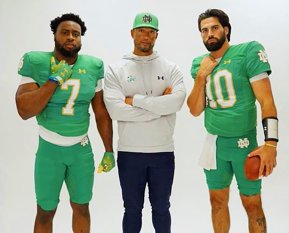
Obviously, the jersey is the same layout* as the standard uniform. The white numbers and monogram outlined in gold was the smart and sensible decision. You can’t go wrong with this look (although the same styling should be put on the back with a nameplate).
*It’s subtle but this is the first look at what is believed to be slightly larger player numbers on the jerseys. If you look at a picture of Audric Estime from last year you’ll see the bottom of his “7” barely covers the end of his shoulder pads in his midsection while these new numbers are significantly taller and reach further down to his massive abs.
PANTS: B
For now, this is technically a one-off uniform for the Ohio State game. However, we can probably assume (especially if Under Armour is still outfitting the team in 2024 and beyond) that this uniform set will be used again in the future. I’ll set the over/under at 1.5 more games beyond Ohio State.
In a vacuum, the pants are fine. Put together with the green jersey the monotone isn’t my favorite look. I don’t hate it, I don’t love it, and it is something different at least.
ACCESSORIES: B+
Don’t sleep on this part! The white base layer shirts, white towels, and white socks help the look to be a lot more clean and fresh. With the monotone green jersey and pants that contrast with the white (especially on the numbers and logos) helps out a lot.
With the gold helmet and white secondary colors the overall look isn’t as dominated by green (after a first glance at least, or as much as it could’ve been potentially) and I think it’ll look pretty sharp on the field.
I would’ve gone further and used white cleats and even white gloves, too. Definitely the cleats though, as wearing the white socks and going with green cleats feels a little bit off. But, I’m surprised they didn’t wear green socks so I’ll take it.
FINAL GRADE: A-
The jersey alone is a big, big step in the right direction and for that I am grateful. If we’re only judging the uniform as it’s seen today I would maybe bump things down to A or even B+ due to the pants but the jerseys at least being in the rotation now is a huge victory.
If we pair these green jerseys with the standard gold pants–which God willing they will do at some point–I would rate that as nearly perfect. They’ve opened the door to this possibility so it’s exciting.
Plus, the green pants aren’t terrible. They could use them with a white jersey with green numbers in a look that would be very welcome. Or use them with another one-off different green jersey design down the road. At least there are some options and at least we have a great green jersey again.
Now we wait for Shamrock Series uniforms coming soon.


2002 BC is not exactly a happy memory.
If you’re an Eagles fan like me, this has been a beautiful couple of days for alternate uniforms. Kelly Green Forever!
https://twitter.com/JeffMcDev/status/1685828386835329024?s=20
Go Birds
Green on green is ugly, greatly prefer it if they had gold/yellow pants even if some of the particular color choices on that combo have been bad
This will look great at night – I looked back at the ’15 Rose Bowl where OU went green-on-green. It’s a subtle difference between kickoff and end of the game, but the green pops a bit more when it’s dark vs daylight.
I actually thought the green jerseys looked a lot better in the sunlight against Cal last year.
Seen this written in other place but is that true? There isn’t a Shamrock Series game this year.
I suppose they could have another alternate one-off jersey at some point, but timing-wise it would take away from the green for Ohio State if they use them for a September game.
18S sources believe we’ll see something for the Navy game.
Nice. Does make sense to do something special for Ireland.
This same jersey, but with orange number outlines and orange or white pants. It’s a no-brainer.
Love this idea. This would be a top 2 or 3 “shamrock series” uniform immediately.
Love the green and white combo. I strongly dislike the monochromatic look and wish they would have just gone with the gold pants. I also think they should go to green full time for both home and away.
Not sure how I feel about the green shoes, I think the green with a spat and no high sock +gold pants would be a great look. Can’t wait for the next NCAA video game
I had this same thought when I first saw these unis. Add in the shamrock helmets and now we’re accomplishing something.
Basically this with those pants would be sex
They did a great job with the video!
Curiously, nothing from the Under Armour Football social media team with any of this today, so far.
Granted, as I pointed out HERE they really struggle in this area. The same 2 posts on Twitter/Instagram and that’s it for the past 2 weeks.
The main UA pages haven’t even posted anything in 3 days.
This would be the best uniform in college football.
I can picture RGIII in these
I am in love
I love what we got but oh my god this would be the single coolest thing ever
now those I’m all in on
Oh my
Going from blue numbers to white numbers was the best change they could have made. Other tweaks, different pants, all good marginal ideas, but now that the numbers are legible I’m very happy with these.
I do think the conspicuous lack of shots of the back confirming the existence or not of a nameplate is kind of funny.
I think that enough of Estime’s back is shown while he’s dancing in the announcement video to deduce there’s no names on the back
Lol on the first good day in the ND-UA relationship in years thanks to these sick threads, they leak ND signing a 10-year deal.
I’m sorry but that would be funny if it weren’t such a bummer. Wild they let Swarbrick negotiate that on his way out the door while his kid is a UA exec.
Future me is interested in how UA will find a way to get out of a 10 year, $100 million deal.
We better be getting a lot of that in cash and soon.