“The tradition continues.”
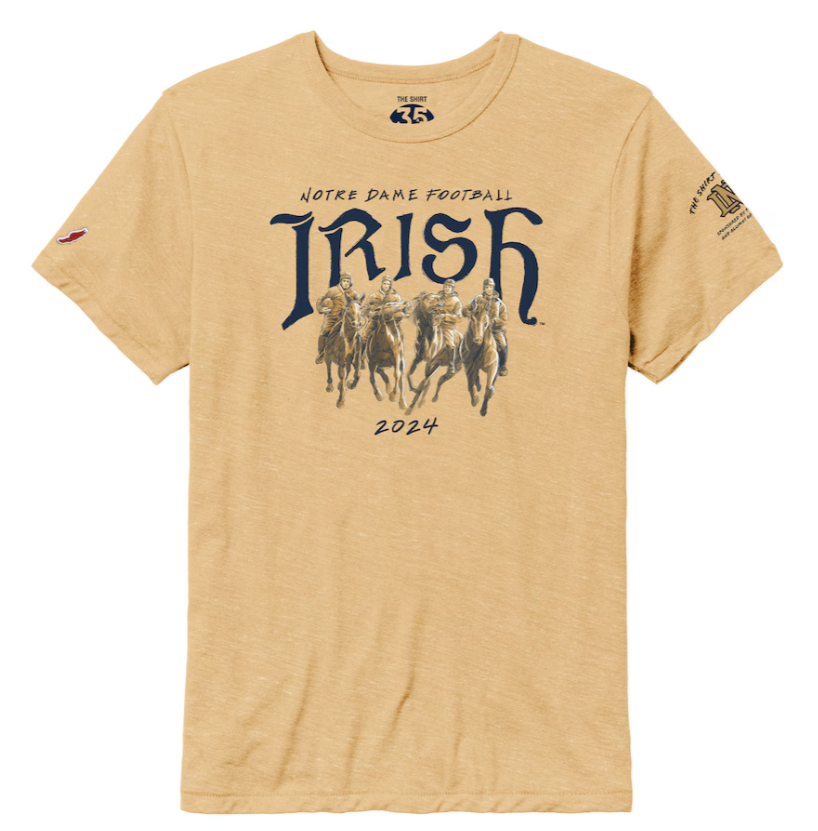
Yes, it certainly does. On Friday night before the annual Blue-Gold Game on Notre Dame’s campus, the 2024 edition of The Shirt was released. You can purchase the latest shirt HERE for $25.99 with proceeds going to The Shirt Charity for unexpected medical expensees for students and other student clubs, as well.
For only the 2nd time, and for the first since since the controversial 2009 design, the committee has opted for a flesh colored design. Soak it all in everyone!


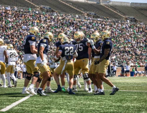
Interestingly, the studio shots of the shirt make it look fairly dark whereas the 2009 version studio shots were fairly light but in person the shirt was a lot more cardboard colored. As I’ll embed below, the 2024 version in the daylight seems much brighter than the stock photos would lead you to believe.
It’s an inoffensive design but the color is a rough choice. Out of all the choices I don’t understand walking down this path when 99% of the public would never buy a shirt in this color for any reason. If it really is much lighter in person, or was some form of off-white, that would be pretty modern and somewhat interesting.
I don’t mind the back of the shirt as much. The helmet facemask seems weirdly disproportionate and the nose bumper script is now dated. The National Championship banners inside the visor is a neat little touch. Any time the end zone stripes are involved I guess this blog has to applaud.
What’s going on with the front and the Four Horsemen, though? The players only took one photo together and they most definitely were not actually riding the horses around. This shirt makes it look like they just booked it out of the saloon and are pulling up to take a picture with the horses still in stride.
Jim Crowley was the tallest of the bunch by far standing 5’11” and at second from the right he looks the smallest and also like the horse is about to throw him to the ground.
The shirt does look to have a nice soft feel to it from League Collegiate Wear. So if you’re going to head to a game and look like a piece of bread at least you should feel comfortable.
Go Irish!


It’s bad, but it’s still incomparably better than the 2005 version.
I logged in to argue with you that there’s NO WAY this isn’t the worst, and then looked up 2005. Guess I’d blocked it out. Yeah, ok. This is a very close 2nd though.
Maybe they’re trying to stoke a “worst The Shirt ever” social media buzz?
Straight garbage. I feel like they were going for some sort of throwback design with the color, face mask, edgy-ish font, hey look 4 horsemen, but it’s so terrible. There’s literally nothing good about this design.
It’s AI generated, right? This is a late April Fools joke?
I think ND needs to start a major in School Colors because apparently a lot of people struggle with that. No, flesh is not a school color, neither is lime green.
I’d argue for one of mine, the 1998 shirt, for worst ever. Baby crap green with a design straight out of 1998 MS Word clip art.
I don’t understand why the powers that be refuse to lean into a primary school color, be it blue or green. This color has nothing to do with anything
1998 might be the worst, for sure.
Of course, 2011 is the GOAT.
“Wait, what are we wearing?”
“Shut-up, we’re winning.”
Also, at least the color of the 2005 shirt stood out. This is going to be completely invisible in the stands
An underrated aspect of the 2005 shirt was that it was made of incredibly thick, heavy material, which was great for September day games.
Its proportions were designed by aliens who only have a vague idea of what humans look like.
I still own mine! It’s a great night shirt
Thank you Adidas for making the worst feeling and proportioned shirts imaginable.
I guess it’s intimidating to look like you’re wearing skin?
woof
Good gosh amighty. Heavy sigh. I go back a ways on the Shirt color issue. At the beginning of my efforts to help our crowd be all it can be, I nurtured the idea of getting everybody in one color. Ran afoul first with the way the Shirt is managed. It’s part of a management/Mendoza School elective, at least it was, so obviously they had to allow the students to change the color every year. That’s what the profs I was finally able to ID and interview told me.
But at the same time, the question was which color? We have seen since that the occasionally mostly successful all-in-one-color efforts have been in one of the various shades of Green. Conceding that our Blue is really too dark for an effective stadium look, I launched an abortive try at Gold. Now that our helmets are really shiny, you would think… but no.
So we’ll always be M&Ms, that’s OK, but … “flesh” M&Ms? The students should get an “F” and the profs reassigned is my view.
Surprised nobody has mentioned more in the comments the 2009 version of the shirt
“Are they all shirtless in the student section?”
The shirt design always reminds me that it was a thing designed by a committee
I had to look it up, but certainly that 2005 shirt is awful looking. At least No. 16 looks like he’s having a good time. Maybe too good.