With Notre Dame coming off a bye week and no game review for our readers I’ve decided to dive into some hard-hitting journalism instead. Who wants to talk about college football score bugs!?
I’m a student of graphic design (I’m really not) and decided to rank all of the current network score bugs that are being used for the 2024 season. Enjoy.
#7 Fox/Fox Sports/Big Ten Network

Coming in at last place, by far, is the score bug used by Fox and its extended family throughout the Big Ten. This debuted last year during the 2023 season and was a brazen attempt by Fox to liven up their presentation. It’s hot garbage.
The tilted school logos are one thing. It’s a bad choice obviously, but it’s compounded by Fox using the silly nickname script under every logo and even extending that script style to the national rankings. It’s a mess. They even doubled-down on the amateur look with the yellow scribble underneath the score of the team with the ball.
This looks like something you’d see from a loading menu on a video game from 2002, not one of the premier broadcasters in American football.
#6 CW Network

I’m not expecting much with this network. I’m not sure if CW Network was going with some sort of Halloween look for this game or what? This one is bland, for sure. The colors and size of the play-clock are pretty distracting. When you look at the score bug your eyes are really drawn to that huge orange number–and let’s admit the play-clock isn’t that important most of the time.
The game score is too small relative to everything else going on and that’s rule number one you can’t break. In general, this is far too wide if the score bug is pretty standard overall.
#5 TNT/TruTV

I really like this one, it’s just way too large. Score bugs in modern times are getting smaller as we move away from the era of the ESPN-style ticker being a constant nuisance on the bottom of the screen. Again, we have a score bug giving a huge amount of space to the play-clock. I’m not sure how I feel about that white light above the :54 either. I feel like everything from the “3” in San Diego State’s score and over to the right can be squeezed and condensed.
Also, this is an extremely TNT March-Madness looking score bug, for better or worse. I do think TNT got the see-through edges of the black pretty right, though.
#4 CBS/CBS Sports

Not that long ago, CBS used to keep their score bug at the top of the screen and changed it back to the bottom for the 2016 season. I miss it being on top and believe a few networks should be doing this to change things up.
Wait, is this score bug even good??
The colors seem off, as if they are not in HD. The scores also seem way too squished to the right side of their containers. I didn’t notice until doing this article that apparently CBS runs that white line above the name of the team who has the ball, right through the top of the logo!
#3 NBC

Now we’ll talk about our familiar NBC score bug. This debuted in the 2023 season after they spent quite a while with a look that was pretty similar to CBS above. The big change for last season was moving the NBC signage, game time, quarter, and play clock to the middle. I think this is a good move.
It’s a straightforward score bug which I like but it is a little boring overall. I don’t know, maybe it needs a little extra spice with the fonts or something? This looks like a book report on screen. Maybe a little more vibrancy somewhere on the screen (I’d be okay with the Peacock logo being in color) would help this a lot.
#2 ABC/ESPN/ESPN2/ESPN+/ESPNU/SEC Network/ACC Network

ESPN switched to a small score bug in the bottom right of the screen a while back and I thought it was really well done. It must not have tested well because they got rid of it.
This ESPN score bug today does most of the things right but a few things wrong. One, it is way too large and doesn’t need to be so long across the screen. I think it’s a relic of the ESPN ticker days when the screen was covered below the score at all times. Look at all the space to the left of the team names–tighten that up! The slanted timeout marks are weird and don’t fit the vibe.
I do like the balance overall. The teams bring most of the color, the scores for each team and the game clock are in white, and the quarter and play clock are in yellow. The down and distance offering contrast in black on a silver-y background looks good, too.
#1 SEC on ABC

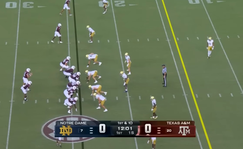
This is the new SEC on ABC score bug that made its debut this season when Notre Dame visited Texas A&M. It’s an immediate eye-catcher in mostly positive ways. Notice, there’s a lack of branding from ABC or the SEC. That’s shocking! The little box where the down and distance sits will occasionally flip to “ESPN” for a brief second but that’s it.
I like how condensed and small the score bug is, taking some inspiration from the newer NBC offering. I might change the middle portion with some extra color, though. I like the script for the school names and everything else for the colleges looks clean. Even the little curved line and small arrow underneath the score denoting who has the ball are subtle but effective.


Now you have to cross reference the % of the screen dedicated to non-game visuals and weight each accordingly.
Be right back….
I would actually have NBC’s first. It’s concise, not a lot of wasted space. ESPN’s is ridiculous. I think the Solid Verbal noted a while back that between the bug and the ticker (when that is on), something like 20% of the entire screen is graphics.
The SEC’s is OK but the on-screen records are kinda superfluous, the rankings let you know how big a game it is. Throw in conference records below it (which they had last week) and it’s too cluttered.
I’d have CBS third and the others are all well below.
I agree with NBC being #1. Does the down and distance move to under the team with the ball ? It should.(in this case move under Iowa when they have the ball) To all the networks, a little football next to or under the school name is the most sensible way to denote who has the ball.
Yes, as I recall it does move to who has the ball.
I like NBC, ABC, and Fox. The less screen you take up, the more points you get. I wouldn’t mind if these were clear. Get rid of the school name, just slap their logo up there similar to NBC or ABC, put their score next to it. Timeouts remaining under the logo, and then the down/distance clock box like on Fox, with a clear background. I stop to watch a game when I’m surfing if I recognize the logo’s of the teams, or if it seems like a close score/good game. I may not recognize the logo for directional state, but If I see a close game between them and Michigan, or Tennessee or whoever, I’ll stop to watch. To many times the score bug has blocked: foot in or out, targeting, etc. Sometimes on the replays they remove them to see the whole screen, but I think they should all make the screen as visible as possible and still provide the information. I think moving it to the top corner on the opposite side of the screen the team is moving, i.e. at the possessions teams back, would be a good move to.
To add another detail for Fox: I can’t get a screen shot at the moment, but whenever someone scores, it flashes “+6” in an especially goofy font. Only way to make it cheesier would be to write it in crayon.
Oh yes, here are a couple quick screen shots:
They did that with their last version of the scorebug too. My first thought was that it looked like a video game and not in a good way.
It’s the Deion Sanders’ing of score bugs
I would prefer something that doesn’t make it impossible to tell what’s happening at the bottom of the screen during a play. Too often it feels like we’re missing a decent amount of action there.
I would love to see a ticker that collapses down to just the down, distance, and clock when the ball is about to be snapped. This might be too manual of a process for the production team, so maybe just any time the play clock gets under 20 or 15 seconds or something like that.
I’d also put NBC at #1. I also want to mention a grievous sin that many of these network have made at various points – ever flashing the color yellow for anything other than a penalty. Stop. Don’t do that.
Love these types of articles, great work!
Please someone correct me if I’m wrong, but I’m almost positive that the SEC on ABC logo is just a knockoff of the old CBS/SEC logo. It’s just different enough to not get sued, but close enough where all the old SEC farts don’t feel like anything has changed.
I’d go NBC #1 probably. I do love going back to games from 1990-93 and they didn’t constantly have something on the screen. It really just allows you to watch the game. I’d be fine if they took down the first down line, will never happen.