
Writing about 20 underrated sports uniforms from college football, NFL, MLB, NHL, and NBA. One uniform at a time.
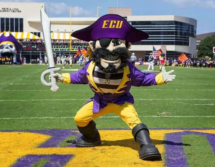
East Carolina has purple and yellow colors with a pirate mascot, I’m in. I’ve always been in on this program’s look. A while back though, things weren’t so hot. The 2009 season saw a turning point where the program leaned heavily into their purple colors at the expense of yellow. Then, as BFBS became the trend across the nation, yellow took an even bigger backseat to black.
Ironically, this was an era when the team wore black helmets and the most visible yellow was an italicized and underlined “ECU” logo (it was originally just an underline then became a very hard to see sword) on the helmet. It was boring and it looked bad.
Cross bones on the hip bone.
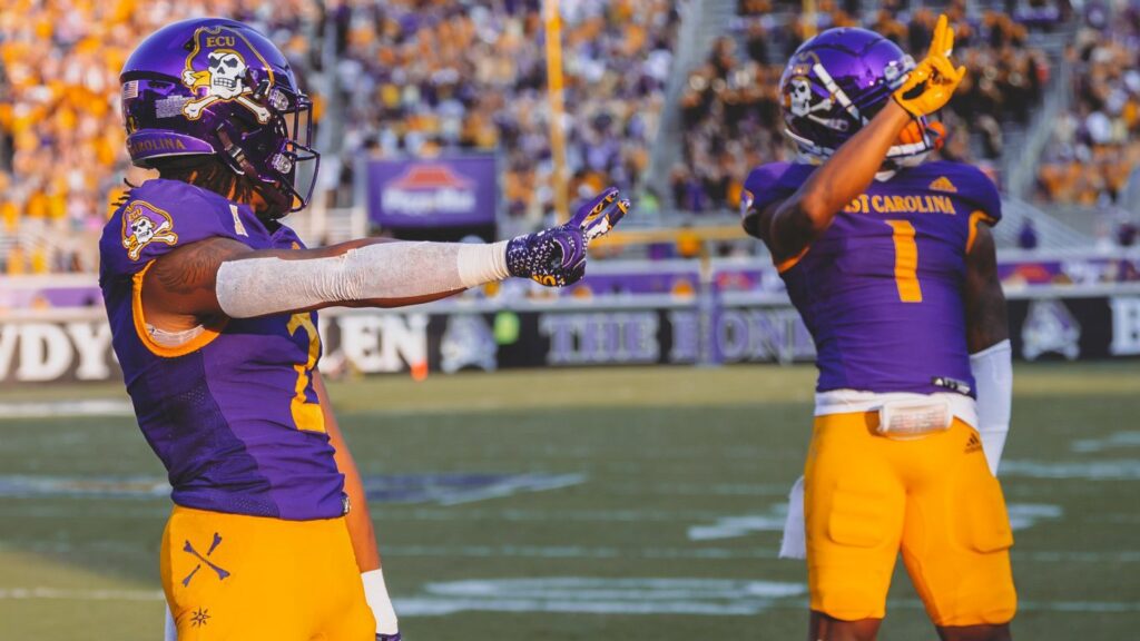
An important change came in 2014 when the skeleton pirate and cross bones logo was moved up to the primary logo and put on the helmets. Since then, things started to improve. In recent years, the school has adopted more yellow and the uniforms began to pop again.
Since then, the vibes have been tremendous. Their best look is the home purple jersey, chrome purple helmet, and yellow pants. The 2024 uniforms featured no white trim outside of the logos. I’d probably add quite a bit of white (ECU uses a throwback uniform with a lot of white that looks amazing) to the above uniform but the overall design is really nice and at least makes them look far different than LSU, the country’s more famous purple and yellow team.


Should’ve never fired Ruffin McNeill