
Writing about 20 underrated sports uniforms from college football, NFL, MLB, NHL, and NBA. One uniform at a time.
The 1967-68 season saw the first season of Pittsburgh Penguins hockey adorned in baby blue and navy blue uniforms. It’s one of the best color combinations in sports. After one season with block diagonal typeface “Pittsburgh” across their jerseys, the franchise unveiled the skating penguin logo. The team went through various design tweaks over the years, and even dropped the baby blue uniforms for 1977-80 in favor of navy blue.
After watching the Steelers and Pirates win titles, the Penguins did a mid-season switch to black and yellow colors in 1980. Such a move would be illegal nowadays, the Bruins even protested at the time, but the NHL allowed the switch.
Beyond adding a yellow jersey, this new color scheme stayed pretty consistent for over a decade. After winning back-to-back Stanley Cups, the team unveiled a new Robo Penguin logo for the home jersey and reverted back to the original heyday diagonal block lettering for the black jersey. In 1997, the 3rd jersey with the Robo Penguin moved up to the full-time black jersey.
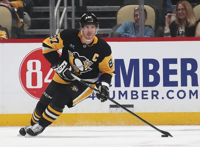
2002 saw the team bring back the skating penguin logo and switch to Vegas gold colors. As alternate jerseys became more common in the early 2000’s the team brought back the 1980’s throwbacks and in 2016 officially made the switch back full-time.
It remains a sharp uniform with one of the best logos in hockey.


I haven’t commented on many of these, but the most recent ones are great choices — Penguins, Vikings, and Orioles all get a thumbs up
I’m partial to Providence’s interpretation