
Writing about 20 underrated sports uniforms from college football, NFL, MLB, NHL, and NBA. One uniform at a time.
The last article in this series covers my favorite underrated uniform in North American sports. I grew up in an era where the St. Louis Blues had their most boring uniforms in franchise history. From 1984-94 they wore a dark blue, with very basic hockey striped uniforms, and an arched “BLUES” script atop the logo. In 1987 at least they dropped the big script on the chest.
1995 saw a drastic change with an increase in red and a modern diagonal striped uniform design–think the Wayne Gretzky era as brief as it was! Only a few years later, St. Louis changed again while adopting a navy blue/light blue/yellow color scheme devoid of any yellow trim. With some minor changes, this uniform was the template used for the Blues’ standard uniform right up through 2024.

The UCLA look for hockey.
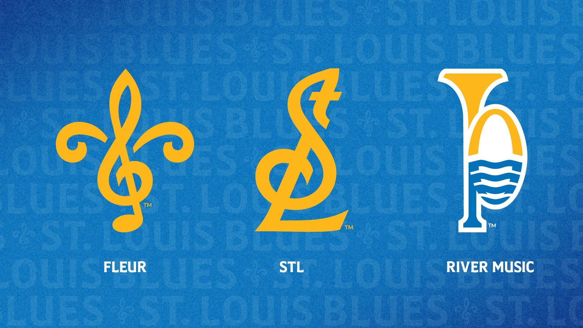
After using the team’s original uniforms for throwbacks and alternates since 2017 the Blues announced this off-season that they are returning to this look for their standard uniforms. It’s an instance of a throwback re-brand and it rocks.
The white uniform is so sleek and sharp. I like the blue jersey too, but the flying note logo pops a lot better on the white. While not an exact replica of their original 1967 uniforms, it’s pretty close. The blue is lighter and the player numbers are solid blue instead of blue/yellow/blue trimmed.
These are a top 5 uniform in the NHL now.


Have to say that the Blues are the hottest team in St. Louis sports wise right now. Whole city was on the edge of our seats in that last playoff run.
The Cardinals ownership has really pooped the bed the last few years, basically telling fans the bad baseball will continue until morale improves. They keep rolling out mediocre product, fans stop coming, and the ownership tells the fans it’s their fault for not attending games so the team can’t sign better players. Haven’t seen this level of apathy since the 90s.
STL City Soccer definitely started hot but has cratered this year, if they put a decent team on the field next couple of years, along with a work stoppage in baseball looming in 2027, they could overtake the Cardinals in popularity too.
Heck, people get really pumped over the Battlehawks.
St. Louis baseball roots run really deep, but it’s just a weird vibe watching the Cardinals shoot themselves in the foot over and over.