Notre Dame is heading into the 4th of its 10-year contract with Under Armour and so far the football team has received minimal changes to its uniforms. Of course, 2014 saw the UA logo placed on the left chest of the jersey, while 2015 saw the ArmourGrid stitching change to the jersey, and 2016 saw Notre Dame officially switch to a new “Leahy” typography.
Besides these mostly imperceptible changes Under Armour hasn’t messed with Notre Dame’s standard home or away uniforms. In fact, those uniforms have remained basically unchanged since the beginning of the 2010 season.

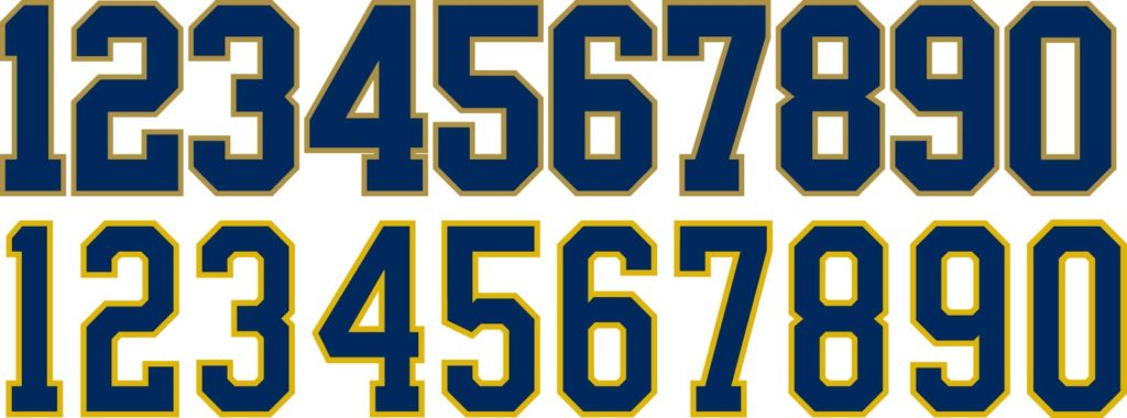
The Leahy typeface on bottom, compared to the previous version
What if Under Armour decided to make some changes, though?
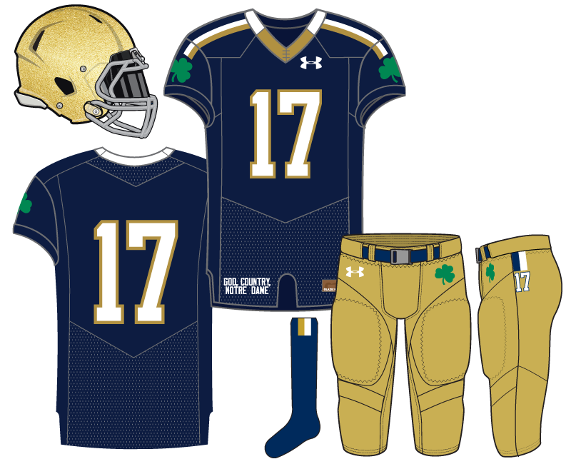
The first change we made was the gold and white stripes extending from the collar down into the shoulder sleeve. We’ve seen UA use this relatively simple striping on the football team’s socks and compression shirts in the past, as well on numerous other Irish athletic teams. For example, men’s lacrosse is a good example.
We also added gold to the front of the collar which switches to white on the seam and wraps around in the back. It’s been since 2000 that any color or design has been on the Notre Dame collar.
The final change to the jersey was the removal of the monogram in favor of a green shamrock on the shoulder sleeves.
The pants feature a blue belt which was a staple for the Irish prior to Under Armour arriving on the scene. A green shamrock on the hip (not seen since 2001-03) rounds out the front of the pants, while we added a small blue/white stripe and player number at the top side panel.
The uniform is rounded out with a plain blue sock and gold/white short stripe on the top.


This concept had my full-throated support. It’s so clean and sharp.
Subtle but noticeable and effective changes to a good uniform. I don’t love the shoulder stripes, though, and might the shoulder shamrocks benefit from white piping?
For the shamrocks, yes from a design perspective white outline would help. But, the only other time the green shamrock was on the blue uniforms (2001-03) it was without outline. So, I was trying to call back to something more familiar.
That, and the school doesn’t often use outline for the shamrock and depending on the situation I try avoid using it. However, it’s not like I’m against trying something different–the black jersey concept Irish Nights boldly breaks Notre Dame’s rules for use of the shamrock.
We’re rebels, obviously.
These were the exact two thoughts that I had.
I kind of think you have ruined our regular uniforms for me. These feel so boring after all the other awesome ones.
Sorry!
I think it’s fair to say that we do what we do really well but our standard jerseys especially are quite boring.
They are not boring! They are tradition and we can’t ever change anything that was ever done by Ara or, more importantly, St. Lou. Times never change.
I like the concept, but I do miss the monogram. Perhaps it can replace the piping and be on the top of the shoulders. I think that is too busy though.
Kinda like the old school bowl patch locations?
Yes
This is my favorite so far, that said I think the stripe on the shoulder might look better under the sleeve. In high school our team jerseys had a white and gold stripe there on a black jersey and it looked sharp
Down the side panels? I think you may be right. The modern jersey cut is really tough to put striping on which is frustrating and I don’t love this one on the shoulders.
The wide gold stripe down the side panel of the Ty-era road jersey was loathed, although using two colors definitely helps.
I do have one concept that I really like that utilizes the side panel. We will see how it’s perceived!
Yes down the side panels, I do think it can go both ways easily bad or good. And I think as a general rule for it, two colors is a must
A jersey like this is sort of what I expected/hope for when UA got the contract. I guess there’s always being cognizant of being respectful to the history and traditions and not wanting to over-do it (maybe just me but I felt UA was very careful to point out they weren’t going to Maryland-ize the ND jerseys [which, thank goodness])…But I wouldn’t mind at all a modern take on the traditional home jersey scheme like this that spiffs it up a little bit.
I liked our ~20 year run where Champion and Adidas were making small tweaks to the standard uniforms every 2 to 3 years. I’d rather have that and no Shamrock Series uniform, to be honest.
Love the collar and the shamrock on the pants. Don’t love the shoulder stripes or sleeve shamrock. I would be in favor of the double-stripe around the sleeve cuff (like on the lax jerseys) or the gold shoulder like from the 2015 Shamrock Series jerseys, though that wouldn’t fit this particular style as well.
One thing I’ve long been curious about…how do people feel about changing the gray facemask to navy or white? Or gold?
Re changing the facemask color, it generally looks okay if the color matches the jersey.
The gray facemask is crazy, arguably one of the most consistent aspects to the whole uniform. We’re so used to it.
Yes, quite possibly the most consistent aspect of the uniform, save for the helmet itself…but why? Everything else has a reason (gold helmet for golden dome, school colors are blue and gold, with some green thrown in for good measure because of the Irish). But the facemasks are gray because….? Just because that was the only color available for facemasks when they were first added to helmets and then it became “tradition?”
If anyone has any real insight behind the gray facemask, I’d love to learn more. It just doesn’t make any sense to me and seems like an oft-overlooked detail.
Probably just the traditional stock color from the 60’s that stuck for a lot of programs. I’ll do some research.