One of the things about being obsessed with uniforms is this attention to detail extends to a million different aspects to watching a sport on television or in person. A lot has changed since I was a kid, but it seems even more has changed in sports over the past 10 to 15 years.
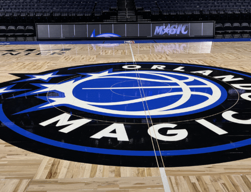
I remember watching a Lakers game about 13 or 14 years ago and thinking the court and lighting looked really different. Fast forward to a 2012 game between the Cavaliers and Mavericks in Cleveland and as I’m sitting in the stands I couldn’t help but notice how much the lighting inside the Rocket Mortgage FieldHouse (then Quicken Loans Arena) played such an integral part to selling an experience of entertainment. The lighting changes in between game play and commercials was super noticeable. It had been a long time since I was at an NBA game and the new atmosphere was leaning heavily into the entertainment aspect of being in the building.
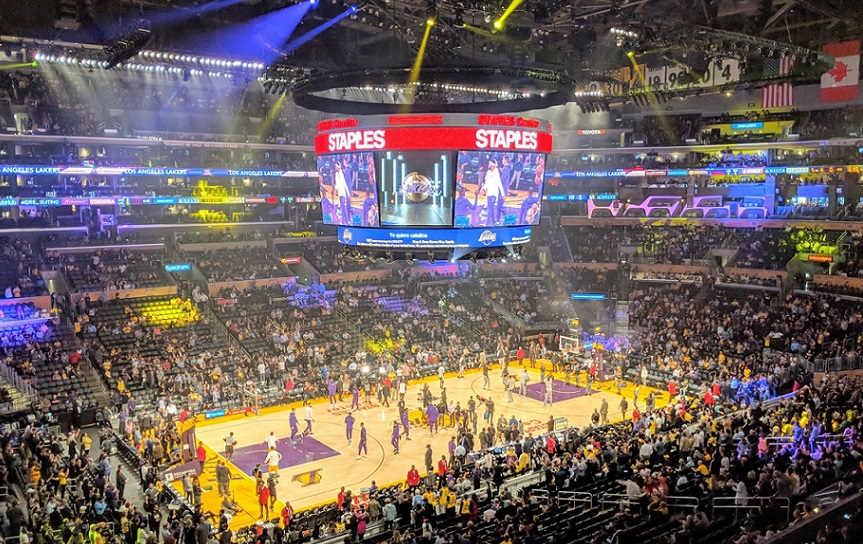
While doing research I found out that the Lakers did in fact change the lighting inside Staples Center ahead of the 2006-07 season in what was dubbed the “Lights Out” campaign.
Initially created only for the 2006 home opener against Golden State, this project spearheaded by late owner Dr. Jerry Buss was meant to focus the lights in the building on the court in an attempt to mimic the early years at the old Forum. It proved so popular among the players that the Lakers have kept it ever since.
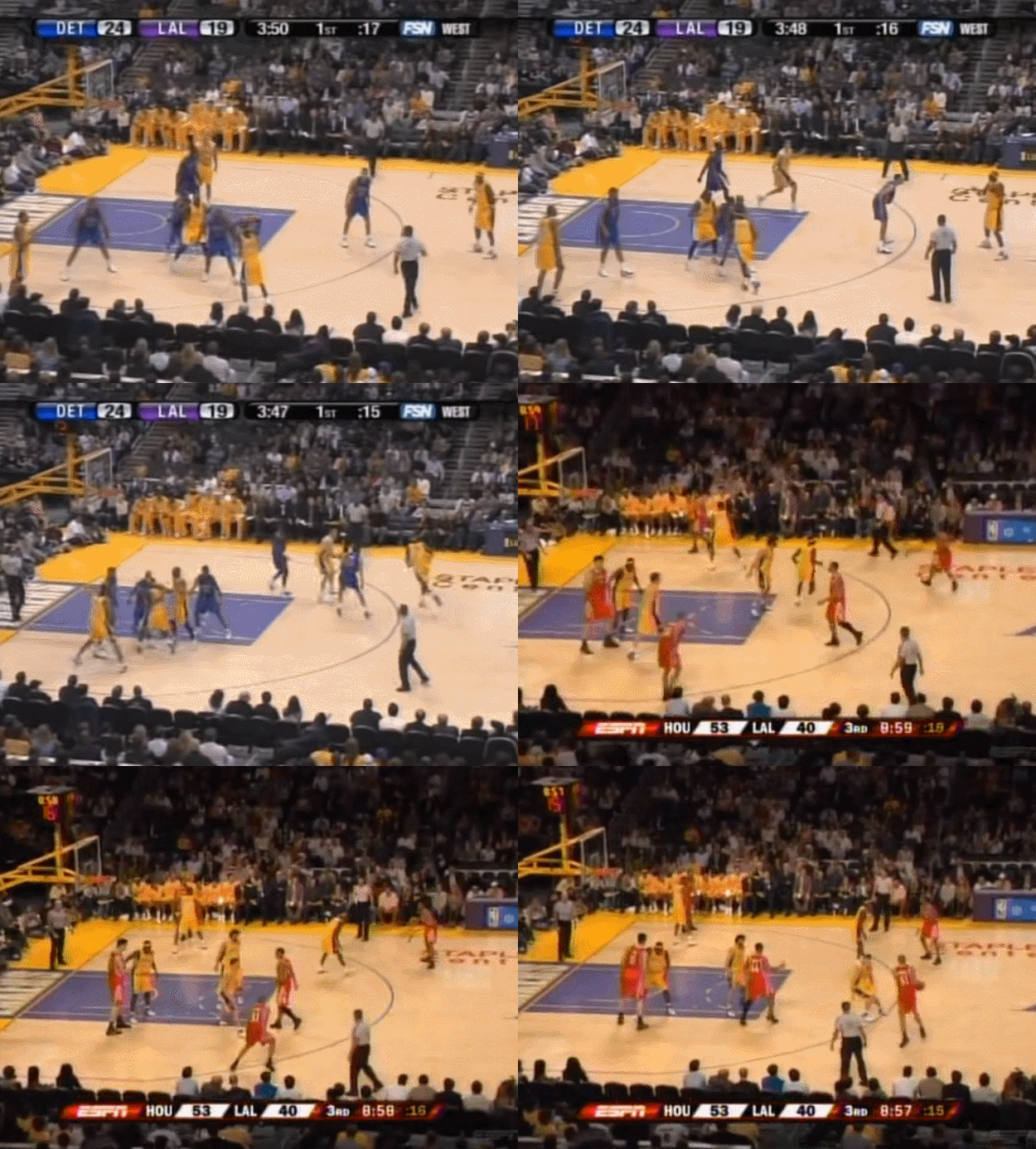
Ironically, the “Lights Out” pertained to the crowd where the seating area became extremely dark and difficult for television producers to spot fans in the crowd at the league’s most celebrity-driven arena. This is what caught my eye, an entire blanket of darkness in the stands beyond the first few rows.
The Staples Center crowd lighting difference from 2005-06 to 2006-07
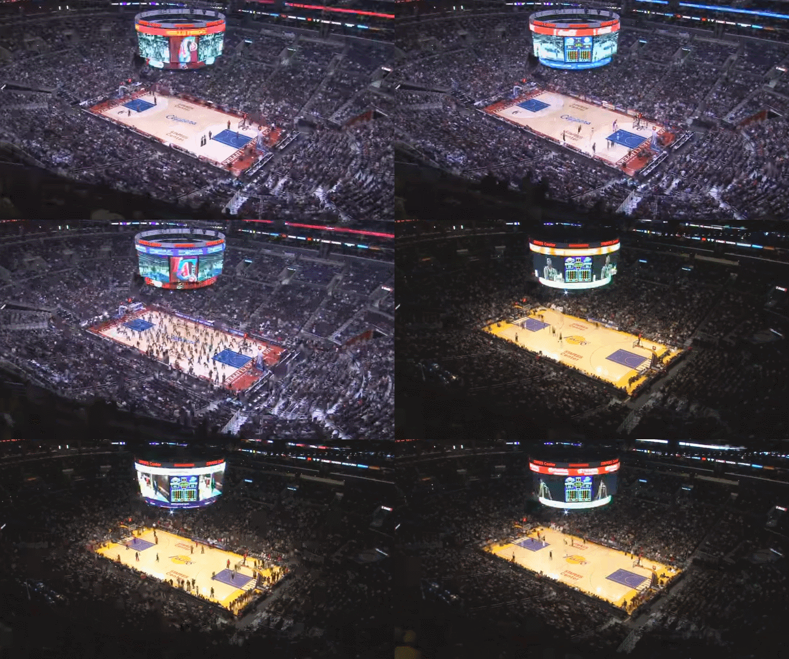
While most NBA teams have followed suit with similar darkened arenas it took a while for this to spread throughout the NBA. Even more interesting is that Staples Center tenant the Los Angeles Clippers did not adopt this lighting system for many years.
This caught my attention, too. There was just something completely different about the way those late aughts Lakers teams looked on television compared to what would eventually become the “Lob City” Clippers that couldn’t be explained solely by the different court colors.
Time elapse of a Clippers and Lakers games from the same day.
While watching The Last Dance documentary there’s even more interesting historical footage of arenas that I enjoy reminiscing about. During the Chicago Bulls’ first 3-peat championship run it was played in the 60-year old Chicago Stadium and they finished off their second 3-peat in the plush new United Center.
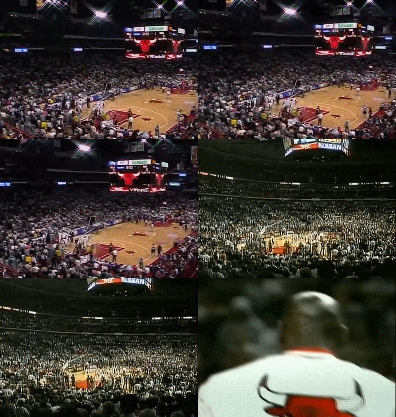
One thing that jumped out to me is Chicago Stadium had that lighting that Jerry Buss talked about many years later.
Chicago Stadium in the ’93 Finals vs. the United Center in the ’96 Finals.
The spectator area is really dark until you get to the front half of the lower seats. The United Center’s upper deck is really dark but the lighting overall extends much more further into the seats. The 1996 arena also looks intensely more bright than its predecessor.
Another thing that jumped out to me–and it’s something I instinctively notice especially during basketball games–is the amount of shadows on the Chicago Stadium court. I know nothing about the technical aspects of photography but the photographs of Michael Jordan in the early 90’s look better than the late 90’s. Some of that could be the changes stemming from digital photography, but I wonder how much the arena lighting played a part in all of this.
Let’s take a look at examples from 1993, 1996, and 2019:
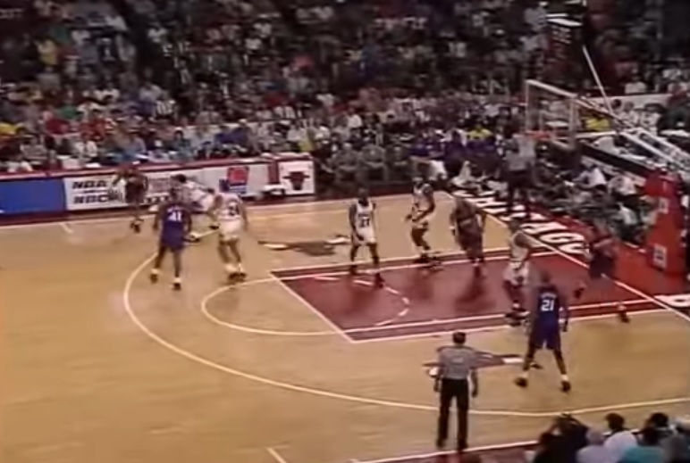
1993 Chicago Stadium
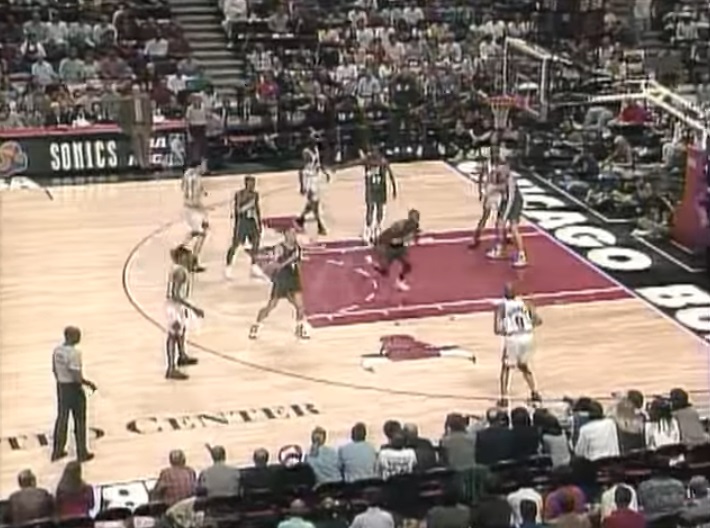
1996 United Center
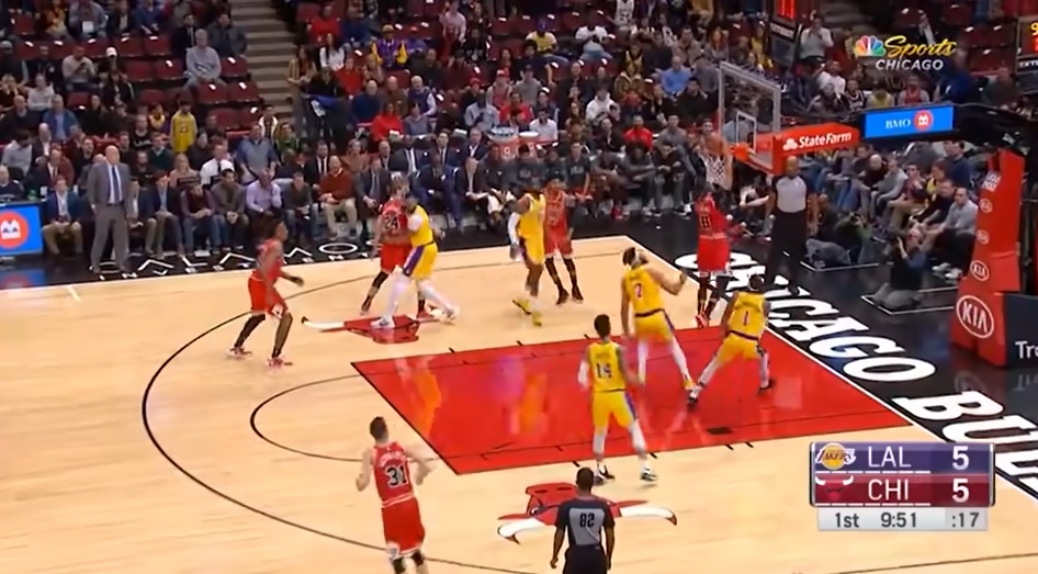
2019 United Center
Setting aside television camera differences the 1993 shot has shadows all over the place and the crowd is mostly in the dark. Pay attention to the paint where the shadows from players are super visible.
Juxtapose that with the 1996 picture and holy cow are things bright! The new court is lighter but I can’t help but notice how washed out everything looks. It appears as if the game is being played under one enormous fluorescent light bulb as even the fans in the seats can’t escape the Great Light Bulb.
The modern day picture isn’t really fair to compare with the High Definition where you can practically pick up patterns on a coach’s tie whereas it can be difficult to read player numbers from the 90’s cameras. In 2019, the Bulls kept the lower bowl of the United Center pretty well-lit and like many NBA teams their floor is now suffering from a lot of glare from advertising signs.
Transitioning to football, Notre Dame has gone through its own lighting change with the completion of the Crossroads Projects prior to the 2018 season.
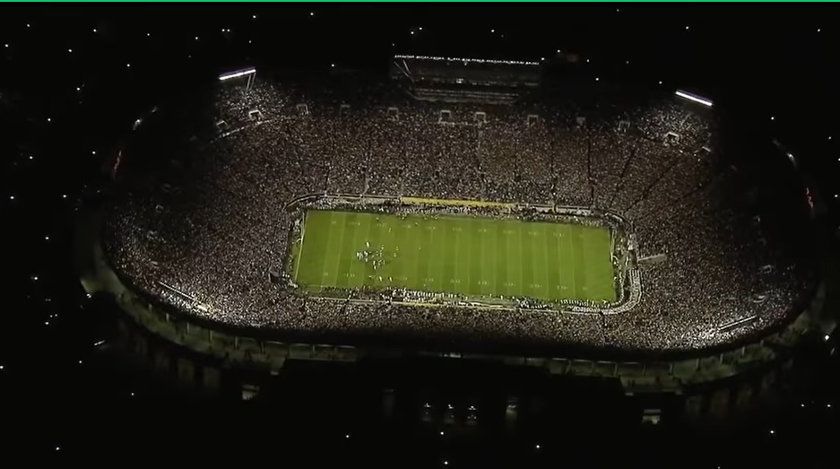
2012 night game vs. Michigan
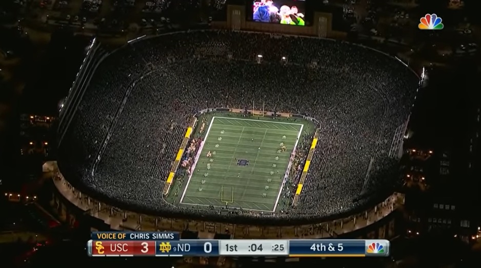
2019 night game vs. USC
The old system lit the field just fine but left large sections of the seating bowl in darkness. The new LED lighting system installed after the renovation does a better job brightening up the crowd, although you can still see some large dark spots in the upper bowl particularly directly under the lights.
Although, the switch from natural grass to field turf provides a different color green it does appear the new lights are far more white and less yellow than in the past.
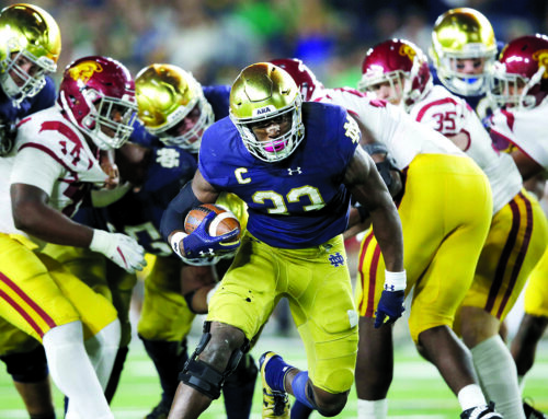
Do things look different on the field of play?
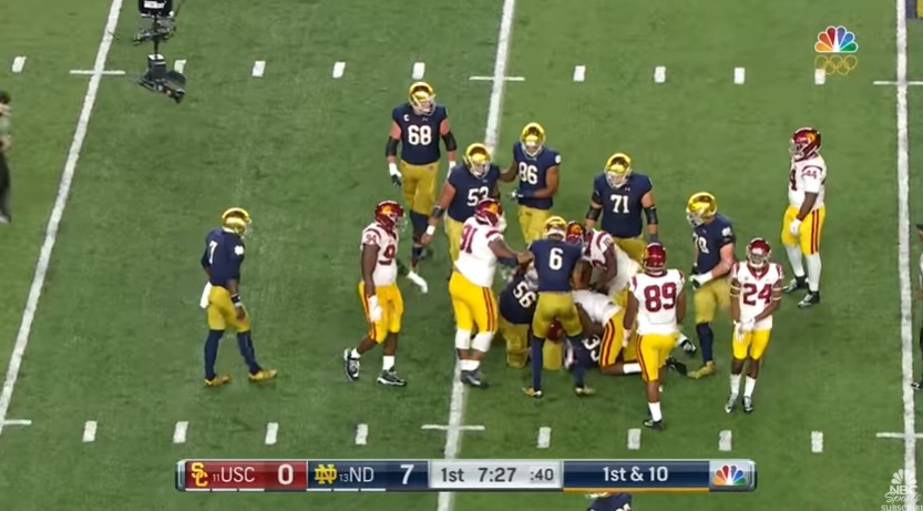
2017 vs. USC
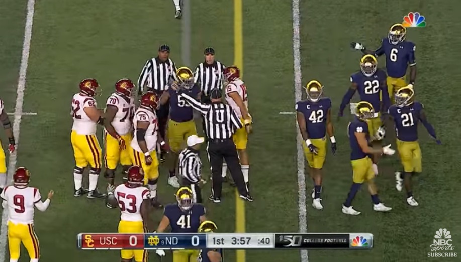
2019 vs. USC
I took a screenshot from 2017 prior to the renovation but with the current uniform and helmet sets compared to a couple years later following Crossroads. Things actually look brighter on the field in 2017, although the difference is negligible to me watching the whole game, it’s possible there was a lighting upgrade prior to Crossroads, and we don’t know if there were any changes to the NBC cameras in between these two seasons.
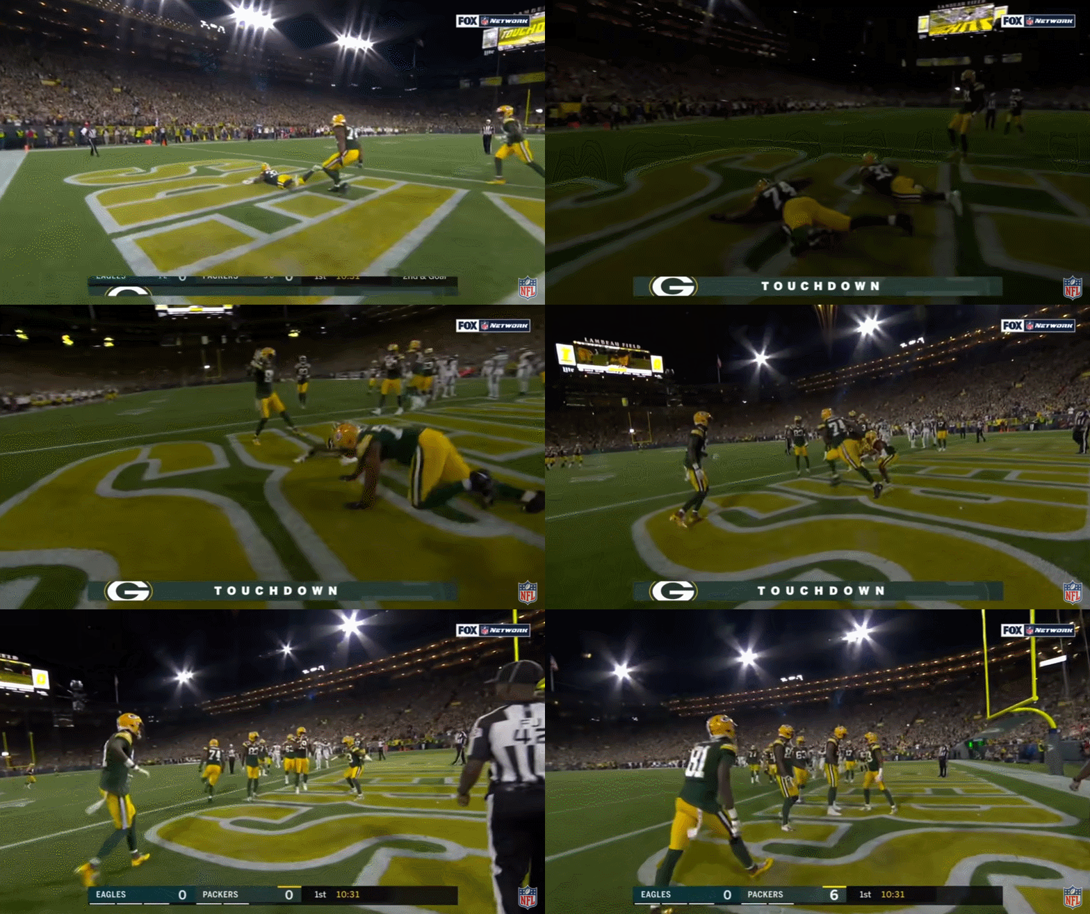
Either way, stadium lights for outdoor football games are becoming a lot more than for just illuminating the field of play. I’ve noticed both the Green Bay Packers and Baltimore Ravens this past season using flickering light touchdown celebrations for night games which looks super weird on television.
The first time I saw something like this I thought there’s no way the NFL allows this to continue. It looks absurd on television and has to wreak havoc on photographers who are trying to do their jobs at the game’s most critical moments. Imagine missing an iconic touchdown celebration because the stadium went nearly dark for half a second?
Lest we forget, the University of Alabama recently installed one heck of a light show for their pre-game introductions. This right here is the future.
A bit light on content.
This article was lit