Today marks the 13th Notre Dame uniform concept we’ve created this off-season. When coming up with ideas we’ll sometimes look across many different sports or simply try to create something as original as possible. Other times, we’ll take a glance at the other Irish sports to see if there’s something that catches our eye.
Some of you may pay attention to the fact that most Notre Dame athletic teams stay in a pretty traditional look with their uniforms. Hardly surprising, I know. This is not the case for the baseball, and especially, softball teams though. A quick search has the Irish softball team sporting 6 different jerseys this year alone. Plus, when you look back to the late Adidas era until today there have been a ton of really bold and different uniforms worn by the women.
The softball team occasionally wears a blue dominant set that inspired today’s football concept:
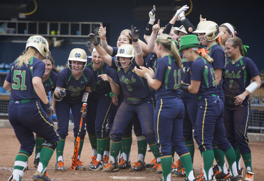
The green inside gold on top of blue color scheme is pretty interesting.
It’s very much a modern creation for the university that’s come on strong over the last 10 years (even more so for the blue inside gold on top of green color scheme) but really in a wider capacity in uniforms and apparel over the last 5 years. When I was a kid in the 80’s you would see plenty of blue-yellow-green color schemes (these concept schemes are coming from us in the future, don’t worry) but the colors were typically separate from each other and in that era gold wasn’t as prevalent.
Notre Dame has done a good job making today’s concept color scheme look normal for some sports. I can remember when they first started working with the green/gold on top of the blue and how jarring it was at first. Now, it feels normal.
One change we made from the softball was blue socks. Even though the leotard effect is real we fell back on the traditional pant and sock stripes to add some relief, plus the green stirrups/white sanitaries don’t work as well transitioning to a football uniform.

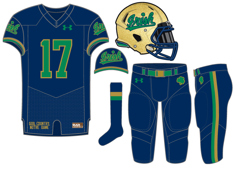



I’d be curious to see that with an even darker blue — almost black.
The “Academic Black” is pretty close to this in scheme.
I would definitely like to see some blue pants. Have we ever done that?
Shamrock Series in 2014
And like 9% of the 2012 Shamrock Series pants.
🙂
These are probably my favorite so far. I might drop the “Irish” from the shoulder pads and go with “ND” or the Shamrock, but I like these a lot.
Do you generally like this color scheme? I find myself liking it more and more all the time.
Though noted in the post otherwise, I think this kit needs some white on it somewhere, socks or otherwise. And I agree with MB, either keep the “Irish” on the pads or helmet, but not both.
I love the color scheme. Agreed that a splash of white might be interesting, but I would love these the way they are now.
I like this concept. All of the concepts will make the heads of people at a certain website explode. They will be afraid that Under Armour will get ideas and stray from the uniforms that St. Lou and St. Ara had (the latter of which have been deviated from).
A question that isn’t necessarily germane to just this uniform, but I don’t believe we’ve seen the back of any of the jerseys. Are we to assume that the tradition of no names on the back has continued? Or do some of them have gimmicky slogans?
12 of the 13 concepts so far have shown the back. This one is the only one not to do it yet.
If there’s nothing different about the back (nameplate, design feature) we may not always show it.
Well….sure…12 of 13 have shown the back, but a VAST MAJORITY HAVE NOT!
LOL
(Did I “internet” correctly?)
I like this. I especially like the “IRISH” script as a helmet logo. I think if you took that helmet and added it to a few of your other concepts you’d have some really good concepts on some of the lesser ones as well.
I do think you’re over-using the script though with the shoulder patch. I would maybe do the monogram or the interlocking ND on there instead of reusing IRISH. I think I’d also stay closer to the softball uni and go with green socks instead of blue.
Overall, good concept though. I give it a B+