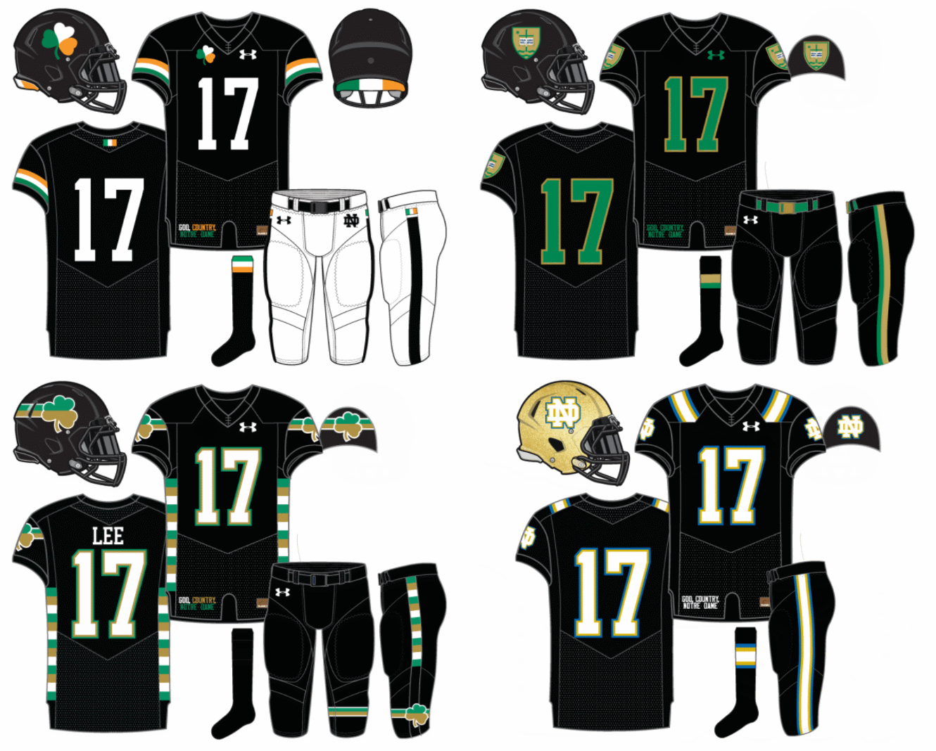
Today, we debut our 4th BFBS uniform (we have one more in the vault before turning our attention to other color schemes) and 16th overall design this year. In our previous black concepts we tried Irish flag colors as well as a pair of schemes using green and gold.
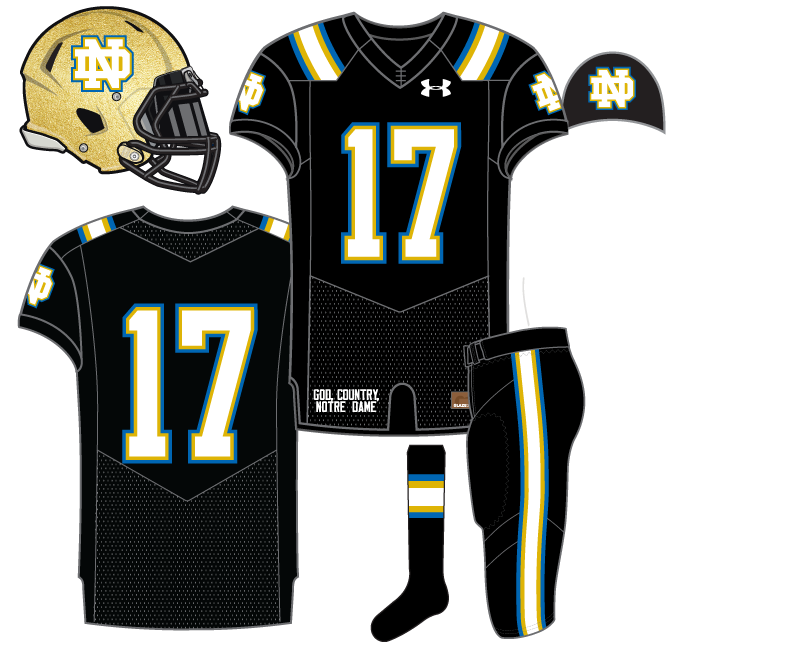
This one attempts to mix black with Notre Dame’s traditional blue and gold.
I mentioned this in the very first BFBS post that it’s tricky using navy blue on black. The basketball team found out the hard way several years ago with THESE UNIFORMS which rendered everything on the uniform virtually blank even in most up-close camera TV shots.
Therefore, with this concept today we severely cranked up the brightness on the blue. Even when bordered with gold and white it’s still difficult to see the blue.
With this scheme there wasn’t much point in doing anything too crazy, unless you want to splash a lot more blue, gold, or white around to take away from the black. Down the road perhaps we’ll look into a design with black as a secondary trim color and see what comes from it.
Here’s all four black uniforms so far:

I guess the question becomes: Just how much more black could this be?
And the answer is none. None more black.
How would it look if you swapped the order of the blue and gold stripes? So it goes Black -> Gold -> Blue -> White. It looks okay in the picture, but light trim bordering white can look wishy-washy once you make the jersey.
Astute point, and I think you’re right. Although, I typically try to avoid gold and black touching but in this instance it might work better.
I don’t love the color green, especially not the brighter colors, so I really like the use of blue instead. And I happen to really like that color blue. It reminds me of UCLA colors a bit, but I like their colors more than our green, so it works for me.
I grew up with blue my favorite color. More royal blue or brighter shades. For ND stuff I’m soooo bored of navy blue. Bright green might be my favorite now.
Bright green is kind of fun. My current kickball team is a light bright green and I dig it. I like the Seahawks and Ducks bright green when their fans wear it, but did not actually like watching either of them play in it.
I should say, I don’t like kelly green and mostly because I have just gotten plain old tired of it. Give me a nice hunter or neon and I’m all for it.
I love UCLA and am glad they made the switch to Under Armour, but these jerseys remind me too much of them, rather than ND. No go.
UCLA stripes gonna do that.
I like UCLA’s alternate black jerseys, but think these would probably look better than those live. The white numbers make a big difference. And the pant stripe makes the pants pop a bit more.
I said this the last time he used these colors too and got roundly chastised. 😉
It’s not just the colors, though. It’s the colors coupled with UCLA stripes on the shoulders. And the fact that UCLA already did a BFBS jersey that this concept hearkens back to.
I actually think the two recent UCLA BFBS uniforms are pretty different, all things considered.
DO NOT WANT
[GoodJobGoodEffort.gif]
Ok, hands up if you think Eric just stole the pants design from us so we could all match:
Also, the unis with the green numbers on black jersey would not be legal per NCAA rules. The current rule states that the numerals must be visible from all areas of the stadium(guiding principal is that you have to be able to see them from the far corner of the end zone from the press box) with minimal effort. Starting next year there will be a rule change that mandates dark jerseys have a white numeral and light jerseys must have dark or black numerals.
The first rule pretty clearly isn’t enforced.
Are they really going to enforce the new rule? Some common sense there sure but also feels like a very Roger Goodell type of legislation.
Well the first is more of a principle and the reason the rule change is going into effect is because of what you say. Many teams are really pushing the limits so they’re going to put it in writing what is and isn’t allowed. All teams are SUPPOSED to send Rogers Redding a jersey for him to review and determine it’s appropriateness before the season. The new rule will eliminate the need for that
They’re calling it!?!?!??
https://twitter.com/TylerWoessner/status/903409103887847424
If I may butt in completely off topic…HOW DID I JUST NOW FIND OUT MURTAUGH AND CREW ARE STILL BLOGGING?! I’ve been suffering in non-substance, poor writing, ND blog purgatory for a year (@while also experiencing all the joys of last season@) when the best ND writers on the internet were a url away! Can’t express how happy I am to find you all – I now return you to your normally scheduled programming while I oh-so-happily go back to my past history of always reading and only occasionally commenting.
Welcome home.
Yikes, and this abomination of a uniform is the first thing you had to see here?
When you’ve been scrounging out of dumpsters, even burnt meatloaf is a king’s feast!
How dare you!
Mea culpa, mea culpa. Please don’t send me back to the dumpsters! Your Cajun loaf of carne is an exquisite culinary masterpiece!
That was meant for MikeyB, you gotta a lot to learn about the comment section!
No no, he got something wrong in the comments, I think he’s already a seasoned veteran!
Heh.
What…is that?
My animated version of your “How dare you!” response to MikeyB. I searched Giphy for “indignant” and this one somehow seemed most appropriate. Ah, Giphy – the gift that never stops giving. Sometimes the gift is a perfectly-cooked filet mignon, and sometimes it’s a flaming bag of dog poo. But it never stops giving.
Wait, don’t tell me you actually spent an entire year reading the garbage over at the old site.
*We’re going to need new acronyms. I refuse to acknowledge OFD as still being OFD, but we can’t label it TOS. Help!
I think Scarponi has it right, why not call it “the dumpster (TD)”?
How about Camo Reviews About the Program? I just wish we could shorten it into an acronym that was still descriptive about the quality of articles there.
Hmm.
Shoddy Hottakes from Immature Tallywackers
Now THAT’S a bookstore basketball name if I ever saw one!
Not to mention very descriptive of the old site. Yeach, what a hot mess that is. Even worse is the podcast.
*whispers* their basketball coverage is a pretty good supplement to 18 Stripes
I don’t know how many concepts remain but when we’re through could we do an online poll for laymen to choose everyone’s favorite like we did for predictions?
Good idea, we’ve done 15 of my concepts out of 47 mock up designs total.
Clint has published one of his and will probably create some more, too.