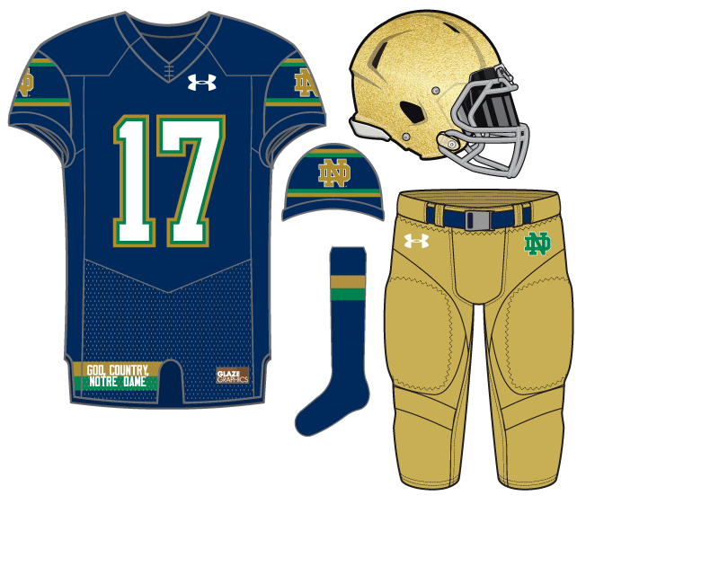
Today we debut our 18th uniform concept and we haven’t returned to a blue uniform since late June. In this example I was trying to combine two concepts. One, an overall base that worked with Notre Dame’s traditional set up of gold helmet, blue jersey, and gold pants. Two, I wanted to try to mix in the blue/gold/green combination that we tried with our 13th concept “Irish Midnight.”
Also, I wanted to try something that is sometimes difficult to pull off–create a jersey that at first glance seems normal or traditional but up close or worn by someone sitting next to you it’s actually quite different.
On the sleeves the monogram colors are reversed from the modern traditional white bordered by gold. The logo is bordered by thin green and gold stripes, as well.
The numbers with the green slid inside the gold is one of my favorite touches.
On the bottom of the jersey we’ve always mimicked the current “God, Country, Notre Dame” tagline that is present on the current uniform. Instead, it is placed on a a gold and green striped background for more color. I think it’s a cool idea because it’s something a fan can showcase but it will be tucked in for the players on the field.


Really like the numbers (the green makes the white pop much more) and the God, Country, Notre Dame.
I’m not sure how I feel about the horizontal stripes on the sleeves. I am having a really hard time picturing how they will look in real life.
Yeah striping is tricky nowadays on the modern cut jersey.
The only thing I dont like about the stripes is I dont like the dark colors touching like this. Outline in white or bright gold and it would stand out better.
Maybe adding one stripe between the green and blue could make them stand out more. That would reflect the white to green to gold pattern of the numbers, which really pop.