This week we unveil our 36th uniform concept for Notre Dame and it’s a special occasion for Irish fans. In searching for some inspiration for a St. Patrick’s Day concept I was dismayed at how generic and boring most efforts are from sports teams. I’d venture a guess that 98% or more of teams simply change one of their colors to green and call it a day. Maybe, add a shamrock on a piece of apparel.
One day, several months ago I came across the Ontario Hockey League’s Ottawa 67’s commemorative St. Patrick’s Day uniforms and I knew this was a great starting point. The 67’s by the way have one of the best uniforms in all of sports all my respect to them.
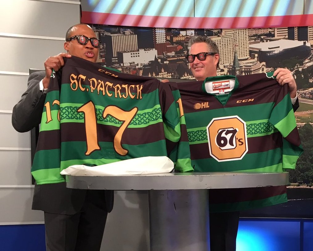
The addition of black with gold was something that caught my eye. When mixed with the shades of green this feels entirely within a St. Paddy’s Day celebration and yet still very much within Notre Dame’s wheelhouse.

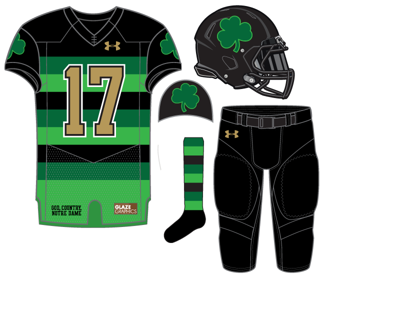


I’d prefer just white where there is gold with maybe some kind of outline on the number.
What kind of outline?
I didn’t expect anybody to call me on it. I think the current blue or black or whatever is fine. I just think the gold contrasts too much.
No!
Canada as inspiration for St Paddy’s Day?
No No No. (Sorry Larz)
Kelly Green Jersey. White Pants. Kelly Green Socks. White helmet if you are wimpy enough to need one. Green shamrock on white helmet somewhat acceptable.

When I was younger I’d wear my late 90’s Irish rugby jersey quite often. Chicks dig it.
I am older, and I will be wearing my early 2000’s Ireland jersey when I watch them notch a Grand Slam in six nations ruby at a local pub this Saturday. Although I will think they do, chicks won’t really dig my shirt.
PS – I love how Ireland absolutely freaking owns England in that English sport. It’s been almost 20 years of dominance.
It’s not exactly Tanzania. There are 4 million Irish in Canada!
This is the best one yet…although I’d most like to see it as a soccer kit.
Great stuff.
It could be, DrIck is high or something.
GTFO! This is maybe in the top 37.
“I’ve said ‘I’ve said it before and I’ll say it again’ before but I’ll say ‘I’ve said it before and I’ll say it again’ again.” H. Wittels
This one sucks.
C- for effort, F for execution.
I dont think there is a worse uniform in the history of uniforms than the Steelers Bumble Bee threads. This one is eerily similar to that. Colors are good, like the helmet. Actually everything but the jersey is pretty slick
A whole generation of Americans were brought up on uniforms that avoided boldness and striping. Case in point, both teams in the Super Bowl this year.
The Steelers throwbacks aren’t even that bad–and actually really simple jerseys–it’s just we’re not used to that bold striping the way, say, millions of Europeans are with their 100+ years of iconic striping uniforms. I love striping but don’t see how the Bumblebees are even in the same category as the all-mustard Jaguars, the current Browns set, and many more.
If European jerseys are the defense, those countries whose jerseys are more advertisement than anything else, the argument is pretty weak. Soccer sucks, anything having to do with looking like soccer similarly sucks.
Your comment perfectly encapsulates my point.
It’s no surprise that the overwhelming amount of critical uniform posts are either A) “this sucks” with no effort to explain why or B) “this looks like some other uniform” and therefore sucks.
At the end of the day it’s opinion of taste but quite often the loudest critical posts come from those with little appreciation for uniform design, especially from sports outside of their narrow fandom. Like Bud drinkers criticizing beers from all over the world.
This post’s uniform came from hockey as inspiration. I used soccer to show that you’re the Bud drinker and nailed it 100% on the head.
I said I liked just about everything but the jersey. We started talking about why the bumblebee jerseys sucked. Different topic.
Yes, but WHY do you think the bumblebee jerseys suck? I think that’s what E is getting at here.
BECAUSE THEY UGLY!!
Ugly can just be ugly.
Salmon Enthusiast: “Why don’t you like salmon?”
Person 2: “Because it doesn’t taste good”
Salmon Enthusiast: “But why don’t you think it tastes good?”
Person 2: “Because I tasted it and said to myself, ‘Ew, this does not taste good!’ ”
Salmon Enthusiast: “Hmm…I like salmon, thus salmon is good. You need to come up with a better reason for not liking salmon, otherwise you’re wrong”
Person 2: “Dude, you’re trying to make salmon pancakes. I’m leaving…”
It’s incredibly difficult to explain food taste without anchoring it to another food.
Explaining why something is visually ugly is relatively simple in comparison. Heck, I designed this St. Paddy’s concept and I could give you half a dozen tweaks because I don’t like something anymore.
Don’t listen to them, E. They don’t know. I think they’re sharp. I might’ve stuck with gold for the helmet rather than black, but maybe not.
Clearwall makin’ it hot!
My initial reaction is definitely “huh?, hmmm…”, but I like lots of elements. A gold shamrock on the helmet could be cool, and maybe just one color of stripe for those of us new to the whole soccer-jersey-esque style?
I will say I agree that the Steelers’ throwbacks are absolute trash. The look like bumblebee-Three-Stooges-convicts.
As for the “generation of Americans brought up on uniforms that avoided boldness and striping,” we are starting to get away from that thanks to Oregon kicking off the whole uniform design arms race a few years back.