Here’s our 34th uniform concept for Notre Dame football. For the second time in this epic series we’re taking some inspiration from the wonderful styles of 1990’s jackets. In case you missed the first concept, you can view it HERE.
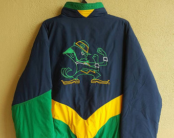
Jackets like the one shown below were inventive for being some of the first Notre Dame gear to heavily mix the blue/green/yellow color scheme. These were the exotic days of my childhood before the late 1990’s arrived and Notre Dame teamed up with Adidas to zap all color and flavor out of the university gear.
Once I saw the rare “see through” leprechaun logo I just knew it had to part of a 18 Stripes concept.

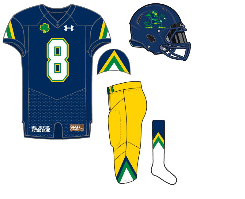



That helmet looks… surprisingly okay?
You bet ya!
i like the helmet – the triangle pattern, though…meh
an interesting one. I like the helmet, but still favor the gold. Would be a good Shamrock Series deal.
Seems like a white hemet would be most ideal for this one
I dare you to make a uniform concept based off one of the Pat Walsh shirts.
I’m kind of surprised you didn’t follow the V of the uniform template to more closely resemble the 90’s jacket. Might have looked ridiculous on the top, but it would set up a nice opportunity for chevrons on the pants and socks.