Today brings us to our 10th Notre Dame football uniform concept and it began with a simple question: Why aren’t there more logos featuring a football? I had something in mind for the Irish but first let’s take a look at how odd this lack of footballs used by football teams is in the United States.
In the MLB there are 8 teams using a baseball in their logo, and of course the official MLB, American and National league logos all use a ball, too.
In the NBA there are 20 teams using a basketball in their logo.
In the NHL only 2 teams feature a puck in their logo but that’s understandable given the small size of the rubber disc.
In MLS there are 6 teams in a 23-team league featuring a soccer ball.
The NFL features only a pair of teams, the Jets and Buccaneers, who use a football in their logo. Of course, primary college logos wouldn’t feature a football. However, after looking through every Power 5 team’s history I found only 5 examples of a secondary logo featuring a football:
Arkansas 1966-70
Clemson 1970-79
Duke 1978-present
Washington State 1953-55
West Virginia 1970-79
So, one current Power 5 team today and it’s honestly one I’ve never seen before and I’m sure it’s very rarely used. The lack of football logos is pretty weird, huh?
In recent years the Notre Dame Wilson football has featured a colored leprechaun and College Football Playoff logo. Before that a shamrock was on the ball with the monogram inside.
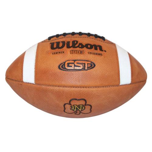
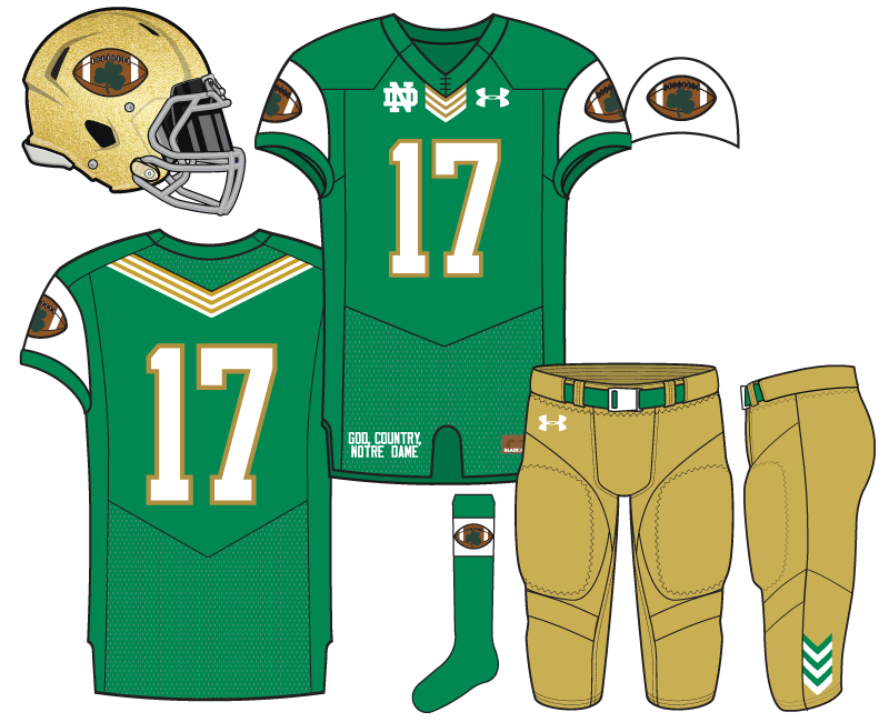
Of course, that shamrock is so small as to render it invisible for a logo on a uniform. Therefore, we decided on a large green shamrock covering a larger portion of the ball. The results are pretty mixed. The football logo fits in really well on the shoulder sleeves and less so on the socks and helmet. The logo on the helmet is especially jarring at first although I’ve gotten used to it over time.
I think we’re finding out that football logos are tough to pull off!
The rest of the uniform features a Kelly Green that is one of my favorite colors. If I had my way this would be the official green for all Notre Dame athletic teams. We also included Chevron stripes at the base of the collar, on the back above the numbers, and at the bottom of the side pants. A plain white monogram adorns the right chest to add symmetry with the Chevron stripe and Under Armour logo.
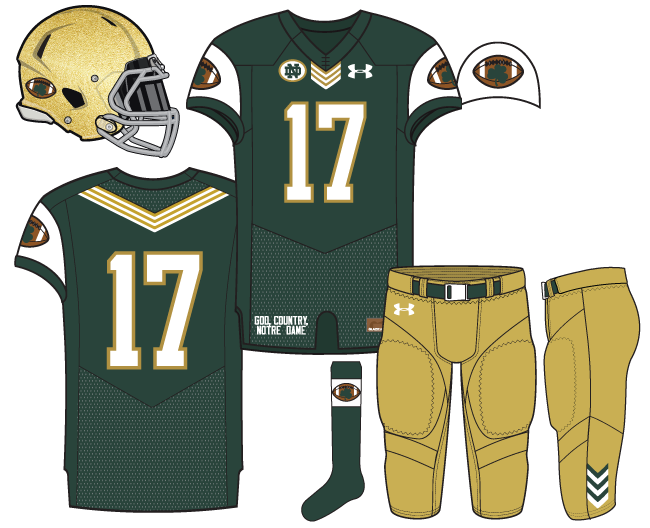
BONUS: We created an alternate to this uniform featuring a deeper forest green with the chest monogram outlined as a patch. The biggest change was putting the football as a smaller sticker-like logo on the back side of the helmet. In some ways it would probably work well on the field but as a concept it combines with the ear-hole to look like a pair of eyes.

I think maybe there’s a good reason not many football logos are used. They are kind of silly looking, weirdly shaped, and an ugly color (not that you need to use the color). I am firmly on team #KeepBrownOffTheHelmet.
I think the CF playoff logo is one of the sharper graphical representations of a football, but it also kind of looks like an angry vagina.
Yeah, the logo looks like something you would put on a youth football team.
I do think a football logo could look good. But it would need to be a simpler monochromatic logo style, similar to the one used in Duke’s logo, not a realistic looking football.
I would want at most, two additional colors added to the helmet. Brown, green, white, and black is too much. If it were just brown and green (but really green and another non-brown color), and the white/black were left empty (i.e. would be gold), I think that might work.
What’s a happy vagina look like?
After experiencing child birth #2 less than a month ago, I can surely suggest that the playoff logo is much closer to looking happy than it is unhappy.
I could give you a description, but you do want to keep this a family site
Oh you did go to Notre Dame, didn’t you
I tend to agree when it’s a logo like we’ve tried where the football is the entirety of the logo.
But the football isn’t so wretched that it can’t be a nice piece of a logo. They’re used a lot in commemorative logos, like Clemson’s new title logo.
I’m always fascinated by what people think are ugly colors. I think it’s because there’s a lot of varied opinions but mostly because I like so many colors that it’s hard for me to discriminate.
I am not anti-brown per se, but do feel it is much more difficult to make brown look good. And brown on gold, nooooo thank you.
First thing I did was count the number of stripes in the chevron patterns. It checks out. I didn’t measure the angles, but I’ll assume its kosher.
#craftsmanship
And, with all due respect (here comes the disrespect), this is definitely the dumbest looking of the uni concepts thus far – from what I can remember. It’s 100% the footballs. The green is [fire emoji] and the white sleeves, though not my cup of tea, are interesting. I’d like to see this without the footballs – or maybe just 1 small football on the pants opposite the UA logo?
Just because the Heat & Mets have basketballs/baseballs in their logos doesn’t mean they have them on their uniforms. [Stops to quickly Google image the Heat & Mets uniforms] I don’t think football is different from other sports in that there are logos and there are uniforms – usually the unis are their own thing with maybe a small logo showing up once.
Lastly, off topic mostly, but is there a way to categorically tag stories? I see that this is listed as “Football” but it would be nice to be able to have, say, all of the uniform concepts stories easily lumped together.
The traditional Heat logo featured a baketball on their uniforms and was one of the NBA’s best. I also believe traditionally the Mets have always worn their baseball/cityscape patch logo on their sleeves.
https://18stripes.com/tag/uniform-concepts/
You can find tags by going to the specific page that an article is under, in this example football. I don’t know why the tags don’t show up in the post but I will try to fix that.
Again, you’re saving all your best work for last. I abhorred the first concepts in this series but the last 2 or 3 have been incredible. I actually like the forest green better than I do the Kelly, but I do like the Kelly as well. Im with everyone else here too in that the football logo is pretty out of place. Looks like someone went crazy with clipart and slapped something on there. I do like what you did on the second concept down below and made it kind of like a memorial sticker. It works like that, but blown up as a full helmet logo is too jarring. Good work overall on these, though
I love this one…football and all, both colors. See the breakout of the side of the sleeve with the white field? I want that as a hat with a bill to match the green of respective final jersey. Maybe the Chevron on the back of the hat.
Let me know when and how to order. 🙂
Looks like we lost Lenzy. Womp womp.
Yeah… Seems he wants to be full time track in the spring, while we have guys run indoor and then focus more on football in the spring. He flipped to Oregon, which if he’s serious about track, let’s be realistic, our program isn’t close to theirs.
It sucks, no way around it. I really liked him. But if there’s a position where we can afford some flux, it’s WR, so that’s the silver lining. We just offered two CA receivers today, both speedsters. Ever forward.