Notre Dame doesn’t lack for throwback uniform options. However, the school has such a long and storied history that it opens up the door to a multitude of avenues for fauxback uniforms. Today, we’re headed back to 1924.
If you’re reading this you probably know the history. The year 1924 wasn’t Notre Dame’s first great football team but it was the school’s first National Championship. It also spawned Grantland Rice’s “Four Horsemen” blurb in the New York Herald Tribune following the win over Army–a slice of the past that has arguably remained at the top of Notre Dame’s extensive historical archive.
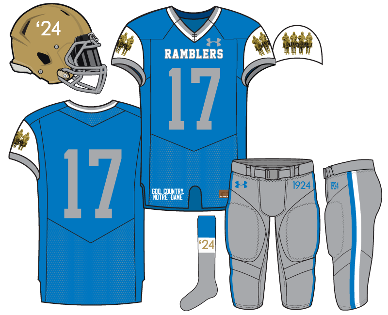
In keeping with the theme of Rice’s famous game recap this uniform began with a stunning sky blue and gray color scheme. Blue-gray sky, right? Although I’m not normally a fan of plain gray numbers on a blue background it felt more in line with pre-World War II uniforms to keep them as such. Plus, any use of white I wanted to be used to draw the eyes elsewhere.
The signature piece is the addition of the famous Four Horsemen picture transposed on to the shoulder sleeve. This is where we wanted to use a white background to draw the eyes. We also used the golden bronze statuesque players on their horses as a way to tie in the color scheme with the gold helmet.
The last key piece was to put “Ramblers” across the chest as a way to honor the early 1920’s nickname of Notre Dame’s football teams, specifically this 1924 team. Combining the Four Horsemen, Ramblers, and 1924 script we tried to put together a fauxback uniform that was stylish for modern tastes but also a concept that is recognizable to Notre Dame and non-Notre Dame college football fans alike.
Up next the Irish Nights concept…

This is the best one yet. They should just steal your idea for the centennial. Though maybe take the year off the helmets.
IT’S ALMOST 2024.
That’s so weird.
They look a lot like Air Force unis. You really love the service academy’s uniforms, huh? I really like the colors and uniforms, but probably wouldn’t buy this because it would just look like I was wearing and AF jersey. I think it would look great on the field.
I would like to see the 4 Horsemen larger. Maybe they could be added in large scale to the UA undershirts. Or maybe even a cool detailed image of them on the socks. Not anything you’d see on TV, but would make for some really cool socks to wear tailgating.
Help me understand the “wouldn’t buy because it looks like X school” because this comes up a lot and I know it drives me and Clint nuts.
Our current standard uniforms look like several other schools, but we all presumably buy it anyway.
So if we stay with traditional colors we look just like several other schools and any color changes are bound to look like other schools too. It is what it is right?
I am familiar enough with ND that all of our jerseys, and probably some of like Navy’s or PSU’s, make me think ND. So if I buy an ND jersey, I want to look at it and immediately think of ND. Whether that is because it is our normal colors, or because it is unique and I know ND wore it.
To be fair, I only own 2 ND jerseys. One is the awful white ND jerseys with gold on the sides (thankfully all faded at this point) from my first game in like 2001, when I didn’t know any better. The other is an “authentic” Johnny Lujack solid green long sleeve that I don’t wear, which I bought because I met Johnny Lujack.
So maybe this is more of a me issue, but it sounds like other people feel the same way. When I do get a new jersey, I am basically looking for 2 things. 1. Reminds me of ND. 2. Looks wicked shahp.
Again, I think it is a good looking jersey. I really like the colors and love the 4 Horsemen. I would feel mild+ about us wearing this in a game. But when I look at it, it makes me think of Air Force, not ND.
Mad respect for the Lujack jersey.
It is awesome. And like you mentioned in maybe your first of these, would be super cool to see a team bust out long sleeves.
Agree re: the Air Force comment. Looking like other schools isn’t inherently bad, it’s just very noticeable because this uniform is such a departure in style & color from what fans are used to.
Personally, I just don’t like light blue very much and would probably go with a darker grey-blue for the jersey, which would make the sleeves pop a little more, too. I’d also like a slightly more embellished script on the helmet “’24.” If you could get these changes to me by Thursday before noon, I’d appreciate that, Eric. 😉
All in all, this is my favorite concept thus far.
You mean to tell me the 2011 The Shirt isn’t your favorite!!????
I thought it was everyone’s favorite.
I am pretty sure this is everyone’s favorite.
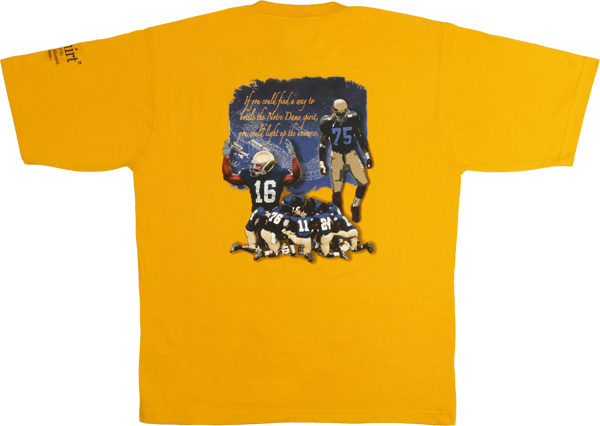
That one can keep you warm in th coldest of temperatures. Heaviest tee shirt ever made.
Haven’t read the post yet, and I’ll go back and do that in a minute, but these are so excellent. That jersey: [Insert Frye Take All My Money.jpg]
Fancy that we’re actually selling this jersey for just $899.99 I’ll put you down for one.
For that price, I’ll take 2. I can’t afford *not* to buy more than 1!
I like this one. The use of the Ramblers nickname is on point. I just wish you didn’t feel the need to fiddle with the gold helmets.
These are all really good, and far more creative than I could ever come up with. I agree with the comments about the year on the helmet. I think the other uses of it are clear enough. Given that they have lifted the Basilica for uniforms, you should copyright this before UA gets any ideas. I am not troubled by the blue and the AF comment, but perhaps would have gone for more of the blue that Gerry Faust used.
I just like that you have the blue and the gray in there…it’d be great if there was some other reference to Grantland Rice, too.
I’ll be honest. I saw Air Force, too, at first glance. That wouldn’t be an issue on the field when paired with gold helmets, but more for people who buy and wear them. I like them, but I like Air Force’s uniforms.
That said, I LOVE the horsemen on the sleeves and I really like the Ramblers homage. I really think this would be a cool concept to pursue – maybe in a Shamrock Series game in NY for the centennial – as others have suggested.
I am pretty sure it’s been over 24 hours since this dropped. Where is the next uniform concept???? This is like crack.
Ha, we do have about 20 done so far. All kinds of varieties. Buckle up.
I can’t wait for the 18S After Dark concept.
The next design should incorporate a stereogram on the jersey or helmet to befuddle opponents
“It’s a schooner!”