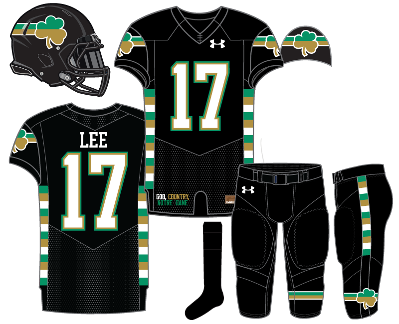
Today we unveil our 14th overall Notre Dame football uniform concept and our 3rd effort dressing the Irish in black. When we started to put together concepts for this series an evenly divided shamrock was the very first logo I began toying with. After a few demos I put that to the side for a bit.
When we were going through ideas for black uniforms I decided to pick it back up again. Using a non-traditional background allowed me to mix the gold and green in the shamrock.
Originally, I wanted to pair the shamrock with the horizontal lines only on the sleeves, but after thinking about the opportunity to do something different with the helmet, I thought a wrap-around stripe on the lid was needed too.
I wasn’t prepared to rest on my laurels with just this and put the multi-colored “Marquette stripes” down the side panels of the jerseys and extending down on to the side of the pants. I know in this 2D representation it does seem too busy but on the field I think this would be a nice touch that isn’t too overwhelming. The stripe and shamrock are also added on the bottom of the left pant leg.
With a lot going on above I decided to keep the socks plain black and ideally they’d be paired with all-black cleats.
The numbers are white and outlined in both green and gold. To change things up for a truly original concept a nameplate was added in white font, deal with it.
I called this one “Metro Black” because the stripes coming off the shamrock reminded me of a subway line or metro bus logo.

I think this would be a winner if we removed the Marquette stripes from the top, kept them on the pants, and moved the banded shamrock to one or both socks.
I have to say, I really like that helmet design. I’m curious what it’d look like as a blue/green shamrock atop a gold helmet.
I like those changes. I like where your head is at!
The shamrock with the horizontal stripes looks awesome and wicked fast.
I would also loooooooooooove it if they put name plates on the jerseys. I find it much more enjoyable watching a game with nameplates.
Pro-NOB let’s go! Don’t care how many downvotes this gets we are in the right on this issue.
You need to get these last 2 designs in front of Under Armour. I’m all in on these.
I’ve noticed, Eric, that when you do lines on these unis they almost always are straight lines. That’s what I think makes me not fall in love with this one. When Im looking at the jersey itself it reminds me of a steeplechase bar:
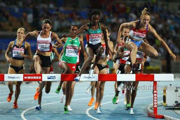
I wonder if you could do a few concepts where you dont do straight 90-degree lines? It seems to me the styles of today’s jersey concepts are going towards more non-traditional patterns and it’s kind of fun to see them. I did like the 2029 SS one you did and it sort of followed this mantra. Maybe expand on that idea a little bit?
It’s tough to say because I’m not super clear what kind of designs you’re looking for. But yeah, most of the uniforms will have traditional stripes and accents.
Just kind of an idea…this seems to be the trend nowadays. No straight lines anywhere, occasionally a pattern sublimated somewhere as well:

It’s a combination of not going with many patterns because they can be difficult and time consuming to sketch and then design digitally, which in turn is a lot of work sometimes for something that can be difficult to see, and generally I think non-traditional patterns don’t look all that great.
I like this one. I’ve liked most of these, and the ones I didn’t like, it’s not like I hated them. They were, you know, fine or whatever. No matter my personal feelings, I appreciate the effort. I guess what I’m saying is, all have been at least as good as or better than the Shamrock Series uniforms we’ve had and Eric should be the head designer for UA.
I’ll also say this: as a bald person, I have an affinity for skullcaps in winter. In fact, they’re pretty much a necessity. The head-on views of the jersey sleeves look like skullcaps. All of them should be made into skullcaps and I would buy one of each for me, and some more for my bald friends and relatives. I mean, just look at the sleeve on this one and tell me it wouldn’t make a sweet-ass skullcap.
This is the first one that sucked me in to making a comment. I like. Also, who is Lee?
Just a nice short name to put on the back is all.
Have we ever had a player with a 2 letter last name? I can’t think of any in all of CFB or NFL, so possible we haven’t.
Either way, this is ND, you should have gone with the goshdarndest longest polish name you could have thought up.
Reggie Ho, Bro!
[Aaron Burr, Sir]