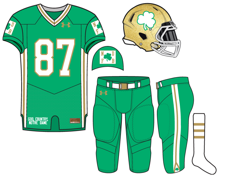
Following last week’s wildly successful black offering we turn our attention back to green today for the 23rd Notre Dame football uniform concept from 18 Stripes.
I still have a couple personal preferences among our concepts but today’s might be my favorite overall. I am definitely #TeamGreen when it comes to Notre Dame and this particular shade has always been dear to my heart. So, even though I’m not crazy about the same color jersey and pants it looks fine with this concept.
I chose white socks to help bring out the white trim elsewhere, but especially on the helmet. It’s virtually unheard of to see a Notre Dame shamrock that’s white and for that reason I was a little nervous to see how the helmet looked in the final product. I am pleased.
The sleeve patches are a simple logo we thought up to try and change things up from the normal stuff. The Irish have tried to put a design down the flanks in the past and failed miserably. This flank design flows right into the side of the pants and creates a much better continuity and whole uniform when put together.
Don’t miss the small shamrock on the bottom of the pant side, either.


Not a big fan of the rectangular shoulder patch. Maybe a different shape, or even just make the white a vertical stripe on the sleeve panel about the width of the shamrock (or even a hair thinner?) and then move the ND/FB to above and below the shamrock inside the stripe. That’s my only complaint though, other than that not bad.
One last note… the best thing this jersey was going to have going for it regardless of what it was, is that it’s not last week’s.
Yeah, first thing that jumped out to me, too was the shoulder patch. Looks too slapped-on for my tastes. The rest of this thing, though is a big winner. Im not sure if I like it just because it follows that awful one last week, but I really like this. The gold line within the white bar going all the way down the uni is a great feature. Love the green color, too. All of this is very nice
The 2D concepts will always make any non-regular logo look “slapped on.” Especially certain shapes.
It’s a combination of lack of familiarity and visual.
Scarponi fixed it for you. Do what he did with it and this thing is totally awesome
“Maybe … just make the white a vertical stripe on the sleeve panel about the width of the shamrock (or even a hair thinner?) and then move the ND/FB to above and below the shamrock inside the stripe.”
Something like this:
private image sharing
Very solid, although a little too skinny for a football jersey. Would work well on a t-shirt.
I think the term is striped, not solid.
The idea was to carry the stripe of the flank up through the shoulder while keeping the logo concept of the original patch. I threw it together quickly at work so I didn’t take the time to check the width to the flank stripe, but in my mind it was meant to be about the same. It certainly could be adjusted.
I like that idea.
I’m a big #TeamGreen guy too and wow these are some beauts. Anything green + gold probably couldn’t go wrong in my eyes but these are pretty sweet. Probably should sent them in to UnderArmour to boost that stock price once they start printing money by producing these jerseys.
Show me the 💰💰💰
Great uniform, but for 2 nits:
Already mentioned, the patch looks like an afterthought/one of those GIGANTIC Coaches v something patches that all schools wear once a year and ruin a jersey/shirt.
Don’t love the snake-tounged gold stripe at the bottom of the pant. Maybe could have gone with a white shamrock on the thigh if there needed to be one on the pant. The lil’ green one looks forced, as well.
And maybe a green belt, not white?
I guess one of those isn’t a nit, you can decide for yourself.
Uggh. Worst green ever. And green shirt on green pants belongs on someone like Oregon, not my ND.
Sorry but you want honest feedback, right?
It’s not honest feedback if you don’t like uniform concepts.
Not to pile on, but agree about the white patches on the arms. What about replacing that with a white shamrock with a gold outline (like the numbers)?
Yes! Bring back the Kelly green!