Recently, I was taking a look at some of the differences between the filled-in Notre Dame monogram and the not filled-in monogram on my usual Wednesday evening meanderings through the internet. After a few seconds I had that special moment when you’re completely unaware and you stumble upon a glorious website.
Click for The Notre Dame Uniform History
This is a national treasure. For uniform nerds such as myself it means so much more. Let’s take a walk through this enormously sharp and accurate representation of over 100 years of Irish uniform history.
*If you’re all about the “Notre Dame’s school colors are blue and gold and that’s what the uniforms should be” mantra this is a humbling collection to peruse. There have been periods (1964-74 & 1986-1991 especially) when the uniforms largely went unchanged but more often than not we’ve seen plenty of changes in colors and design through the years.
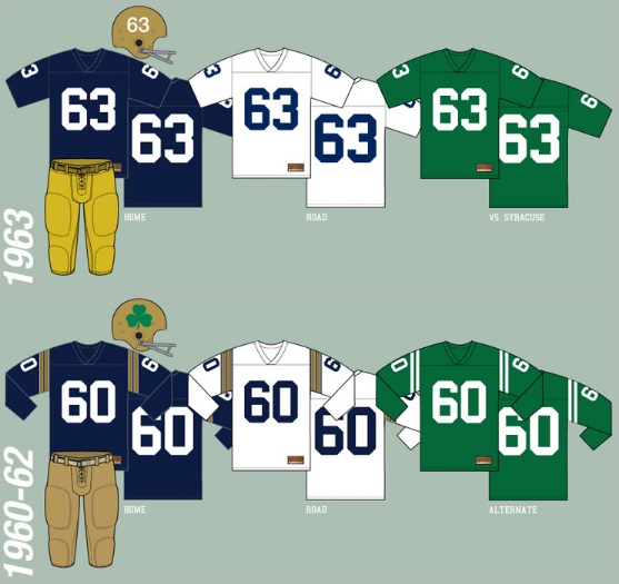
*It’s become fashionable recently for players to wear long-sleeved tee-shirts under their gear which makes me wonder if long-sleeved jerseys that were the norm prior to 1963 should be used in the colder weeks of the season. Marketing opportunity!
*1959 to 1963 what a time to be alive! Shoulder stripes, upside down shamrock, right side up shamrocks, three sets of uniforms, and helmet numbers. It’s kind of interesting that as the 60’s progressed and the country saw an increase in color and design Notre Dame’s uniforms reverted back to something as basic as they’ve ever been in modern times.
*I’ve always had a soft spot for the Faust-era striped uniforms, aesthetically a very pleasant uniform even if it did look too much like Pitt in those years. That 1983 green uniform worn against USC still sticks out as the most strange jersey ever worn by Notre Dame.
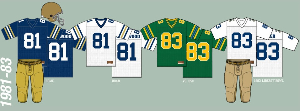
*1983 also saw the first bowl patch on the jersey for the Liberty Bowl against Boston College. With the wind chill close to zero that was one of the coldest games in school history. The Irish would wear bowl patches in every bowl game from here on out with one notable exception: The 1988 Fiesta Bowl which was the last title team.
*A beloved uniform, and one certainly in the running as one of the most strange, was the 1991 Sugar Bowl. Many recall the green numbers (and socks) but the rest of the uniform remained in standard style to create a weird mish-mash that has never been seen before. The team also ditched one of the Sugar Bowl patches in favor of wearing the 150th anniversary of the school patch on the left shoulder. That patch was also worn all season in place of the monogram on the left sleeve for the standard jerseys.
*The 1992-2000 collection has always been among my favorites which has a lot to do with my age. Subtle little changes over a number of years but still a very coherent Notre Dame look. Champion went out with a bang.
*The Adidas era began not without plenty of controversy. The gold flanks down the road jersey garnered enormous criticism, of course. It’s amazing the flanks stayed on the away jersey for 3 years! Also, script appeared on the front of the jersey for the first time ever, and while a few Shamrock Series uniforms would do the same years later, the 01-03 set remain the only standard uniforms to do so. Additionally, remember the American flag remained on the upper left chest for 2 years post 9/11 following the opening game against Nebraska.

*Among the many terrible things to occur under the watch of Tyrone Willingham nothing may be worse than the gold jerseys created for the 2003 spring game.
*For me, if you had to create a basic modern day green jersey it would be close to the 2002 version. Those never had a chance that day with the debacle that would become the Boston College game. It’s too bad, in the 14 years since the Irish haven’t worn a sharper green uniform.
It’s been almost 15 years. I’ll still go to bat for these gorgeous green uniforms. pic.twitter.com/jgnCiXVyrC
— Eric Murtaugh (@EMMurtaugh) February 14, 2017
*Man, were the 2004-09 uniforms super boring. For the first time in almost 20 years the monogram was removed to complete such a lifeless set of uniforms. Even the green jersey from this era was uninspired.
*I know I’m not the only one who wanted to marry the 2011 Under the Lights uniform. Near perfection.
*We’re heading into the fourth year of the Under Armour deal and so far there have only been almost imperceptible changes to the standard uniforms. It feels like we’re due for a change but UA appears to be taking a harshly conservative stance on most athletic uniforms at Notre Dame.
*The more I look at it the more I think this past year’s Shamrock Series uniform is one of the worst in school history.
~~~
Thanks to Clint Glaze for building and maintaining this Notre Dame website for everyone. Coming soon, Clint and I will be working on some concept uniforms to share with everyone at 18 Stripes. Stay tuned.

There definitely needs to be an official 18S uniform.
Perhaps an idea in the works already…
I think the mid-aughts jerseys were better than Under Armour jerseys, generally. That Under Armour deal has been a big mistake on a number of levels.
I’m no defender of UA by any means but why do you say that?
I’ve really grown to dislike the TV numbered jerseys of the mid-aughts.
Taking the entire uniform package from that era and things got really bad there for a while.
From what I understand (though now looking back, wording of stories at the time was ambiguous), ND took a chunk of the UA deal in stock.
Then, e.g., https://www.fool.com/investing/2017/02/07/why-under-armour-inc-shares-dove-28-in-january.aspx and https://www.google.com/#safe=active&q=under+armour+historical+stock+prices&*
Oh, okay. Well, I kinda agree with you on that.
Though I’ll rescind my comments re: the mid-aughts. Those were bad (I was mistakenly looking at 2001-2003 before making my initial comment. 2004-2009 pretty bleh). But the 2010-2013 Adidas stretch is much better than the UA jerseys. 2011 Under the Lights unlikely to be topped.
I agree with most of that.
I agree about last year’s Shamrock Series uniform. Looks like they took an away uniform and steeped it in a diaper pail for a couple of weeks. And that cutesie Carlos Murphy’s font on the numbers. It must be said, however, that it takes a certain creativity to pack so many bad ideas into one work of art.
Damn diaper duds.
Am I the only one who noticed Clint left off the ’17 NCG unis?
The gold ones?
Wait a minute — ’17 was just after we got in the war — we had to wait another 7 years for the natty…?
“It’s become fashionable recently for players to wear long-sleeved tee-shirts under their gear which makes me wonder if long-sleeved jerseys that were the norm prior to 1963 should be used in the colder weeks of the season. Marketing opportunity!”
I really like the 1960 unis. Would be interesting to see something like that again.
With uniforms always trying to get lighter it seems we’ve crossed that bridge already but who knows with a throwback option?
I’ve always thought long-sleeved jerseys work so much better for people when it gets past September. Seems like they’d sell more if the team actually more them, that is.
Clint also has a page with game results per uni variation – http://caglaze.cts.com/ND.html. Goes back “only” to 2011, but fun all the same.
Also, I’ll never understand how people allowed the 1959 fallout shelter helmet to become an actual thing. Although it was fairly appropriate for the Kuharich era, I guess, so maybe it was just satire.