In this line of work you tend to spend a lot of time looking at college football rosters. If I’m not on 18 Stripes or cfbstats.com I’m burning a lot of bandwidth on team roster pages. A few quick thoughts on college rosters pages in general:
*Some colleges maintain tremendous pages and much love to the programs who keep track of snap counts for each season. You’re the best. Other colleges really put in minimal effort. Usually, the larger the program the better the information but that’s not always the case.
*Some schools still don’t use the redshirt designations. Notre Dame remains a culprit. This could save so much time from the main roster page.
*Most of the web pages are getting more difficult to navigate, especially if you’re humbly seeking basic football information in the quickest way possible. I can’t count the number of times I’ve accidentally moved my mouse near the top of the screen and, boom, a drop down menu displaying information for 6 other sports, ticket information, and a video for volleyball are now blasting me in the face.
A company out of Syracuse, New York called Sidearm Sports runs many of the athletic pages, including Notre Dame. For the longest time the Irish were a hold out to a more “modern” roster page but I loved it because you could sort by name, number, position, height, or weight with a click of a button. Now, the page defaults to displayed by number (I would prefer name as the default) and if you want to sort that’s done by a separate drop-down menu with further options to display the roster in list form, grid, or player card style.
No doubt, the Notre Dame page is a lot more flashy and appealing even if it isn’t always the most user-friendly.
The genesis of this article began because I was curious about the outfits the players wear for their official roster photograph. Then, I did a little more research.
Notre Dame switched to Adidas in 1997* the same year Bob Davie took over as head coach. That season, Davie wore THIS same blue polo for the first 6 games which is interesting for its repetitiveness but also that the Notre Dame logo was on the right chest (virtually no shirts do this anymore) and the Adidas logo was missing the “3 Bars” which debuted that same year. Davie’s polo looks like it’s from 1972 not a couple decades ago.
*For whatever reason, tons of sideline staff are still wearing Champion gear too. Unthinkable today that you’d see a sideline mixed with Adidas and Under Armour apparel, for example.
It wasn’t until late in the 1998 season that Davie began wearing sideline apparel with the Notre Dame monogram logo inside the shield. This logo had over an 11-year run as the main mark for the Fighting Irish.
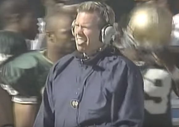
Let’s put this logo right below the xiphoid process, why not?
That logo is in nearly all of Davie’s most famous photographs, it was there when Tyrone Willingham stopped by for a few years and Adidas was pushing the visually arresting three stripes, it was there for Charlie Weis’ final game, and it eventually became the press conference background for a number of years including for Brian Kelly’s first presser.
I bring this up because for what seemed like a decade Notre Dame players took their roster pictures with a white mock turtleneck emblazoned with this shield logo on the left and Adidas logo on the right. The logo was phased out by Adidas before Brian Kelly’s first spring game in April 2010 but lived on for that season’s roster through Robert Hughes who never bothered updating his picture.^
^Probably because he looked 32 as a freshman and they didn’t see the point.
With the mock turtleneck kicked to the curb, the program spent quite a few years putting the players in polo shirts with photographs zoomed in to hide the differences among the roster. Most players clearly wore navy blue polos, but sometimes freshmen are in all white, or others have a white polo with a blue collar.
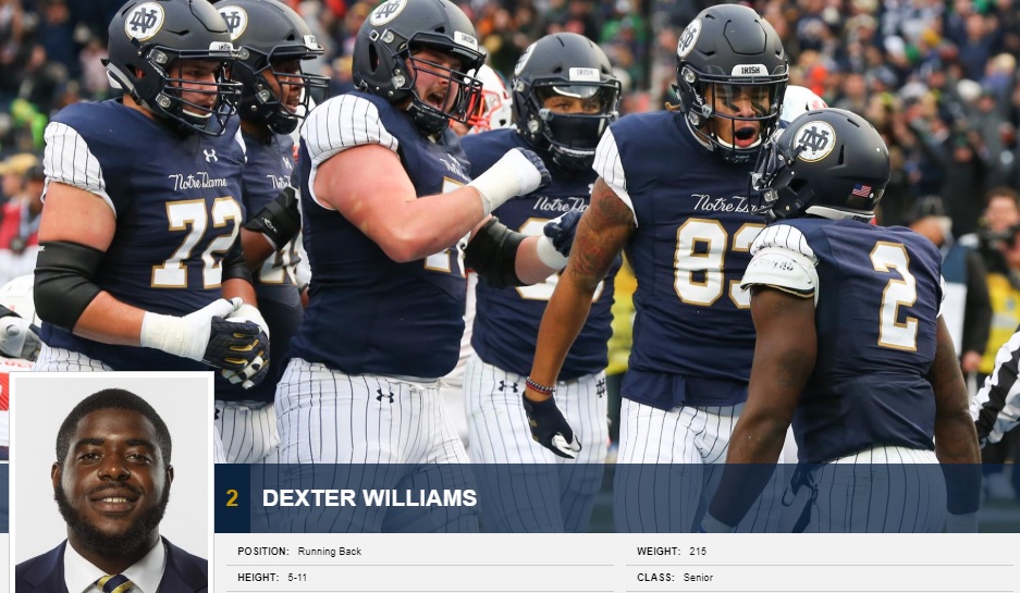
Not until 2017 did things change when players were photographed with shoulder pads on underneath the home blue jersey. Later, the pictures changed again to coat and tie with players either wearing a tie with thin stripes or a tie with wider stripes. This past season, the roster page got another face lift which included everyone in the exact same coat and tie. Uniformity is here!
One of the cool things is that for the more prominent players there are high resolution carousel photographs on their individual pages which adds a nice touch. I thought it was really neat to see Devin Studstill’s page with him kissing his mother who passed away almost 2 years now.
The movement in 2018 to get everyone wearing the same thing even led to some photoshopping!
Not fooled.
My stealth research indicated Jafar Armstrong, Shaun Crawford, Alohi Gilman, and walk-on Brandon Garcia receiving a photoshopped coat and tie from their 2017 picture. Notre Dame players must be busy if they can’t make this photoshoot but updating their photos for uniformity is the least they can do anyway.
One of my pet-peeves is to wear a neck tie tightened properly, especially for official photographs. I was actually impressed with how well the 2018 roster pulled this off. However, we had some poor performers to mention. Nick Coleman (a touch too loose but usually passable), Darnell Ewell (his thick neck widens his collar and exposes his tie beyond the knot), and Sam Mustipher (loose knot and askew, tisk tisk for a senior) are among the worst offenders.
However, last place goes to rising sophomore offensive lineman John Dirksen.
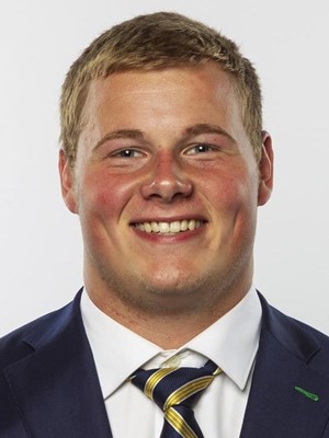
Bruh.
The entire top shirt button is exposed, sir!
Will the jacket and tie pictures remain for 2019? What would fans prefer the players wear in these profiles? I await with uncontrolled excitement to see what plays out with the new roster.


We may have found the most Murtaugh post ever
Spot on.
That loose tie just kills me. I don’t think I can ever forgive him.