So far in our concepts we’ve used a shamrock, leprechaun, monogram, a football, various scripts, the university seal, and the golden dome as various logos on the uniforms. Suffice to say, Notre Dame isn’t short on logos in any way, shape, or form.
Our 38th concept adds to the bunch.
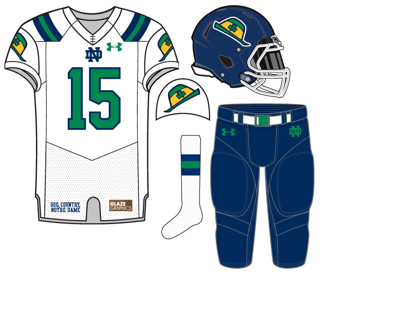
The hat from the leprechaun graces the helmet and shoulder mixed with a primarily blue and green color scheme. We have mixed the blue and green in the past and here’s another attempt to mix and match a growing familiar scheme in university athletic.
This concept skews towards the younger crowd, for sure. That’s okay, kids need cools stuff too.


I like the angle of the hat
The angle is important.
I’m surprised that I’m a really big fan of these. I’d be interested in how it looks on Gold/Blue/Gold
Very creative, a fun idea! The only thing I might change would be the hats on the sleeves (too many hats?) – maybe replace those with the leprechaun or a shamrock?
The leprechaun…..without the hat?
I’m having such a hard time determining if I love these or hate these, but the anger that they would generate within the fanbase is definitely pushing me toward love.
I like these, I’d just bring the shoulder stripes down more so they’re less vertical and they end up going across the shoulder pad instead. I think we could have some great celebrations with “The Hat” on our domes