Changing up your uniforms, even for one game, need not be complicated if you follow one rule: If you’re going an alternate route dive in with vigor and if you’re doing a throwback get it right with the correct era specifications.
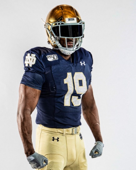
On Tuesday, the Fighting Irish debuted a 1988 throwback uniform to be worn on Senior Day against Boston College that half-heartily tries to dip its toes in that water while apparently adding some modern flair. Full review after the inset pictures for your viewing pleasure.
To send off our seniors, we’re going back to ’88… and adding some modern flare. 💥
More: https://t.co/7dL9FKEQIk#GoIrish ☘️ #CFB150 pic.twitter.com/TPZFfLerYV
— Notre Dame Football (@NDFootball) August 13, 2019
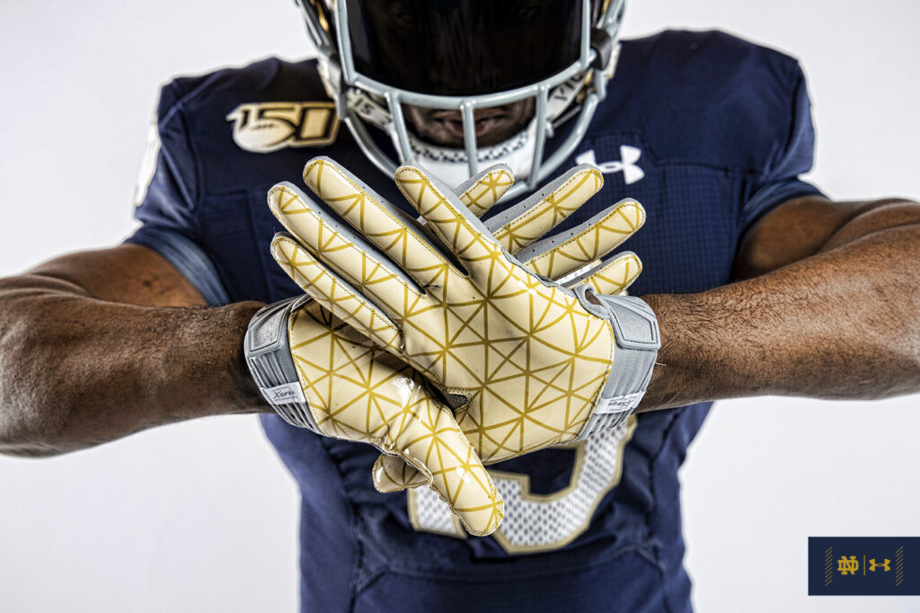
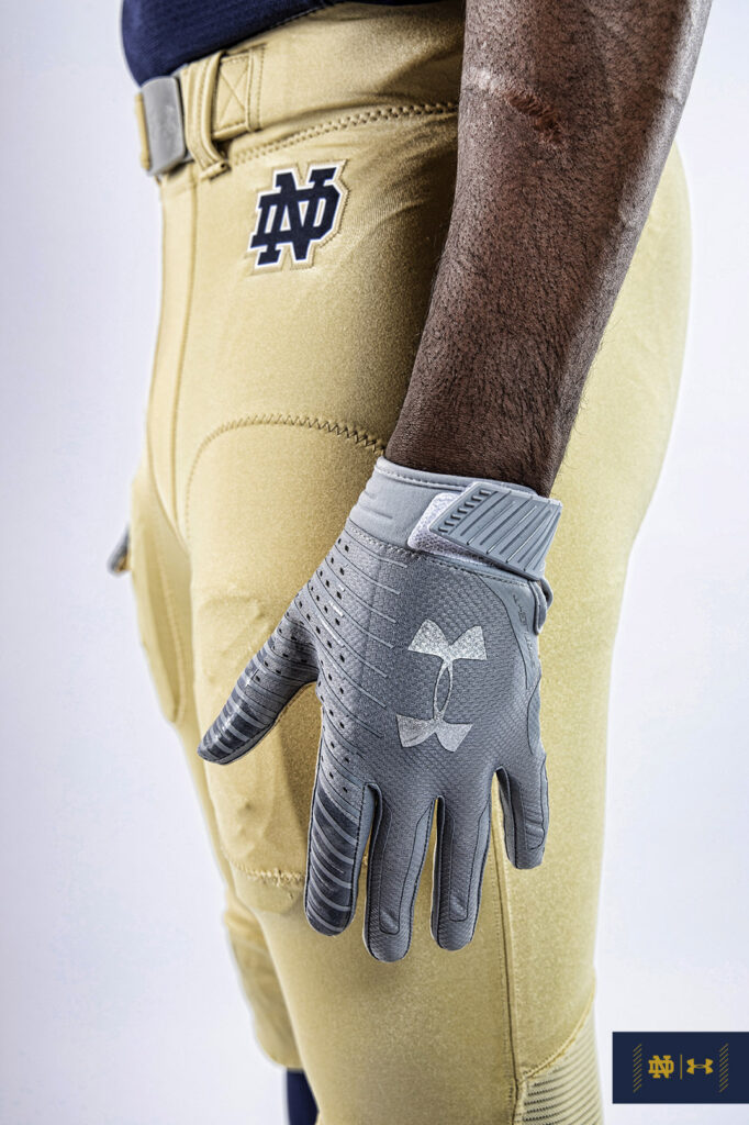
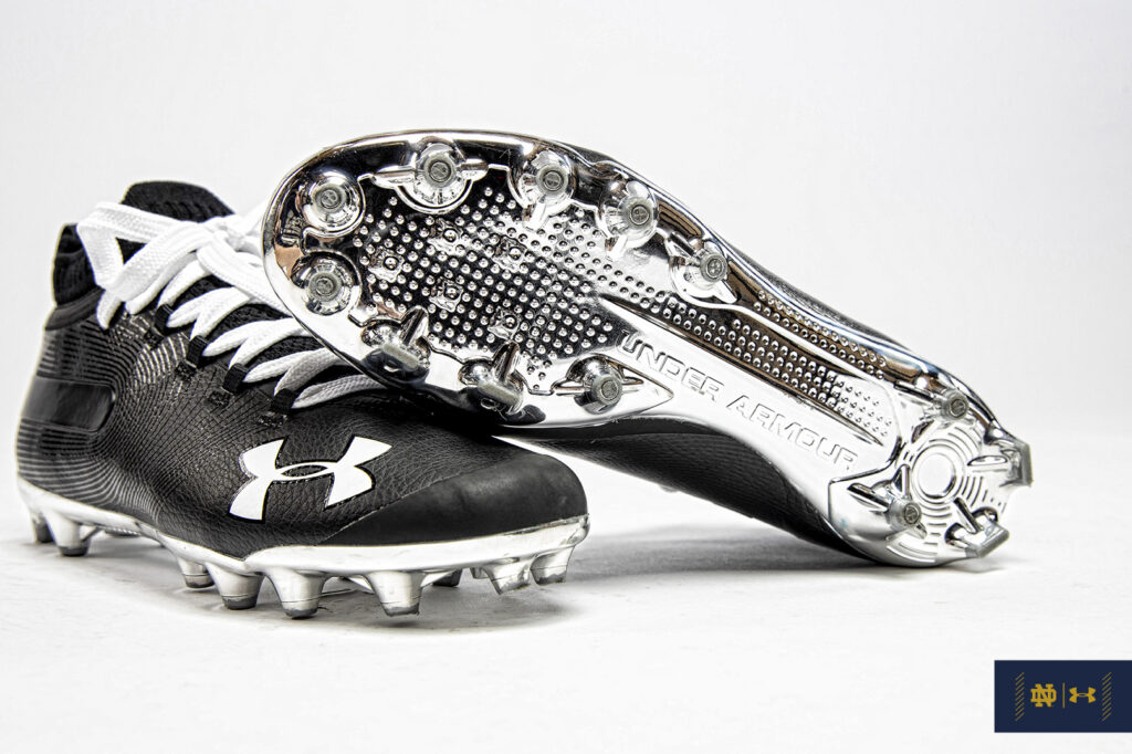
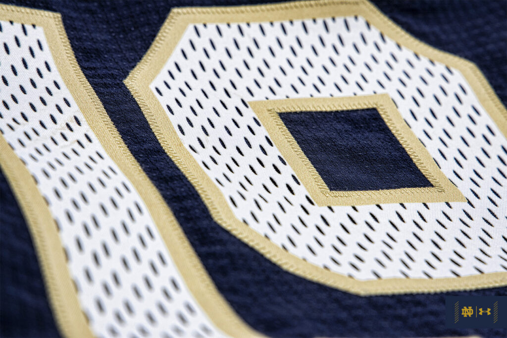
Helmet
Obviously, going back to a duller gold helmet from the 80’s was going to be problematic on so many levels. They likely couldn’t guarantee it would come out right in the manufacturing process so I’m not too hung up that they didn’t mess with that.
Jersey
So, it appears they changed the jersey number font from the current “Leahy” script used for the regular uniforms but didn’t copy the font from the 1988 uniforms. Very weird. If you’re curious just look at that swooping curve on the ‘1’ from this model compared to that number on Ian Book’s uniform and then Pat Terrell from 1988.
I also believe the monogram on the sleeve should be tweaked to fit the ’88 version, as well.
The fake mesh inside the numbers is hilariously dumb and I’m not wasting anymore time on that.
Pants
They changed the pants from the current mustard gold but yet again did not follow the era-specific pants from 1988 that closely. This throwback has what looks like more of a sandstorm gold matte color similar to what Notre Dame wore in the 2011 season. Maybe a touch more brightness than that. The ’88 pants were Vegas gold and metallic shiny. These look too matte to match that–the jersey number outline also looks like a sandstorm gold as well–although I think once they are on the field they will look more era accurate.
Important to note that the ’88 pants didn’t have a white outline on the left hip monogram and the team wore blue belts, not gold.
Accessories
I’m not sure why this was so hard to replicate. The 1988 team wore black gloves not gray. The gray gloves didn’t come into fashion until the 2000’s.
Maybe the most egregious mistake are the cleats. Lou Holtz made a big deal about black cleats with black laces after the 1970’s and early 80’s saw the Irish wearing white cleats most of the time. The black cleats with white laces were never worn during the Holtz era and come from an era in the early 60’s and into the 1970’s.
Summary
For a lot of people these uniforms are pretty harmless. From afar they look so similar to the normal uniforms as not to be bothered even worrying about how they will look during a game.
From the standpoint of creating an alternate uniform clearly these are mega-boring.
While trying to create a throwback uniform this offering seems so strange and underwhelming. So much more effort could’ve been put into the details to get it correct and why 1988 throwbacks in the first place against Boston College (a team that wasn’t faced in ’88 if that matters) for the 150th anniversary of college football anyway?
— ndmspaint (@ndmspaint) August 13, 2019

I just saw a quick post that said SR Day jerseys and thought they were legit mesh and got really excited for this alternate jersey. Then read this and learned it is all fake. Booooooooo. I do like the sandstorm more than our yellow pants though. Would look better with blue belts.
So basically, nothing about this is actually throwback? It’s just a really lazy attempt to sell slightly different jerseys.
In theory I agree with you on the pants, but I don’t like it with this helmet at all. Maybe it will look better on the field, but it doesn’t look like it pairs together well.
The mesh being fake ruins it. The detail (wrong gloves, shoes) just torpedoes the whole concept, missed the mark. Trash effort by UA but oh well, it’s not that much different than the normal home jersey so who will even notice? (Prob not a good sign for them). This isn’t atrocious like the NY Yankees jersey but isn’t inspiring at all either.
Weren’t there hints of 2 alternates this year? Like maybe a green for USC? If so that would make me happy.
Yup, my theory has always been the Holtz era pants are what many of us grew up with and associate it with winning. I personally don’t think they are better looking than the current pants and they definitely will look worse with the current helmets.
That’s a great theory. I’d be down with this retro jersey more if they made Thicc boy Kyren Williams wear Jerome Bettis-sized shoulder pads.
(And yeah I know he wasn’t on the ‘88 team but that will fit in with the other. Glove/shoe/faux mesh inconsistencies).
I’m more into therib-knit wool sweater, padded gold canvas pants and brown leather helmet look.
It’s not great for a “specialized” uni, but I have nothing against it in general. I think it’s solid. The mesh is a little corny, but it doesn’t look bad at all.
The numbers should be legible from the upper bowl, so that’s a positive.
You guys are so analytical. Sometimes you have to let art just wash over you.
That’s actually true, I agree! However, I think if you showed this uniform to 100 Irish fans very few would recognize it right away as a 1980’s throwback.
I still can’t tell any difference, really. I needed Murtaugh dissecting it to see what the changes were. I first saw it and said, “this is an ALTERNATE?”
I was trying to quote “The Big Chill”.
The only way I’ll really get excited and call these a true throwback is if we wear them as cutoffs and untucked or tied back with tape.


Tremendous. Agree with the general tenor that this doesn’t really move the needle much, but if everyone walks out with a crop top look, it immediately goes to the 2nd best alt uniform in ND history (after the Michigan under-the-lights look, of course).
Crop tops were banned ahead of the 2015 season after Zeke Elliott brought it back.
NCAA must be taking cues from the NoFunLeague
Came here to say this. Also, the players better spat those cleats. At least get that right.
Yeah the mesh numbers are not only stupid, but really the only part that approximates an 80s uniform. i dunno why they even tried to do one from the 80s since in that era jerseys were very loose and oversized. Literally impossible to do justice to that look with modern materials cut to a tight fit.
Every year the alternate jerseys miss the mark. Usually it isn’t by that much (2012 notwithstanding). Why not make some minor tweaks before the season starts. I have never understood why they don’t release it, receive feedback, and make it better. These would be so easy to make cool with such minimal effort.
People love the 80s, especially ND fans, so it shouldn’t be that hard to make something exciting. #WeWantMesh