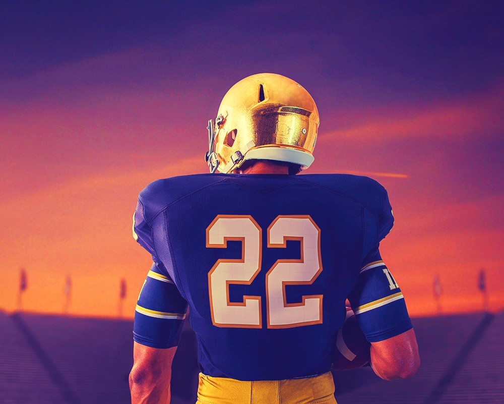
Notre Dame’s uniforms are important, historic, and symbolic. This is especially true for the home blue uniforms that the program has worn for a majority of their games in South Bend. I am going to embark on a journey to rank the best home Notre Dame uniforms of all-time.
A few caveats that will be important to remember:
1) Blue Only
We are only looking at the standard blue home uniform. So, no alternate uniforms, no bowl game uniforms, and no green uniforms if they were the standard home set of the time. We’re not going to look at any road whites, either. As the first offering from Adidas in 2001 showcased, the road jersey can be very different and a lot more controversial than the home jersey.
2) Modern Era Only
We are starting from the point when the modern football helmet, and thus the modern football uniform, came into being and provided us with the template players still wear today. Specifically for the Irish we are starting in the late 1960’s when color photographs provide a clear picture of the uniform.
3) A Select Few Out
Due to no green we are not including the home uniform from 1977 through 1980. Also, since there are precious few quality photos in existence we are not including the 1959 through 1963 uniforms.
Therefore, we will include the following 15 blue uniform sets:
Late 60’s
Early 70’s
Early 80’s
Late 80’s
1992-93
1994-97
1998-2000
2001-03
2004-09
2010
2011
2012
2013
2014-15
2016-20
So, how will we go about ranking each of these uniforms? I’ve come up with a standardized scoring system:
Tradition (max 3 points) – How closely or not does the uniform stick to Notre Dame’s traditional navy blue jersey, gold helmet, and gold pants?
Style (max 2 points) – How well does the uniform incorporate modern styling?
Success (max 1 point) – Since so many people identify with uniforms based on how well the Irish played in them we will include this begrudgingly.
Total Package (max 3 points) – Our personal taste included with how we feel the whole uniform looks after judging all factors together in one package.
We’ll publish Part I of III soon, but until then we have questions for our readers:
1) You have one more opportunity to buy a Notre Dame jersey for the rest of your life. Which number do you choose?
2) Notre Dame uniforms are generally talked about in positive ways, but what is something you don’t like about them?
3) If you could make one change to the home uniform what would it be?


I’ll start things off…
1) I’ll go with #9 but #3 and #25 are tough to pass up.
2) No nameplates (fight me).
3) I’d remove the gold trim from the numbers (and add NOB).
Love this.
1) #7 or #21 (Mo Stovall really pulled this # off, IMO)
2) No complaints, I personally would like to see them go back to the old mesh uniforms but I know that will never happen.
3) I know we’re supposed to be sticking to the blue, but I would like to see a switch to the green homes and green accents on the aways. I think it would be great to have it for about 5-6 years. Then the blues would feel fresh again. I don’t like how UA mixes the blue and green though. I want to see green, white, and gold.
1) #21 was my high school number so that’s a good choice. Jalen Elliott brought some honor back to it.
2) That would be better than the faux mesh, for sure.
3) I’m 100% with you on this.
1) Not sure why, but I’m going with #11
2) The “gold” pant needs tweaking, if only to minimize the appearance of ass sweat. No nameplates is classic — I’ll fight you!
3) I wouldn’t mind a shamrock instead of the block ND on the shoulder, but don’t have a strong feeling about any change.
1) #11 makes anyone look taller which is a plus.
2) Yeah, the sweat marks are bad sometimes.
3) They did this once in the first bowl game versus Oregon State, I loved it.
appreciate the visual!
1) I would probably get a #3, although I enjoy the total non-specificity of the #1 jersey. (Also, 2 of my 3 ND jerseys are #1s.)
2) I very much like the current jerseys. I’m sure there are little tweaks that could improve them but off the top of my head I wouldn’t be able to give you one. I’m especially a fan of the Leahy font; when we inevitably switch from UA (who’s dropping all their college contracts one by one), I hope we keep that font.
3) I’d probably put a shamrock somewhere. Maybe on the pants, around the hip where the monogram is.
Really curious to see who ultimately owns the Leahy font (I’m assuming Notre Dame).
#5 – Hanratty …my first ND hero.
Definitely no name plates on the players but ours could/should.
The simpler the better. I like a ND or shamrock on the neck line.
I’m very pro-shamrock on the neck line.
The fact there is nothing on the neck line is a missed opportunity imo
1) I’m a big fan of #9
2) I don’t like the ACC patch on them or “Rally”
3) No baggy white long sleeve shirts underneath (I’m looking at you Wu)
Re #2, those will likely both be gone next year. Obviously the ACC patch is a goner, and I assume ‘Rally’ was 2020-only. (I actually really really liked ‘Rally’ as a 2020 slogan, though I could’ve done without it on the jerseys.)
Hot take, I loathe the Rally patch. Text laid out like that looks absurd and there’s a period. Just looks bad.
I like the baggy long sleeve shirts, though!
I don’t get the long sleeve shirts, makes them look like it’s a pickup game or gym class or something to me. I bet in 10-20 years we look back on that looking low rent. (Especially the way Wu has it). Does anyone else really do that? I haven’t noticed that to be like a trend or fashionable, my take is that isn’t going to age well.
I think it looks good when the shirt matches the jersey. Players like Wu started wearing white shirts at home late this year and it’s definitely a different look.
Excited for your thoughts!
1. Probably something in the 80s: 80 (Eifert) or 83 (Samardzija).
2. I can’t quite name why, but I don’t like our gold. It’s a tough color. I love it in the away uniforms, like is less against the blue, and hate it against green. This effect gets worse when the helmet color is far apart from the pant color.
3. Piping? Way before my time, but I love the snow bowl collar/sleeves.
Actually let me broaden my point: gold is a tough color. You either go authentic, and it can look drab, or go “gold” and it looks yellow (hello, LSU).
I think ours is a nice middle ground, but the helmet vs pants thing looks weird against the blue. Maybe they should match better? Maybe it’s a materials thing? Idk. I can’t put my finger on it exactly. It looks especially bad against green (e.g. FSU game).
The gold is tricky. IMO it’s more about the shade of green that made it look off — and especially with blue numbers on the green jersey that year, didn’t look quite right.
I think if you go green jersey it has to be like 2005 in the USC game. Gold numbers and a better green makes it work.
1992-93 could be your top pick then?
I totally understand the thoughts about gold in the sense that it’s a difficult color to keep constant throughout an entire uniform.
Did you like the throwbacks last year with the gold pants and helmets? I’m pro-mustard for the pants but I get the disconnect, too.
I think there have been some recent examples (UTL uniforms, ASU Shamrock Series) of the gold and green looking really good.
I’m with you. I like the mustard but find the throwbacks more cohesive. Maybe it’s because I became a fan in 2005?
I think there are examples of green looking good (ASU being the winner), but in general those colors are weird against each other (eg 2010 shamrock).
1992 could be my year! I’m excited to see your series to work through there thoughts! I always enjoy your uniform articles.
1) #69
2) Not soaked in the blood of our enemies enough.
3) Add Yankees-style pinstripes.
I watched a replay of the ’93 FSU game. The helmets were mustard colored. I hated them.
I like the bright, shiny gold much better. Gold pants too.
I’ll take #3, Montana. No names. no patches.
They need to go back to the Hydro graphics Helmet color from 2011-2016 ( I think or 2018) the new one especially at night and home looks awful. Also looks brutal in overcast games
This was great
This looks awful
That’s interesting, I didn’t realize they switched? I know in recent years there was a slight difference in shade between Schutt and Vicis helmets, but the latter went out of business and I don’t think we wear them anymore.
Could different nighttime stadium lighting be a factor too?
Yea I think the lighting does make a difference but I went back and watched 2012 ND @ MSU and ND 2017 @ MSU and they haven’t really changed anything as far as their stadium. There is a difference. If you watch any game 2011(USC and on) -2016ish there is a big difference to now and not in a good way
Like this looks ridiculous imo
This is overcast game this year looks yellow
Vs overcast in 2012 which looks great imo
Yup, I see it.
The only thing that could be happening w/r/t lighting is that they switched to new LED lights in the stadium around this time, too. Even in overcast those lights could be on and making things look different?
I kind of want to go on a deep dive of the helmet color in this period but with photos in the locker room or indoors where the lighting may be more consistent.
Would love a deep dive. I’ve been on this for a while now cuz I thought they looked so good when they re-did them and I was so happy and now I think they look brutal again and you basically can’t do throwbacks with it cuz once it got dark last year when we wore the 88 throwbacks the helmet was back to that brassy look. Below is Att stadium 2013 vs 2018 and the difference is wild
2018 cotton bowl
If they can get back to what they had originally and then I think the 49ers pant color would be perfect
How about Green Shamrocks on the back of the helmet for good plays during the year?
Wink wink.