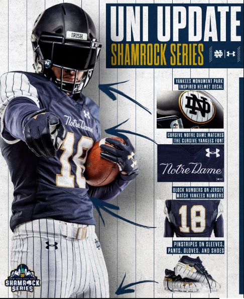
The 8th Shamrock Series uniform, to be worn on November 17th against Syracuse inside Yankee Stadium, was unveiled this afternoon. There were whispers leading up to the announcement that the one-off uniform would lean heavily into the Bronx Bombers and in that regard they certainly did not disappoint.
Let’s grade this thing.
Concept: F
This is something that ruins it for me and is a hurdle that can’t be jumped over. I’m not a Yankee fan, and as big as the fan base for New York may be, chances are you’re not either. Why would you create something that so many Irish fans won’t like to associate themselves with or wear on their person?
In addition, the kneeling to another brand is a bit disheartening while the cross-sport motif is strange and a bit bizarre. If the Chicago Blackhawks do something similar when they play at Notre Dame Stadium for the upcoming Winter Classic in 2019 will Irish fans think that’s cool? Please don’t do that, Blackhawks.
At most, this game deserved something small to commemorate the event and tie in something associated with the Yankees. To go full dress-up in a Pinstripe motif goes overboard.
Colors: B-
This will be only the second time in the modern era that Notre Dame will wear white pants, and it’ll be the first time the Irish sport a predominantly blue and white uniform with minimal gold trim. Taken without the attachments to the Yankees the color scheme looks pretty sharp overall.
Of course, the Yankees wear white jerseys at home so this football version does give off the vibe of a spring training outfit worn by New York. Trust me, I wouldn’t advocate a white pinstriped jersey in this situation, I’m just saying the mixing of the sports gives off a weird end result where Notre Dame is the home team and not in Yankee home colors.
Execution: C+
I’d be the first one to tell you pinstripes wouldn’t bother me if they weren’t attached to the Yankees. There’s really nothing throughout the entire uniform that I hate or that I think is truly ugly.
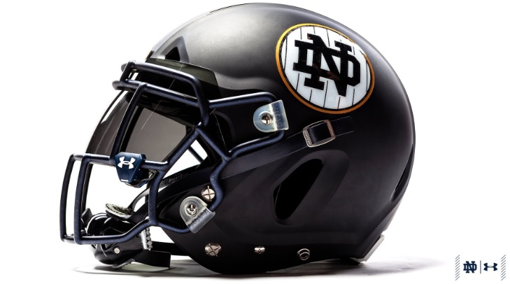
The helmet is fine enough. It’s understated, at least. I would’ve liked to see the gold circle trim a little thicker (in general the gold gets lost on this uniform) and it does look like something a Wall Street banker would have in his office if he was a fan of both teams.
The Yankees script across the chest is fine, I tend to think Notre Dame loves them some cross-brand script and that it’s cooler than in reality but whatever. The pinstripes on the sleeves look really dumb–and since the jersey overall isn’t really that outside the traditional home offering–this is probably the one Irish jersey I’d be least likely to purchase. During games on the wider televisions shots it will look okay–I can already tell from certain angles the pinstriped shoulders will look washed out and hard to recognize unless there’s a tight shot of a player.
You could make the case these are the best cleats Notre Dame has worn in the Shamrock Series. Although, I’m wondering if the colors should’ve been reversed so the pinstriped pants run into the pinstriped design on the top of the cleats?
The flat navy blue helmet throws everything off, in my opinion. Upon release many thought the helmet was actually black. A little research indicates Notre Dame and the Yankees share the same navy blue pantone color, although in practice this isn’t the case. The Yankees blue is really, really, really dark and sometimes imperceptible from black. Notre Dame typically uses something a little lighter. So, the uniform looks like a Yankees helmet and everything below that is Notre Dame blue. It’s an odd combination that might not have been thought out that well in the planning stages.
Overall: D
Look, there are uglier uniforms out there. We can point to the 2012 Shamrock Series and that’s fine. However, something should be said for something ugly or audacious actually having some character or be charming in its own way. One of my problems with Under Armour is that they too often fall into the trap of having to design something around an idea where certain elements have to have meaning. Sometimes, just designing something from pure creativity–and I’d include the 2015 Fenway uniform in here–ends up giving us something more memorable.
This uniform somehow combines relative simplicity with being super cheesy. It tries to pass itself off as being stately and yet all I see is something really chintzy. It may not be the ugliest of the bunch but this is by far the least cool Shamrock Series uniform in history.
What’s funny is that the accompanying apparel for sale right now is actually some of the best of the Shamrock Series. A lot of that stuff is aesthetically pleasing, again, if you can get over the pinstripe motifs in certain instances. The problem is I don’t think many will be able to do that, and I will be shocked if all of this stuff won’t be the lowest-selling gear since the neutral site game was incorporated.
Full look pic.twitter.com/gSh867wjc9
— Chris Bacsik (@NDFBEquipment) August 16, 2018

Actually quite surprised they didn’t attempt the monogram on the helmet in the Yankees “NY” script.
Edit: got it working
I AM a Yankee fan and think this is butt ugly.
At first glance I thought this was a Steeler helmet.
Dumb concept IMO.
I was all set to not care. Then I saw the pants.
Savvy Jack is a genius! Honestly, what else could unite every corner of the ND internet in such a way? Everyone is on the same page. Remarkable.
Ugh it looks like a set of baseball pajamas I had in the early 90s.
And the Blackhawks already have a history of wearing stellar green jerseys, so I would fully expect them to wear those in South Bend. But yeah they’re not going to try to tack on any weird ND specific touches.
Not just a swing and a miss, but on the follow-through they hit the catcher attempting to throw out the runner from first and he is called out for batter interference. Double play to end the damn game. These aren’t the worst things I’ve ever seen for ND concept jerseys, but they’re the worst things that have actually been turned into REAL ND jerseys.
Fugly!!
The worst thing about all of this is that they potentially have 3 months to fix this. But they won’t. I hate when people or company’s or whatever level make horrible decisions, then refuse to acknowledge it was a mistake and just go with it, and often time even insist that it was a success.
People make mistakes. And most people are fine with a first mistake. So why is it so hard for people to admit that they are wrong?
Sweet mother of god, what a disaster.
The sole positive quality is that the design makes ND’s priorities pretty apparent by practically screaming “cash grab”. Should we prioritize setting up a schedule to bolster the team’s resume while trying to avoid a death march? Nah, let’s put on a carnival act to sell mercy at the bookstore.
I would give the execution a lower grade. Concept aside, it looks like they rummaged through a high school gym’s closet and built a uniform out of whatever they found. It just feels thrown together.
Better NYC themed ideas:
Statue of liberty uniform, including dress, and forcing players to carry a torch in one hand all game. Hey, she’s green!
Sewer alligator uniforms, where the helmet looks like the mouth of a gator. Or subway rats.
Staten Island Ferry orange, with a bunch of images of little windows wrapping around the body.
Tom Brady’s magician costume from the met gala. And coaching staff wears whatever Gisele had on.
Brooklyn hipster. Plaid jersey, skinny jeans pants and socks, cleats that look like boots, underarmor with one arm a sleeve of tattoos, helmets that look like the hipster haircut (everyone knows what I mean right?) and comes with fake glasses.
Think we could 18S to mock these up and pitch them to UA?
Apropos of nothing, but I thought this comment from Bill Connelly was spot on:
https://www.sbnation.com/college-football/2018/8/15/17604372/georgia-football-2018-preview-schedule-roster
“Smart signed two four-star freshman WRs (Kearis Jackson and Tommy Bush) and landed one of the offseason’s highest-touted transfers in Cal’s Demetris Robertson, who caught 50 passes for 767 yards in Berkeley in 2016. The NCAA’s Random Eligibility Determination dart board declared he can suit up this year, too.”
Your title says it all Murry. Awful.
As good as much of the associated swag (not the unis!) looks, though, I hope folks don’t buy it. It only encourages them to do something dumb like give up a home game to go to New York the week before flying out to USC.
Who cares, as long as we can sell some more swag. We’ve turned into effing Disney.
Just flat out ugly.
I don’t completely hate them, but I agree with some of E’s complaints. The biggest issues for me is the mismatching blue on the helmet and jersey (maybe sticking with a gold helmet would have been better?), and then the pinstripe sleeve would be much better if it was a stripe instead.
I think these wouldn’t be nearly as terrible if they 1) got rid of the white sleeves – just a blue jersey, and 2) made the helmet the same blue. They’d still not be great – as mentioned, they would look like Spring Training – but they’d look much better. And I can already predict a rainy game and suddenly those white pants become too risqué for TV.