With the updated home uniforms recently announced, we were just talking about the attempt to wear shiny gold player numbers on the Notre Dame blue jerseys. For the 2024 Shamrock Series uniforms, the school simply says, “hold my beer.”
On Wednesday, Notre Dame released their 2024 Shamrock Series uniforms to be worn at Yankee Stadium against Army later this November. The school teased out a video yesterday and released a longer video today (just like last year) releasing the new alternate uniforms:
Sell Like a Champion Today#GoIrish☘️ pic.twitter.com/c8OJQrHK0Q
— Notre Dame Football (@NDFootball) July 24, 2024
Playing off the famous 1924 Four Horsemen game in New York City, the uniform color is a gray-ish blue which includes blue pants, as well. According to the publicity photos, Notre Dame will be wearing their standard gold helmets with the uniform.
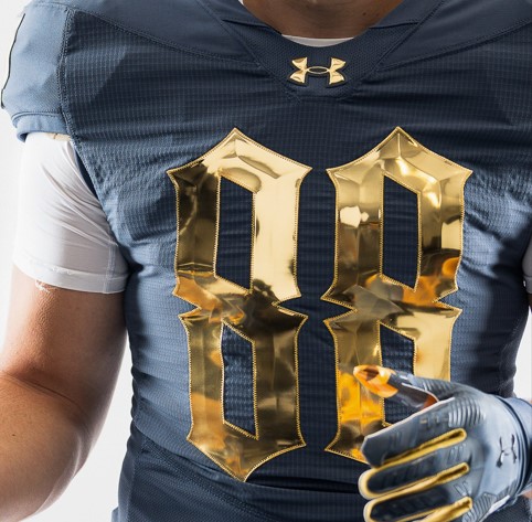
The highlight of the uniform are extremely shiny and beveled player numbers and monogram.
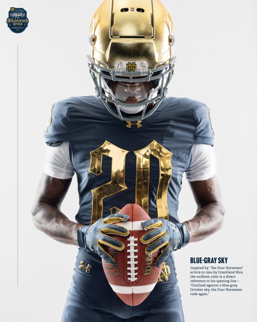
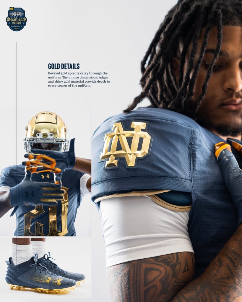
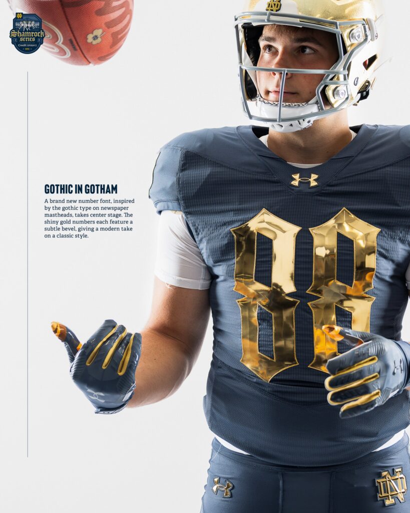
The gothic type numbers are also an interesting touch. I’ll also note they even brought the bevel to the logos on the pants too.
In the history of Shamrock Series uniforms, these most resemble the 2014 edition worn in Indianapolis that also utilized a blue-on-blue jersey/pant design. That day, the Irish also wore a slightly different gold helmet with a blue monogram logo.
Here’s a look at the Shamrock Series logo, as well as a screenshot from the video with the players (sadly without the helmets on).
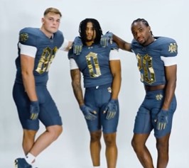
I like these, probably a lot.
They’re just different enough to make them look unique but it still looks very much like Notre Dame. I’m all for a different shade of blue, and would argue Notre Dame could use some rebranding on that front with the regular uniforms, although that’s a topic for another day. I like the way the shiny gold and blue-gray color are working together here.
Don’t sleep on the white undershirts and socks choice, these decisions matter! Even with blue golves and cleats I like that they didn’t swallow up everything in blue or gold.

We’re wearing gray and gold in a game against Army, whose colors are…black, gray, and gold.
lmao
Dang, it took 137 years, but ND finally is playing a game against a team who has the same colored uniforms.
Looking forward to our orange uniforms for the next game against Syracuse.
A Shamrock Series game against Syracuse in Ireland with ND wearing Orange/Green/White unis would be cool as hell.
Well we’ve been to Dublin twice in the last 12 years, why not switch it up and have a game in Belfast?
I’m not well-versed in Irish history, nor do I claim to be, but my gut reaction to that idea would be that ND wouldn’t want to look like they’re “making a statement”. Easy answer is that Belfast hasn’t been particularly kind to Catholics and bringing in a team called the Fighting Irish might have some negative connotations in, what is technically, the UK, not Ireland. Also, a quick look at Belfast airports and they lack any direct flights to North America.
As resident hater of most new uniforms, I think they’re pretty decent. I was expecting them to be green again like the last Army NYC game, but this makes sense.
Wearing green against Army makes sense. The peak of that rivalry, in the 1940s, occurred when ND wore green as the regular jersey.
These do not make sense at all.
“The thing I say/want makes sense because of reasons I state” – “These uniforms are bad because they don’t make sense, even though the reasons for them are given and make sense”
what
I think he needs them to be orange and black.
Don’t threaten me with a good time
Curious just how shiny those shiny numbers will be. Any possibility of reflection of stadium lights into players eyes? (Are gold or chrome helmets shiny enough to do this already? Would have preferred a very thin outline of the numbers, probably the cream color of the horses in the Shamrock Series logo.
I like these! The numbers might not be readable during the game, but hey, they’re playing Army so it does not really matter. The announcers will be like “And there’s a pass down the sideline for Notre Dame’s seventh touchdown today”
This is different, so I don’t like it.
I’ll blame Swarbrick again
His legacy just lingers!
He’s just lingering there, Swarbrickly
Weyulllllllllllllllllll his Under Armour stock deal isn’t doing so hot
I mean besides The UA and ACC deals not living up to the hype, NBC trying less and less with the tv deal, the football HC causing a panic by abruptly leaving, the MBB coach having to be forced into retirement after the program tanked, and screwing up the season tickets, who can argue with what Swarbrick has done?
That patch would be nice to have, if it didn’t have the bank name. Maybe “Army vs. Notre Dame NYC 2024” instead.
You don’t wanna rep Credit Union 1?
You picked up on that, eh ?
People are asking…can you make fully beveled pants?
I would have made the numbers white with a border of that super shiny gold. Think it would have made the numbers pop more, especially with the white undershirts (which feels weird saying considering they are ridiculously shiny gold). Does the gothic font make the numbers taller than normal? They seem kind of tall, skinny and harder to read, even in photos. But that might just be the shiny bevel.
ND obviously has the best color scheme in CFB, as per the recently published white paper on iconic sports uniforms, but I will be building my new university in NCAA 25 with this palette. Who has the RGB code?
UA uniform with bluish gray. ND sure knows how get the millennials going.
I tapped into some sources for this info*
*This is entirely made up.**
**But could be close to accurate.
Whatever it is, it’s beautiful
I have really grown on the shamrock series and it’s silly one off uniforms lately honestly
like yeah i would hate this if it was ever worn again but doing a grey uniform bit to honor a game played on black and white tv is silly and fun and we’re losing a lot of that in the new age of college football
Uniform post has 3.5x as many comments as the fall offensive preview; Eric has truly found his audience
Shamrock Series apparel has dropped:
https://nd.spirit.bncollege.com/c-2220