The journey to display the best high school football uniforms in the United States enters our ninth and final installment. The summer’s most anticipated article is finally here. Last week, we looked at the home of Keon Keeley, the home of Luka Massa, and the home of Chinedum Ndukwe rounding out a strong group of schools.
Now, we give you the 3 best uniforms in America.
Our Countdown So Far:
#27 Vanden HS, California
#26 McKay HS, Oregon
#25 Bishop Gorman, Nevada
#24 Orange HS, Ohio
#23 Mountain View HS, Idaho
#22 St. Vincent-St. Mary, Ohio
#21 Long Beach Poly, California
#20 Chaparral HS, Arizona
#19 Duncanville HS, Texas
#18 Manasquan HS, New Jersey
#17 Fenwick HS, Illinois
#16 Carroll HS, Texas
#15 Jonathan Law HS, Connecticut
#14 Gonzaga, D.C.
#13 Bixby HS, Oklahoma
#12 Zachary HS, Louisiana
#11 Northwestern HS, Florida
#10 Trinity HS, Texas
#9 St. Thomas Aquinas, Florida
#8 Punahou School, Hawaii
#7 Mission Viejo HS, California
#6 Berkeley Prep, Florida
#5 St. Xavier, Ohio
#4 Dublin Coffman HS, Ohio
As always, we welcome your ratings in the comment sections, plus any submissions especially if they are from small schools not well known throughout the country. On today’s countdown we round out the very best high school uniforms in the country with a trip to northern Georgia, central New York, and the pleasant weather of Anaheim.
#3 Buford High School
Location: Buford, Georgia
Mascot: Wolves
Enrollment: 1,682 (public)
If Notre Dame, Baylor, and Oregon’s uniforms had a baby they would be Buford High School on the northeastern outskirts of the Atlanta metro area. In recent years, the school has produced top recruits such as Isaiah Bond (Alabama, 2022), Harry Miller (Ohio State, 2019), and has one of the country’s top running backs Justice Haynes for 2023. It’s also the school of former Notre Dame running back Darius Walker.
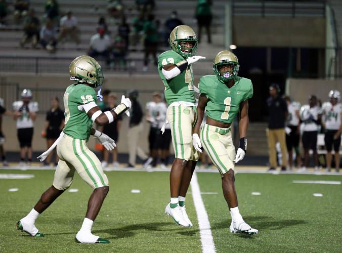
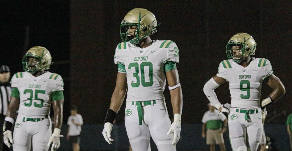
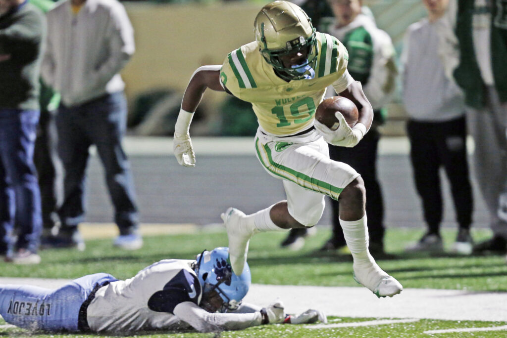
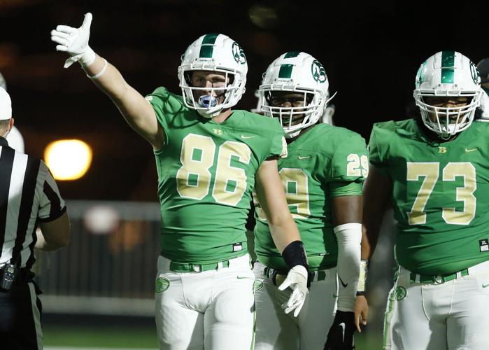
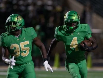
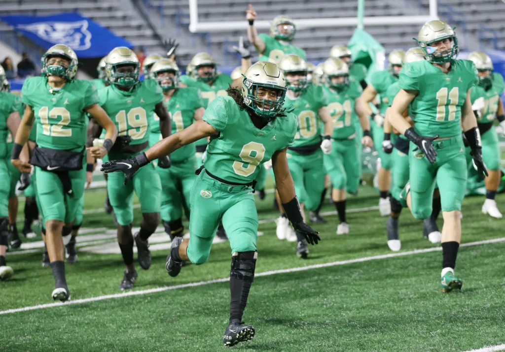
Buford’s traditional home uniform (the first in the set of pictures) are outstanding and serve as an example of why Notre Dame should return to this type of green and gold color combination. The white helmet set is my least favorite, but most of these are awesome. They can even pull off a gold jersey! Of course, they have really sharp Jordan uniforms which they wore this past season to win their 3rd straight AAAAAA state title before they jump up to Georgia’s highest AAAAAAA classification for 2022.
#2 Cicero-North Syracuse High School
Location: Syracuse, New York
Mascot: Northstars
Enrollment: 2,300 (public)
Our number 2 program comes from the north of Syracuse and is one of the largest public schools outside of the New York City footprint in this great state–and that’s with servicing only 10th through 12th grade. As such, they are usually one of the stronger football teams in the state but are coming off a tough 38-0 loss in the AA state semifinals this past year. Their official colors are royal blue, kelly green, and white but they bring a lot of black in their football uniforms. The school’s most famous alum is WNBA star Breanna Stewart.

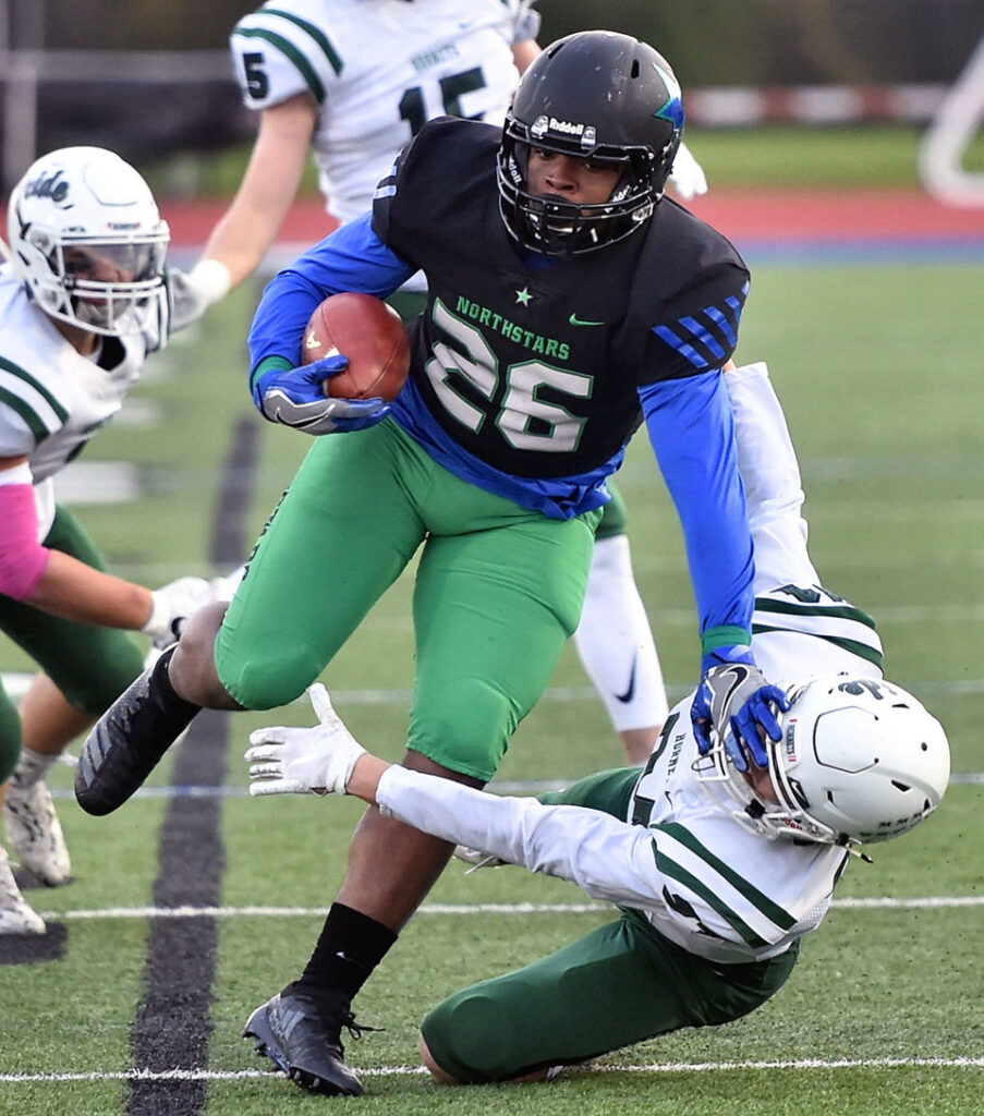
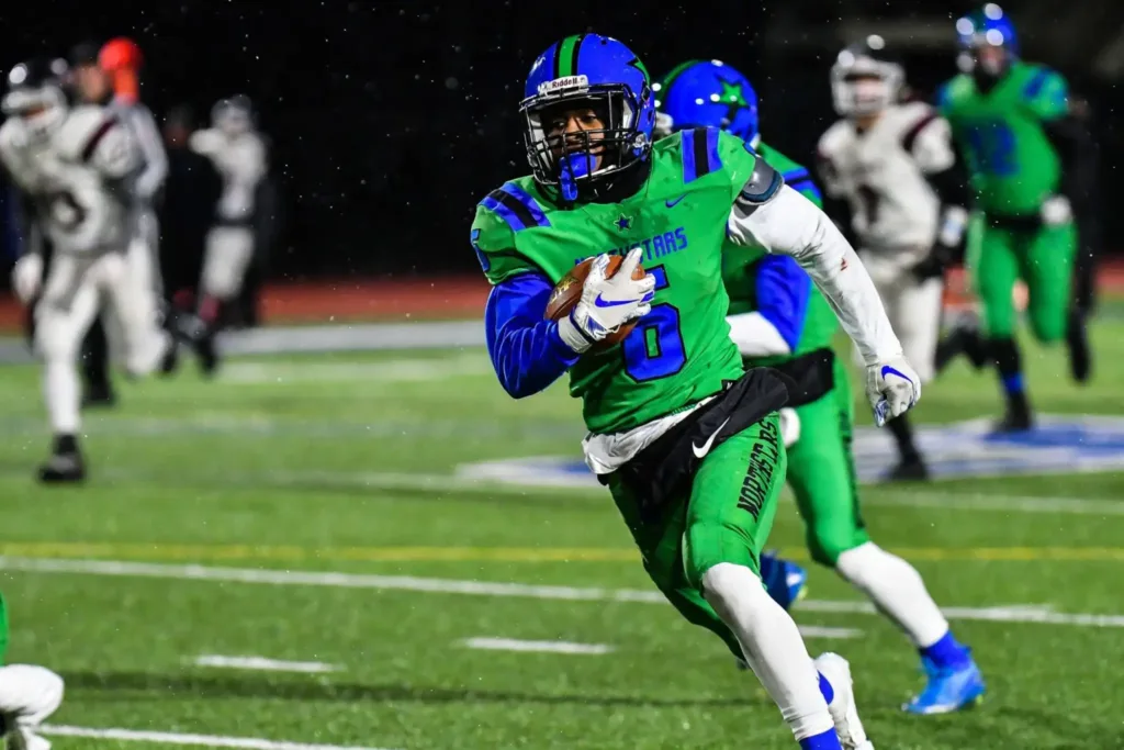
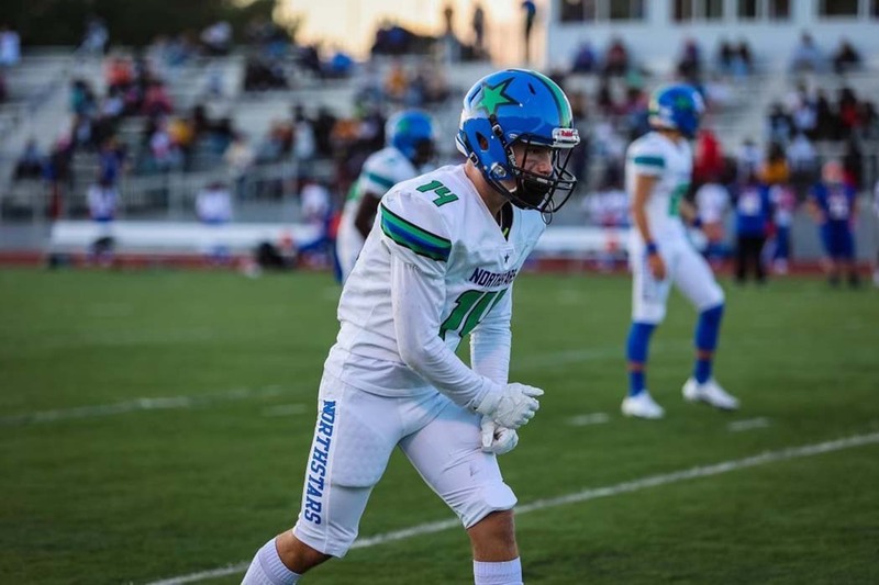
This is an elite color scheme with dozens of different combinations to choose from each game. CNS is perhaps the best team in the country at putting together combinations that give them an entirely fresh new look. Their shade of kelly green is key to this whole look. Also, their standard home uniform with the blue jersey and helmet stands out due to the lack of white. This is an out-there look and works well given their nickname, too.
#1 Servite High School
Location: Anaheim, California
Mascot: Friars
Enrollment: 765 (Catholic, all-male)
The best high school football uniforms in the United States of America belong to Servite High in the northwest suburbs of Anaheim. This is the former home of Notre Dame stars like Steve Beuerlein, Troy Niklas, and Equanimeous St. Brown. Their look is straight and to the the point. Black, white, with a splash of gold. Their school crest on their matte black helmets is phenomenal. The “S” and “M” standing for Order of Servants of Mary who own the school.
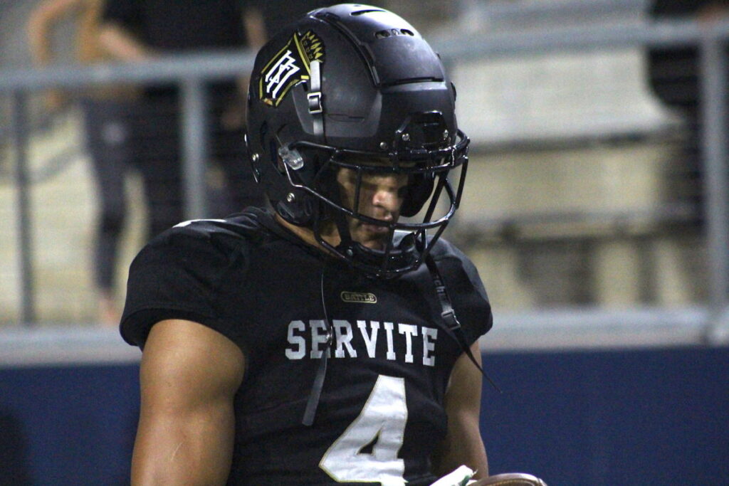
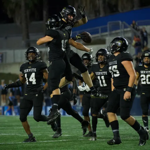
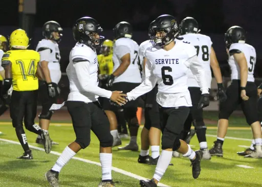
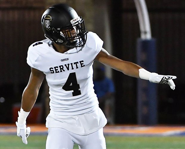
For the last 20+ years, Servite has worn all-black at home games. Out of all the monochrome black uniforms in football, at any level, I think this is the best. I don’t know they there’s a small “battle” patch on the chest but it looks good. As does the cross above the numbers on the back. Also, notice the faintest of gold outline on the numbers with the black jerseys. Not to be outdone, their all-white uniforms with the black helmet is also fantastic.
All solid, but I still think some of the earlier ones were better than these. Servite looks like unis from The Longest Yard.
That’s Texas Tech though.
Or were you thinking the original?
Original, of course.
Does Georgia really use a AAAAAAA designator instead of 7A? That’s absolute lunacy.
Also, those Cicero look like they were inspired by Space Jam, hard pass.
Which is awesome.
Those Cicero-North unis are easily the worst in the countdown and among the worst I’ve seen lmfao. Those colors all clash in such unpleasant yet boring ways, like a 12 year boy old did a create-a-uniform.
I think they might be from a color combo in Mutant League Football
I’m gonna need some more thoughts on blue/green/black clashing.
They clash.
Colors in this gif also clash, tbh
The final test:
There’s no black, these colors don’t clash.
Maybe I like it for the clash.
There’s an old adage that ‘blue and green should never be seen’. I suppose there are some looks that it comes off OK, such as the Seahawks. Cicero doesn’t pull it off. The black just highlights the clash. The white uniforms soften it a bit, but the colors are more of a dressing on that uniform. The Grey in Seattle’s colors works a lot better in unifying the blue and green than the black in Cicero’s. Overall I think the blue/green combo has to be the same tonal group for it to really work.
That’s silly, IMO. I love these colors together.
I think of the CNS uniforms as a cosmos version of the old Timberwolves colors.
Florida Gulf Coast U also made it look good. I don’t have anything against it. It’s jarring, but the unis don’t look terrible. I do think it’d be better with gray over the black, though.
Probably, also like how the ND gold helps a little with the blue/green uniforms. Jarring, like you said. But, I like when people take chances.
If they balanced the amount of each color more finely, fine tuned the tones a bit, and got more artful with their logos (that Star logo on those helmets is atrocious), there is some potential. But it’s real ham-fisted execution here. The green jersey/green pants and white/white combos aren’t the worst, but the other two are *real bad.*
I would’ve thought the green on green would be the least popular.
They’re standard logo I like a lot, not sure why they don’t use it on the helmets.
It’s because this logo also sucks
If you put all these uniforms up on a wall, I think I would have immediately pointed at that first Northstars pic. Love it. Only one problem though, they should be #1.
^Eric’s mom
Illogical, if so I would’ve made Eric go to Cicero.
Wait, did Eric go to Cicero? I don’t actually know.
MOTS self-reply. Ok, first, I’m serious, I’m not just being contrarian. In the entire rankings, Cicero is the only one that I felt like I hadn’t seen a million times before. The vast majority of HS unis are college or pro knock-offs. I don’t even know how they get away with blatantly stealing even the logo sometimes. I hate that. It looks cheap and derivative and it’s unoriginal. And it’s super boring. Those Cicero uniforms are NOT boring. You could devote a whole article to just the four different versions pictured here. Somehow, they pulled off four TOTALLY different looks without straying from their core colors. My favorite color is that green, I love how it looks seafoam or mint in one pic but more parakeet in the one under the lights (I know this is the photography/filters/processing too but still, I love it). Side note: If you have young kids, dress them in mint green, they’ll look sharp and you’ll always be able to pick them out at the park/playground).
And Cicero should be #1 because it looks like it came down to best traditional vs best non-traditional, and I’d pick non-traditional every day of the week and twice on Sundays. Although, I do want a tshirt with that Servite logo on it, that is a beautiful piece of art. But the rest of the Servite uniforms are classy, but a little pedestrian for my tastes.
Really enjoyed these articles Eric, thanks! Great idea!
You sir are a scholar of truth.
Nah, I’m from Western not Central New York.
We should have an offshoot discussion where we post our HS’s uniforms. Mine were basically Redskins colors, but we were the Mustangs. Playing HS FB was a formative time in my life… but even then we knew the uniforms kind of sucked. The 80s mesh (though this was the 90s) was the best part, I think?
I’ll start
Tohatchi is the HS I graduated from. I think the uniform looks pretty good now, there have been some iterations of it that didn’t look so good.
like this one
My HS’s current uniforms look pretty good! I like the Milwaukie font. They definitely didn’t look this good when I played, can’t find a pic though, gonna have to search old hard drives.
Man #2 is legitimately ugly imo. Do you like the Seahawks jerseys too? (#3 and #1 are tremendous, to be fair.)
I don’t think it’s fair to the Seahawks to bring them into this conversation. They have good balance of complimentary colors and a cool logo; the CNS jerseys look like someone had an idea for something but wasn’t able to articulate it to the uniform designer.
Did you go to Liverpool HS?
Everton
Just wondering because the 2 things you’ve been most passionate about is orange and CNS being the devil!
My HS was Orange & Black, a combo that’s hard to screw up. I don’t love their newer uniforms, but still doesn’t look horrible
(^^Can’t stand Geneseo’s uniform, which is a Packers ripoff)
And I don’t knowingly have any beef with CNS, just their clown-ass uniforms.
And now apparently you and your opinion, for adding them to this list, which you took the time to create and then I read and continue to read and comment on.
Hmmm…
Does. Not. Clash.
Incomplete. Guitar. Pick.
lol
(When I was there, it was just the interlocking UT)
Re: Cicero, I think if they put in some thing white stripes on uniforms 1-3, that would break up the black green and blue, which I would describe as… “chunky”
Black is black, and their blue is a darker heavier color as well. I also think in context, the green they use gives the whole uniform a dark, blended feel. Without any lights for contrast, it wort of blends but I’d say missing some harmony. Maybe like 1/8″ thick white stripes or outlines, etc, would break up the borders from the dark on dark colors.
Uniform 4 is pretty tight, but see above regarding the helmet, again, a little too color “chunky”.
And yooooo, servite’s uniforms, those are clean and mean!
All told, cool list, and it was fun hearing everyone’s thoughts regarding outfits, who knew there were so many fashionistas in the 18S community?
With all of our RB injuries, I wonder if the staff is considering potentially taking a grad transfer. Markese Stepp is entering the transfer portal as a grad transfer. He hasn’t really done much, but at this point, our depth chart is a guy who has only had 10 carries in a game 3 times in his career (and might be best suited in the slot), a guy who has 7 carriers for his career, and a true freshman. Stepp isn’t exactly exciting, but he’s a body.
Feels like he’s been in college since 2009.
Just saw the Liverpool away kits for this upcoming season – looks like there’s a 50/50 chance of them looking dope as hell, or look like absolute crap on TV broadcasts
Thinking they might have the same effect that a herringbone suit has during a news interview.
Spurs just released theirs, too.
I didn’t bring those up, because they, just like CNS, suck and look juvenile.
The Saints aways might be the winner