The top 50 alternative, secondary, or old primary logo countdown is entering the top 15 today. In this article we have a trio of Power 5 colleges and a couple of great logos from smaller schools.
As always, logos and information are courtesy of SportsLogos.net.
#15
NC State
Type: Secondary
Years: 1967-2005

NC State has cycled through several logos over the years and seems to equally favor their standard block letter primary and an updated front-facing wolf logo. In the 1960’s, the school came out with 3 new wolf logos. One, has been updated and is used often as a primary logo mentioned above. Another one, dubbed the ‘horny wolf’, is seen with a slurping tongue. The ready to pounce Tuffy logo above is my favorite of the bunch.
#14
Saint Louis
Type: Primary
Years: 1970-1984
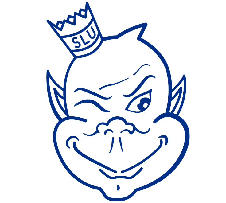
The Buddhu/cherub/devil good luck charm character of the Billiken is perhaps the strangest mascot in all of North American sports. Saint Louis therefore has used some absolutely wild mascot logos, and good on the school for not running away from this and using this mischievous looking elf. The above logo is their best and isn’t completely creepy.
#13
Purdue
Type: Primary
Years: 1980-1994
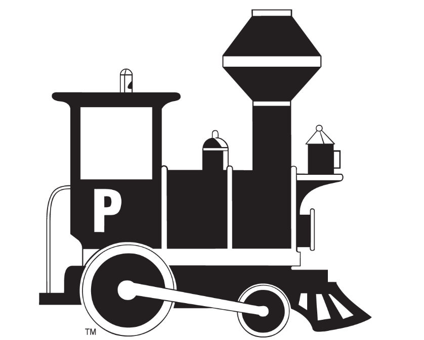
Apparently this was the primary logo for Purdue and I have no recollection of any such thing. For years, Purdue used 2 different variations of a much more busy and detailed train logo until settling on a slightly italicized block “P” logo in recent years. They are all very recognizable but I enjoy the simplicity and striking black and white boldness little choo choo train.
#12
Arizona State
Type: Primary
Years: 1967-2011
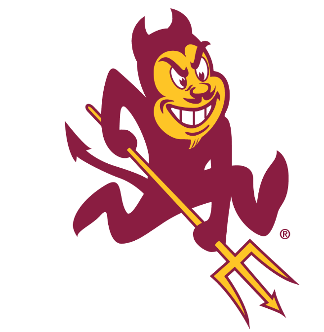
Ah, Sparky. Arizona State has maybe half a dozen logos that a lot of college fans would recognize and their current primary trident logo is by far the worst of the bunch. ASU still uses Sparky liberally with their branding, although officially he is not the primary logo anymore. Therefore, he is eligible to make this list.
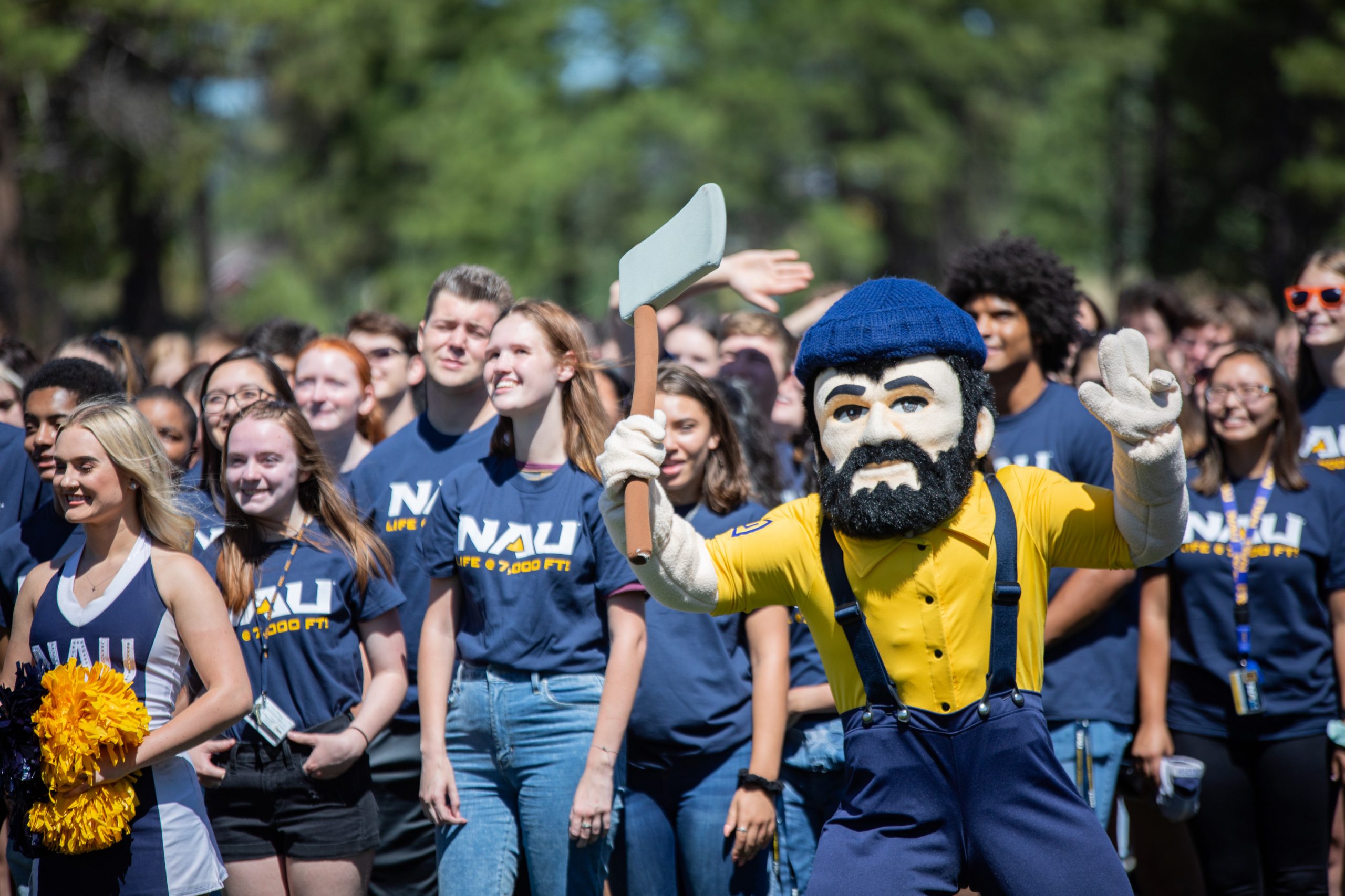
#11
Northern Arizona
Type: Alternate
Years: 1978-1987
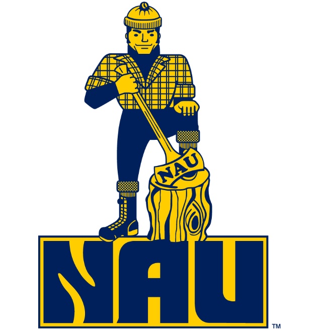
Northern Arizona went nearly 40 years with a burly lumberjack logo but since 2005 they’ve reduced things to an axe as the main design. It’s fine but doesn’t grab your attention much. This alternate design created 45 years ago has stood the test of time. Yes, it’s a little busy and I’d remove the script on the bottom since it’s on the axe anyway. The outfit is legendary and really personifies a lumberjack.