We have reached the mountaintop. Today we unveil the best alternative, secondary, or old primary logos from college sports. I think we’re going to go out with a bang and firmly place a cherry on this logo sundae.
As a reminder, special thanks to SportsLogos.net for all of these pictures and information.
#5
Tennessee
Type: Secondary
Years: 1987-1997

Help me understand things with Tennessee. They have the checkerboard pattern. They also have Smokey the dog. Yet, they use the Power T logo which gets mistaken for Texas quite often. For a decade, they used the hunter in a coon skin cap logo with “Tennessee” written underneath as a primary logo. I get that guns in general aren’t part of logos that much these days. I love this “VOLS” script with the star and lines through the right hand side.
#4
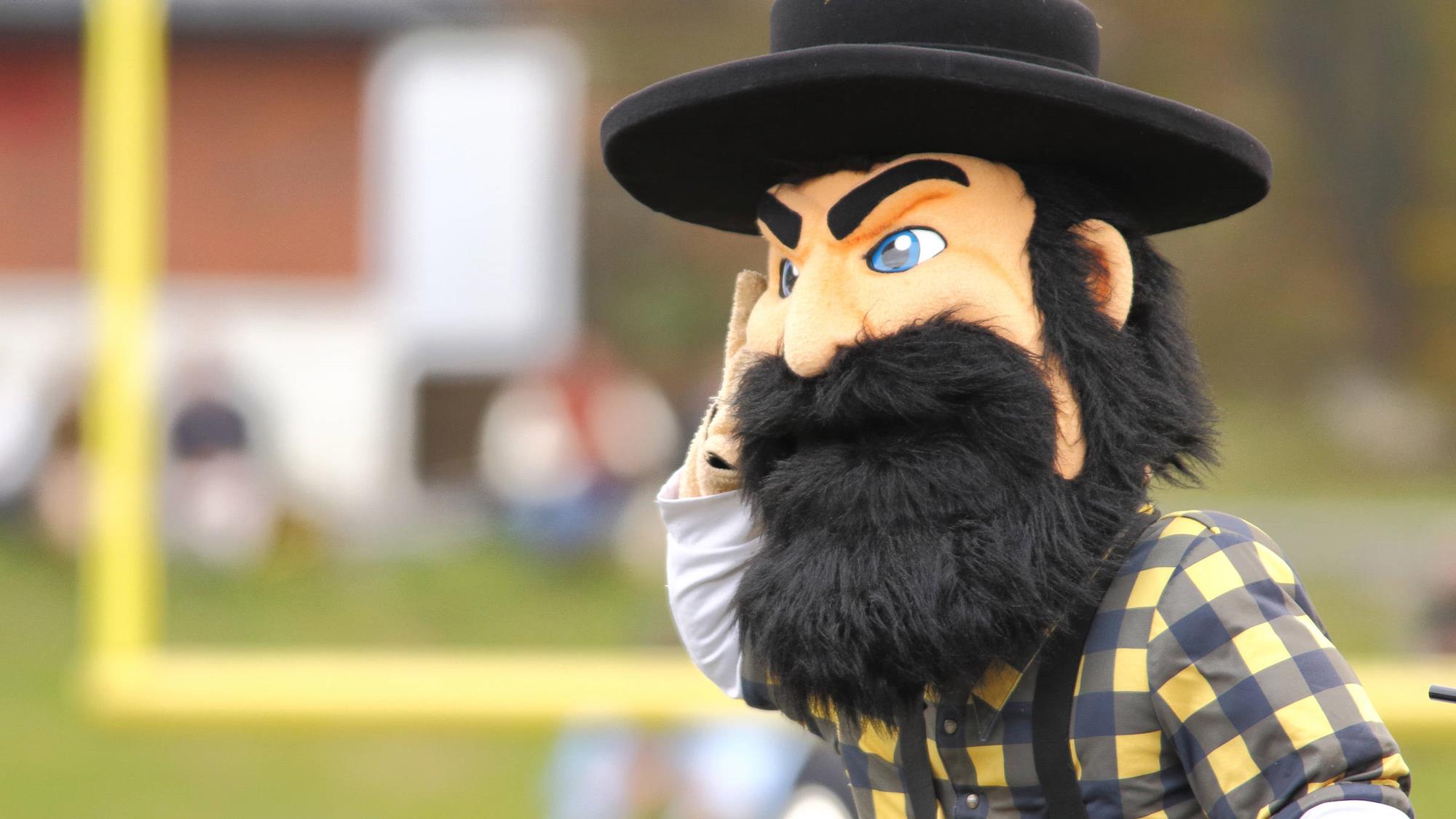
Appalachian State
Type: Primary
Years: 1976-1986

App State went 13 years with this weird man face coming out of a mountain logo in between their traditional “A” logo with “Mountaineers” written in small lettering inside of it. You have to go back to the 1970’s and 1980’s and see a couple really great Yosef logos like above. To the school’s credit, they brought this logo back in 2012 for a throwback game and it proved so popular they brought a tweaked version as a secondary logo ever since.
#3
Providence
Type: Mascot
Years: 2002-Present

I’ve only used a couple mascot logos in this countdown and I’m making yet another exception today. Most of Providence’s primary and secondary logos for the school today are fine. Their main logo today is a side profile hooded friar which is recognizable but not a great design in and of itself. The skating friar logo (the original stretching back to 1972) has been something I’ve always adored. They updated the logo in 2002 (basically adding the additional black outline) when the school introduced all new branding.
#2
Georgetown
Type: Secondary
Years: 2004-Present
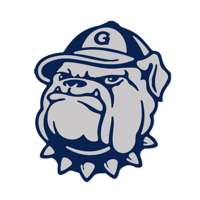
It doesn’t seem possible, but yes we are approaching 30 years(!) since Georgetown ditched the Jack the Bulldog logo in favor of a terribly boring block “G” logo. The use of the bulldog logo stretches back to the early 1960’s and was redesigned and patented in 1985. Ten years later (when they changed primary logos) the Jack logo was updated for a slightly younger look and then brightened in 2004 as seen above. Georgetown needs to bring this back officially on all sports uniforms.
#1
Tulane
Type: Primary
Years: 1920-1924
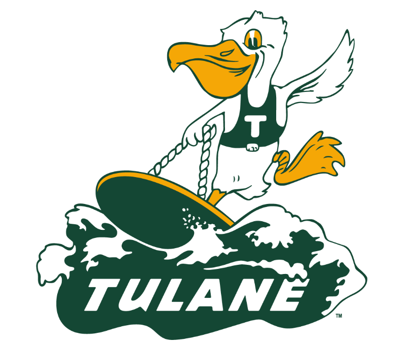
What can you say? Well, one thing is that Tulane’s angry wave logo is among the best in the country today. As a primary logo it’s technically not eligible for this list but the original design from 1964 could’ve been, too. I’m not sure you can beat the surfing pelican logo. And it was created over 100 years ago! Whomever that person was who came up with this should posthumously receive the Presidential Medal of Freedom.
These are all good, but I think 6-10 were better (although you could keep Tulane #1).
I do like how the various hats are employed on #2-5.
That Vols logo has 2 separate logos that would both be top 10 combined into 1. It’s almost overwhelming in its gloriousness.
Does Tulane have a creative team devoted solely to design and style? They have the best colors, the best uniforms, the best logos, the best The Boot, the best midfield design*.
*actually the third best midfield design behind LSU (must be something in the LA swamp water inspiring midfield artistic greatness) and ECU.
Even their boring-ish T logos have character with the waves. The ’86-’98 one is so nice for a single letter logo. https://1000logos.net/tulane-green-wave-logo/
This series was fun!