Monday morning brought us the return of the Shamrock Series uniform drop, an annual event that dazzles many but had been skipped for 2019-20 as the series gets ready to re-boot itself at Soldier Field against Wisconsin later this season.
Enough with the small talk, let’s rate the new uniforms.
HELMET
Most were expecting something much more bold or at least different than the standard helmet. That is not what was unveiled. The Irish will wear their normal helmets against Wisconsin with one small change at the back of the helmet.
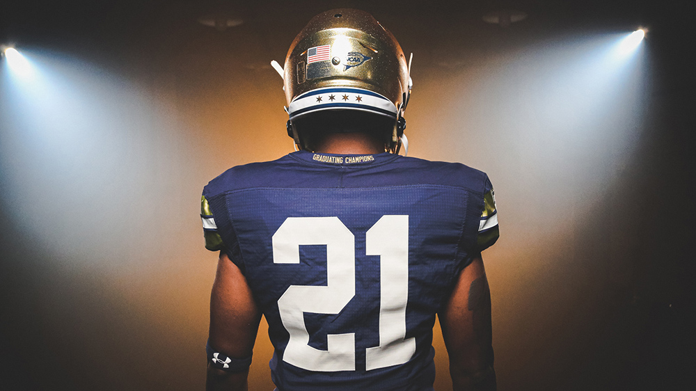
On the back neck bumper there is a nod to the city of Chicago flag. Chicago really loves their flag, it’s probably the most famous city flag in the country by a wide margin, so this move felt inevitable of course. I will say, this is a cool placement. You’ll see it a lot on TV but it’s not that obtrusive.
JERSEY
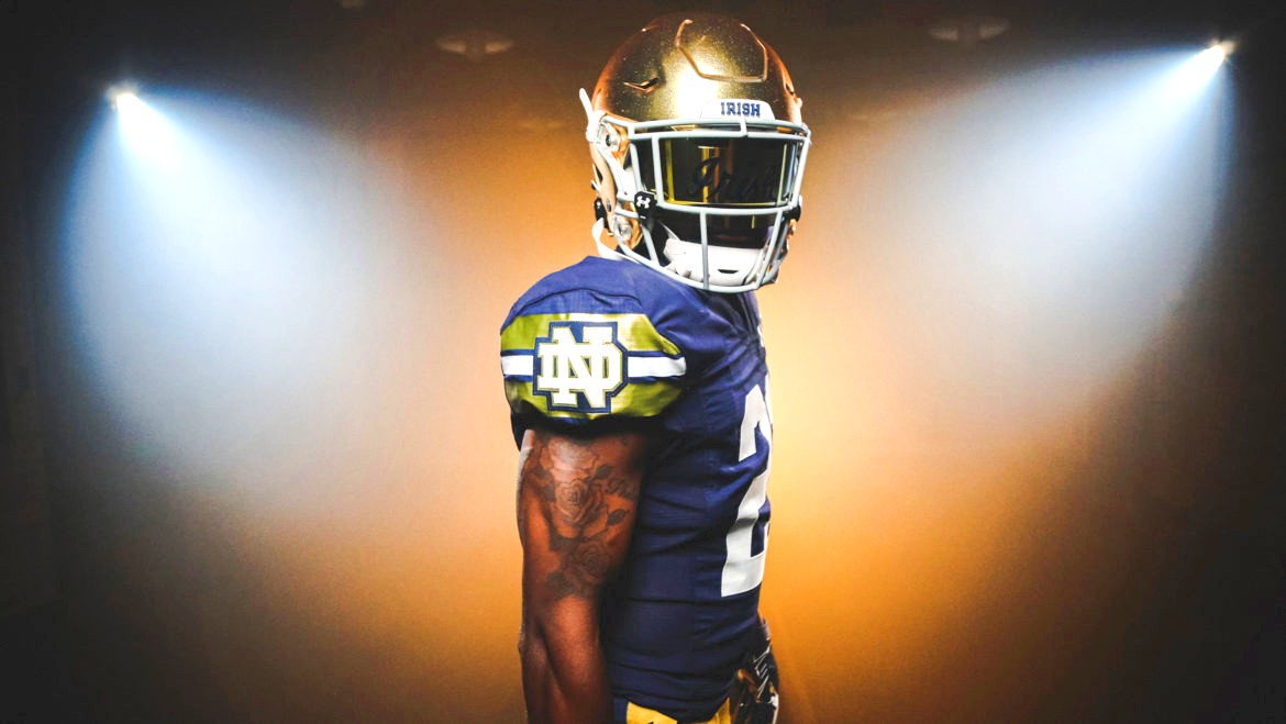
The leaked jersey that surfaced over the last couple weeks turned out to be right on the money. Most prominently, the sleeves feature 2 metallic gold strips surrounding a thinner white stripe with the Notre Dame monogram placed in between. From the school release this is supposed to honor the rivers and waterways of Chicago, which okay!??
I have to say…this looks quite nice!
I really wouldn’t be opposed to this sleeve making its way on to the standard home jersey. Remarkably, we are heading into the 12th(!!) straight season with basically no updates to the entire uniform and this could be a medium-sized change that would break the monotony.
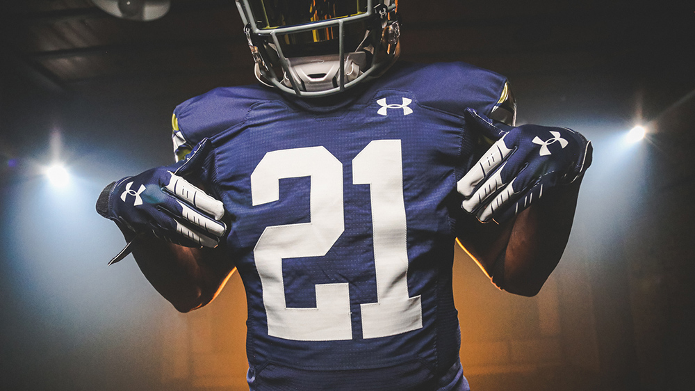
The jersey numbers are block slab-serif type (meant to symbolize Chicago’s City of Broad Shoulders guys come onnn) in white with no outline, which I love. At first, I was hesitant to put so much metallic gold on the sleeves but without gold on the numbers I like the balance. I’ve been recommending the Irish remove the gold trim from the numbers for years.
On the back collar there is the inscription, “Graduating Champions.” The blue jersey seems lighter than normal but that could be just the presence of the large white numerals making it seem that way.
PANTS
The pants are similar to the standard set worn by Notre Dame, although in the promo shots they don’t appear to be quite like the mustard variety nor the Vegas gold of yesteryear. These pants seem to be a little more deeper metallic gold to me?
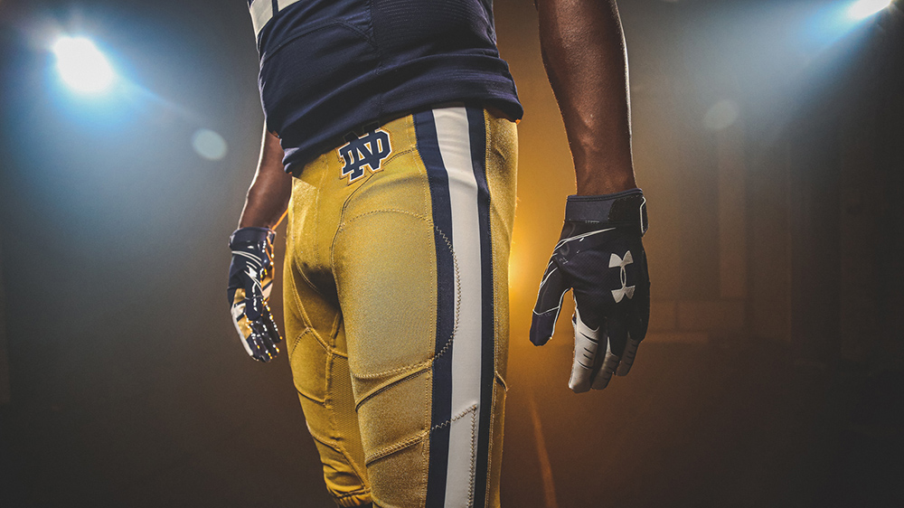
There’s a wide blue-white-blue stripe down each side of the pants which works well with the jersey sleeve striping. Notre Dame infamously wore stripes down one side of the gold pants during the 2012 Shamrock Series game (also in Chicago) but this will be the first time in school history that striping is used for both legs with the gold pants.
The press release says this is in homage to the 1924 National Championship team that played at Soldier Field (against Northwestern on 11/22) but I guess it’s more to copy the Chicago Bears pants?
SOCKS/CLEATS
Nothing too exotic here as the cleats are primarily blue with gold trim. In all of the renderings and mock ups the uniform is paired with plain blue socks.
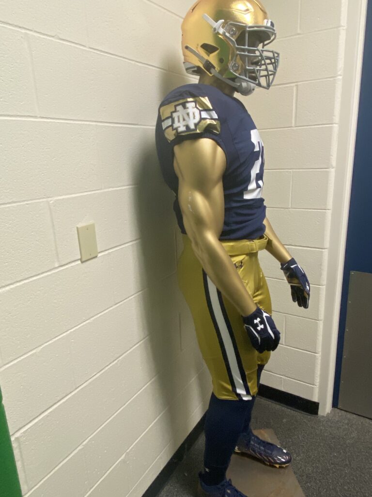
In the past, the players have all worn the game-specific cleats (whereas in other games they wear a mish-mash of differing colors) for the Shamrock Series. The team has been good in the past about keeping this aspect of the uniform, well, uniform.
Final Grade: B+
It’s not wild, and that’s okay! I would prefer something to be a little more creative for these occasions (a big swing and miss is acceptable for a one-off) but this more muted design works pretty well.
It’s also obviously supposed to be a Green Bay Packers uniform–and since Under Armour isn’t exactly swimming in cash lately–got repurposed for this Soldier Field game. This is a Notre Dame road game and it makes no sense for the Irish to be wearing blue.
This would also explain the nonsensical Chicago touches on the jersey and pants. I would bet money there was a different helmet to mimic the Packers in the works (perhaps with a stripe down the middle) that never made it to production and instead they threw the Chicago flag bumper on the back of the regular helmet and called it a day.
All’s well that ends well, I suppose. Maybe this opens the door to wearing 1918 Notre Dame throwbacks when Curly Lambeau played for the team when the return game against Wisconsin gets played in Green Bay in 2026? Both the Packers and Notre Dame wore identical uniforms in the late decade of the 1910’s.


Good laydown, and I hope they will wear them with success. But how do they get to wear blue anyway?
These were made for last year’s game at Lambeau when ND was supposed to be the home team. I guess they just decided to roll them out for Soldier Field, too.
There’s that, plus the fact that Wiscy could wear either white or red (I think they’re going with white) and it wouldn’t affect our decision to wear blue. Love me a good color-on-color uni clash!
Also, no idea where to place this remark, but I see that the Toledo game is only going to be streamed on Peacock. That means that none of us overseas have a prayer of seeing the game? Anyone have any useful advice before I launch a major effort with the AD to shame him in to action (ref his words in introducing this [wonderful] scheme, about the “ND family around the world”?
It appears you are correct, Peacock cannot be accessed outside the US. That sucks.
I understand why NBC and ND are doing this, but I really hope it’s a flop.
It’s the way the world is going, there’s going to be way more streaming in the future. Especially with NBC shutting down the NBCSN channel later this year, I’d bet anything the spring game is going to be Peacock exclusive, like I believe it was this year.
Even if this doesn’t perform to expectations, I don’t really see it changing the overall landscape where the network is so heavily invested in growing this platform with some of their best content. Maybe the 2022 ND/Marshall game gets Peacock’d too? Wouldn’t be surprising to me at all if the non-P5 home game each year, at the least, is transitioned over for good.
Hopefully though they figure out better distribution, I believe Peacock isn’t in Canada either. They def need to make it accessible to those who want the content.
Thanks for the replies, all. I will have to check out this VPN deal, I guess. But I am going to try to energize the AD on the issue, as it affects his “world wide brand” claims, and hence credibility.
VPN is your friend. I’m binge watching Chicago PD now to iron out any issues before the game.
For what it’s worth — my forays have yielded a promise from a senior person in the Ath Dept that this issue will be fixed. They are just not sure how yet. But he seemed very credible and sincere (said the always innocent and gulllible ex-pat).
Benefit for cord-cutting, American-soiled, Slack users is that the game day chat should be real time for everyone (All 9 of us).
Not bad for a shamrock series uniform — I agree with the B grade. For me, the top SS special uni has been the all white unis (in Dallas?)
B+ feels right, which for shamrock series feels like an A+. Pretty happy with this if we’re going to have to do it
Agree with all of that. I was worried they would make a blue helmet for this game (ala the Yankee Stadium Shamrock Series game) in a nod to the Bears, which would have brought it down for me a lot.
I do like the pants, that’s a nice twist that fits. Wouldn’t really like the stripes on the top to become a fixture, but it wouldn’t be the end of the world either.
Chicago stars aside, if we at some point “updated” the look to be like this, I wouldn’t even complain. Not that I prefer it, but college football uniforms are a real crapshoot when the apparel company and school decide to shake things up a bit. I want to see them on TV, they’re kinda growing on me as I look them over
There’s a navy helmet with a gold shamrock on it floating around the Internet somewhere that I guarantee was supposed to go with this uniform but got scrapped for some reason.
And this jersey was made for the Packers, make no mistake about it. The numbers are huge because the Packers’ numbers are huge, and the pants and sleeve stripes both resemble the Packers’. An all-time “how can we BS our way out of this one” job by the UA marketing team to pretend this was a Chicago-themed uniform in concept.
The Packers also have 3 stripes on their sleeves. It looks nothing like our 3 stripes, but still closer than Chicago’s waterways.
I saw the navy helmet earlier, that was the start of my worrying!
I agree with you and Eric above that this is certainly the 2020 Packers jersey with a few slapdash Chicago features…But I don’t think it’s fair to say they were BS’ing away out of it, the Lambeau game was rescheduled to 2026, and the Under Armor/ND contract ends in 2024, so it’s reasonable to not risk being the sponsor by then. Or maybe they already had enough product on hand and didn’t want to sit on it for five more years, so make some Chicago alterations and go with it.
It does end up being a weak effort, but understandably so given how much the last 18 months has turned everything upside down.
The accompanied gear for the game:
https://www.bkstr.com/notredamestore/product/ua-polo-playoff-nd-navy-4xl—716295-1
Also has a strong, “We had a general idea for this Packers theme then stopped and decided to just slap the sleeve striping logo on it” kind of vibe too.
These feel like if navy, pitt, and Georgia tech all had a uniform love baby, annnddd, I think it looks kind of sharp. Just enough flash, but still pretty classy.
Maybe add the 2011 shamrock on the side of the helmet? Or would that be too busy?
Sort of off topic, but… Remember when ND caused a minor controversy by airbrushing out Chris Thomas’s tattoos on the media guide cover about 15 years ago? And here we have an official university publicity photo release featuring a heavily-inked arm.
I don’t know that there was any singular force that drove it, perhaps just the passage of time, but I’m glad to see the university adopt at least a marginally more “come as you are” stance.
That was 20 years ago. We are old.
I’m a little surprised these aren’t getting more complaints — I think the shoulder detail looks cheap and the numbers are a bit boring.
Low expectations, I think. I expected some sort of horrific orange and green Bears/Irish flag mashup.
Haha, yeah, that’s correct. I’ve seen some complaining in other place that this concept isn’t bold or different enough. But after some of the SS jerseys, I know my personal reaction is favorable when it’s not the wild swing (and usually miss) when they try to get really daring with a design.
But I can also recognize these jerseys aren’t really meant for my enjoyment and if the kids and players think it helps in a small way to make the ND brand cooler to them, then it’s well enough for one game.
I do wonder if it actually makes a difference. Back when Oregon broke ground in like the early 00s, maybe it helped them a bit. Bama and Auburn and Penn State and etc. who refuse to change their jerseys don’t seem hurt.
Everyone was freaking out about the “leaked” version, which of course was not fitted for one of our players but rather a fat kid shopping at Dick’s with a yen for giant retro 80’s jersey sleeves. These look fine to me. I like the stripes on the pants, and the big numbers without trim are a nice change of pace. I agree that the jersey *appears* lighter; in the photo above, they could almost pass for Washington Huskies purple.
After the atrocity that was the Yankee Stadium pinstripe dandy, this one is an A+ by comparison. In the end, winning the game is all that really matters.