By the laws of nature some sports uniforms have to be overrated. In order to qualify, a set of uniforms needs to be at least well regarded and respected in each of its sport. If we have sartorial disagreements today it might be on whether these uniforms are well liked by most of the public.
#10 Tampa Bay Lightning
I don’t know how a team named the Lightning features not even a touch of yellow or a volt color. If there’s anyone in the sports world with the right to use that as a secondary color it’s Tampa Bay. And yet, save for a super 90’s third sweater they’ve never chosen to go down this road.
Once upon a time, the Lightning uniforms at least had character. Now, they are very much Generic Hockey Team.
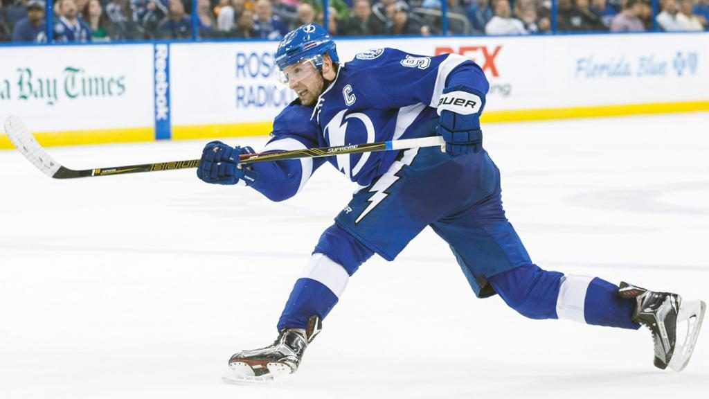
There’s nothing memorable for Tampa Bay except the fact that they look like a minor league team for the Toronto Maple Leafs. To be fair, the original Lightning logo left something to be desired and it’s great to still see the bolt on the side of the pants. Still, the logo today looks so boring like a generic Gatorade crest that was never colored properly.
#9 Seattle Mariners
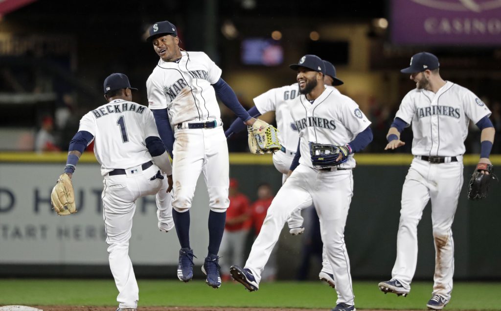
The Mariners caved in the 90’s by adding northwest green and navy blue to their uniforms–literally the two most chosen colors for changes in that decade. Today, Seattle keeps that scheme going with one very small yet crucial mistake.
They don’t wear the green-brimmed hats with their home whites like they did briefly during the Ken Griffey Jr. era. For me that’s a sneaky iconic look in baseball. Today, the Mariners relegate that hat to Friday home games when they pair it with the green jerseys.
#8 New York Knicks
It’s mostly the losing. The amount of losing in New York is making me dislike what should be classic and sharp uniforms. It’s making me miss all that black the Knicks used to plaster all over their uniforms.
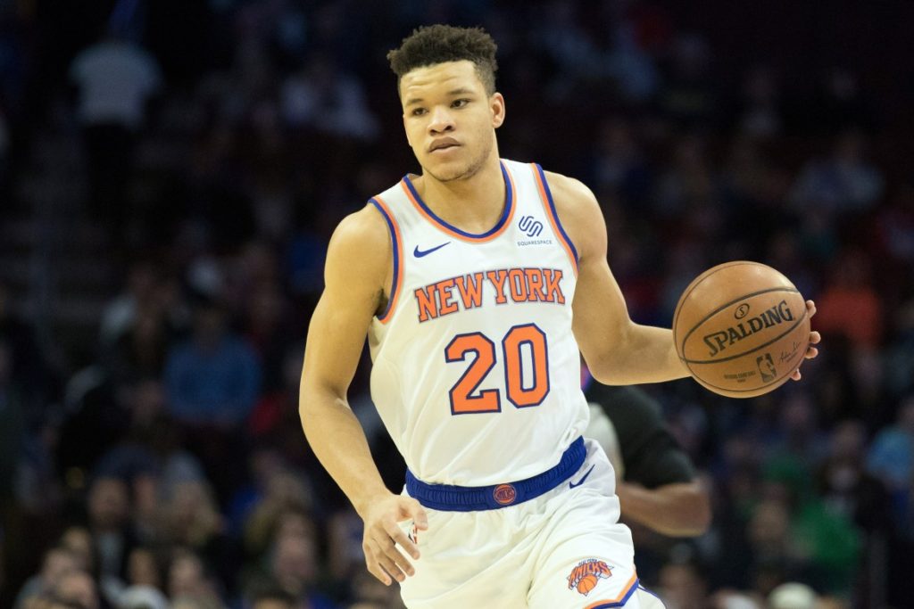
I do have some legit problems. Traditionally, the script on the Knicks jersey is far more arched and today the lettering is so small it looks like NEWYORK. Plus, I know the orange wrapped in blue has been used for 50 years but I wonder if the original blue inside orange might work better for next season.
#7 Winnipeg Jets
When the Jets came back from the dead as an organization their whole updated uniforms were well received–maybe not in the Top 10 of the NHL’s traditional-laden sweaters but perhaps in the next tier. Their sin is easy to understand, though.
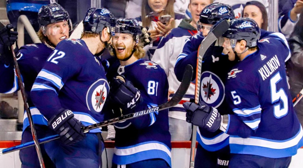
They went with muted colors compared to their original uniforms which contrasted well with the ice. Then they fell in the trap of a 21st century circular logo that looks like it should be a crest for the Winnipeg travel advisory bureau. Can you make a jet look less inspiring? There’s nothing worse than looking bland in sports.
#6 Los Angeles Lakers
The LeBron era for the Lakers has been weird and that’s reflected in their 2018-19 uniforms. The team attempted more of a throwback look and yet something about things just seems off.
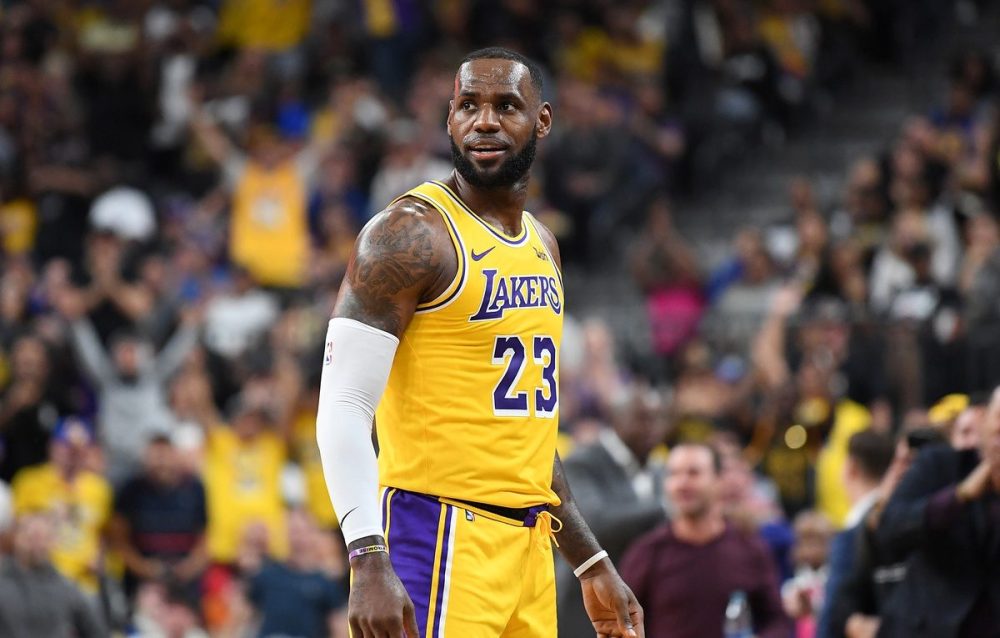
To their credit, the Lakers moved away from the hyper-bright yellow uniforms from 2017-18 and switched to the Showtime era purple numbers. Still, I would’ve copied the Jerry West era white numbers and kept the purple piping up the sides of the jerseys to match the shorts. Los Angeles should have iconic uniforms and somehow it just doesn’t feel they are in that class with the NBA today.
#5 Miami Marlins
Quick, name the colors in this home uniform for the Marlins:
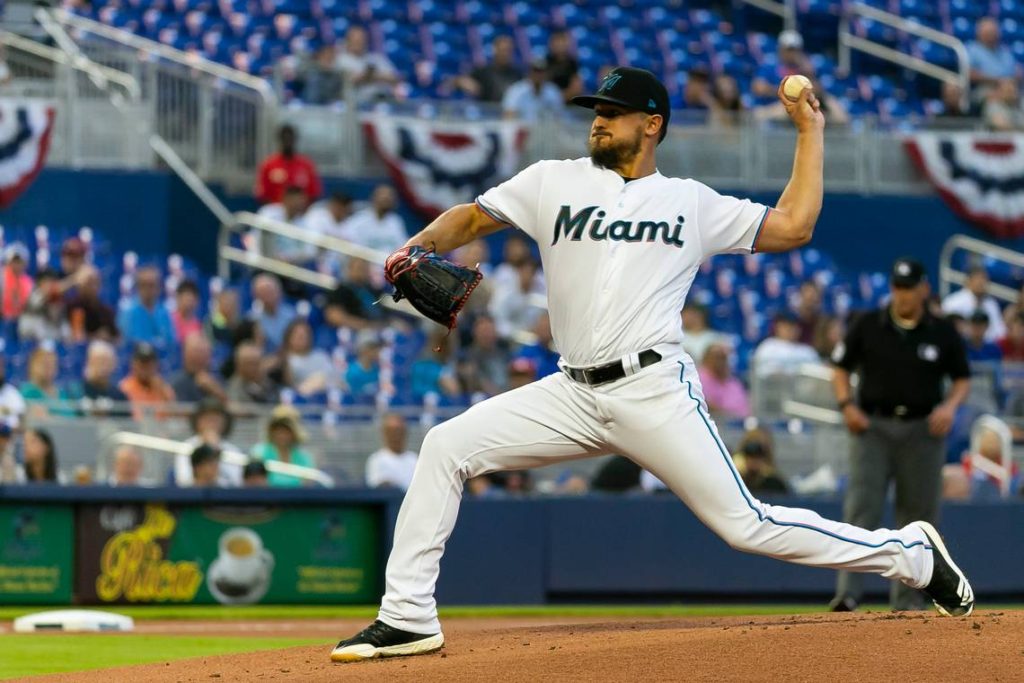
For some teams the 90’s teal absolutely fit their organization and worked really well. The Marlins have spent several years now actively walking away from embracing their initial look. Today, the teal has been relegated to an accent color that is difficult to see as they’ve tried (and failed) to copy some of the ‘Vice Nights’ feeling from their local city mates Miami Heat.
#4 Toronto Raptors
Once upon a time, the Raptors used to sport purple, red, and gray for one of the most creative and identifiable color schemes in all of sports. While using those colors Toronto was instantly recognizable and like the Fiorinta FC of North American sports. Fifteen years ago, the Raptors decided to walk away from the purple in order to embrace a far less creative red and black scheme.
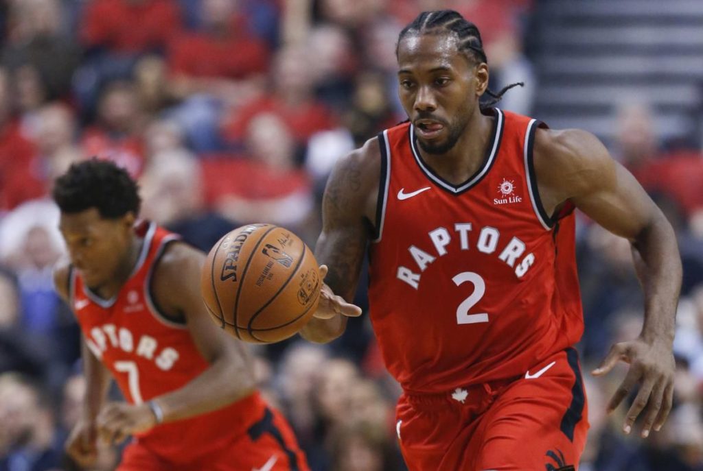
Coming off their first NBA Championship these uniforms will now be enshrined in Toronto history and should be around for far longer than their fair sartorial judging deserves.
#3 Alabama Crimson Tide
Some people like simple. In college football, some people really really really like simple. If that’s what you desire than Alabama is your team. Me on the other hand, I have a simple rule for a football: Your jersey should not look like a tee-shirt when you buy a replica from the team store.
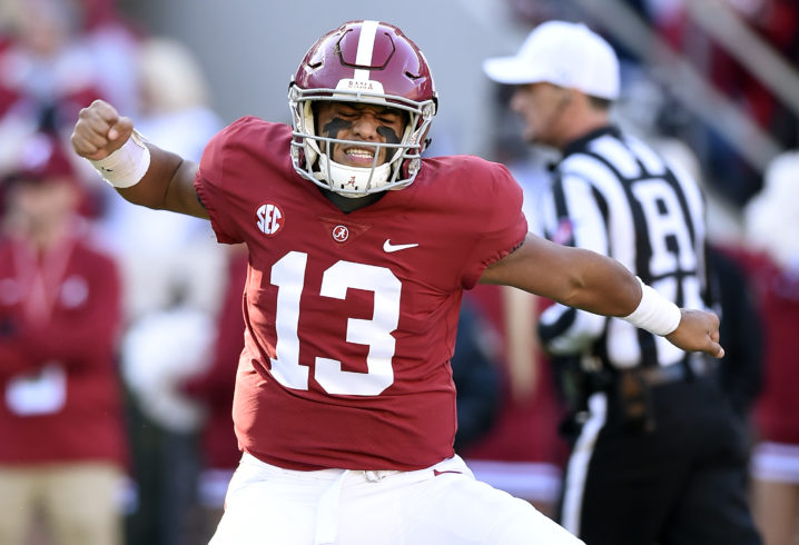
If you’re a Bama fan, you’re effectively paying $119.99 for a heavy tee-shirt. Not putting ant TV numbers or logos on the sleeves is really brutal for the Tide. They are saved by the patches and nameplate otherwise they might have to sell replica jerseys for $25 to their fans.
#2 Philadelphia Eagles
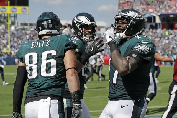
Once upon a time, the Eagles had some of the sharpest uniforms in the NFL. Today, they are heading into their 24th season with some of the league’s dullest and uninspiring uniforms.
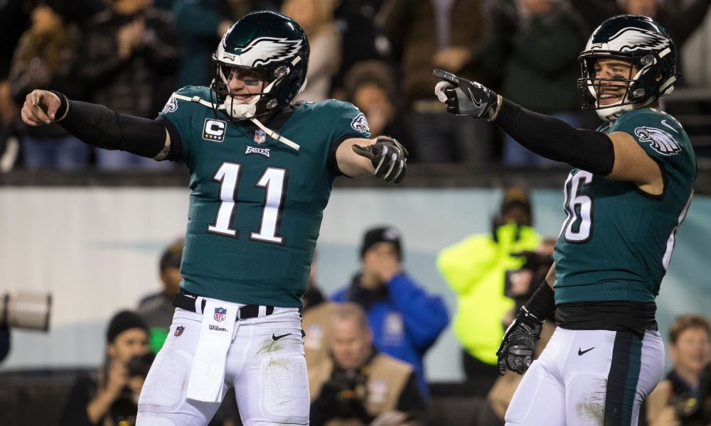
The story goes that Eagles owner Jeffrey Lurie’s (now divorced) wife made the decision to move Philadelphia to the infamous midnight green and that the organization wanted to look less like the New York Jets. Goal achieved but at what cost? The washed out jerseys with disguised black and gray trim pair terribly with the darker green helmets. Of course, the team went away from their slick silver pants too. Fans have been begging for a return to the kelly green with good reason.
#1 Real Madrid
The richest sports team in continental Europe would have utterly forgettable uniforms if it weren’t for the fact that…they’re arguably the biggest club in the world. They are nicknamed Los Blancos and might have one of the least appealing all-white uniforms in soccer.
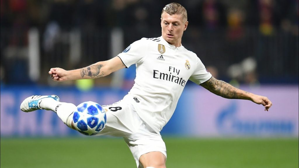
Most years, Madrid sticks to black as their secondary color (as above in 2018-19) and if it’s different they really shy away from a nice contrasting color. For example, Eden Hazard was just revealed to fans in their new kits in gold trim which in combination with their logo washes everything out and looks like they’re appealing to a young Saudi prince. That is probably exactly what they’re going for these days, though.
Don’t disagree with anything you really said here, but most of these jerseys aren’t considered great so they can’t really be overrated.
As a Giants fan, I LOATHE to admit how great the Kelly Green Eagles jerseys are. I also REALLY like the all black jersey and pant combo they rock (usually in a BLOWOUT against the Giants on a Sunday night).
Yeah, that was my comment about the Lighning jersey. They’re not good but as a big hockey guy I don’t know anyone who thinks differently.
I agree with everything on this list, esp. the Jets’ look. And the Mariners need to bring back the trident logo with a quickness.
The trident is the best design feature that the Mariners franchise ever had going for it, by several orders of magnitude. Similar to the Brewers’ ‘ball in glove’ logo, which they also stupidly went away from for some years before managing to finally extract their heads from their asses.
My grade school was/were the St. Valentine Volts — our colors were blue & white!
You could basically list any soccer team on this list and have a perfect run-down of awful unis. Every single soccer team seems like it tries to one-up each other with being a walking billboard on a t-shirt. They’re dull and uninteresting and offer nothing to get excited about.
Say what you want about jersey ads but I don’t see how they make uniforms less interesting or dull.
I have always thought that Virginia Tech had th ugliest unis with their brown and purples.