Welcome to this website’s off-season sports sartorial content. We are counting down the world’s top 50 most iconic sports uniforms. Only current uniforms apply, we are not including one-off or alternate uniforms. Let’s stick to the basics.
#27
UCLA Football
Back to back UCLA! Recently, we discussed the Bruins’ basketball uniforms making the top 50 countdown and now football enters the spotlight. Not many teams in any sport provide a uniform so iconic that part of it gets named after them. So it is with the UCLA shoulder stripes which have defined the Bruins’ uniform for most of their history.
Around 70 years ago, UCLA wore light tan pants and gold helmets adorned with no logos (just like Notre Dame) and baby blue jerseys with the white shoulder stripes and white numbers.
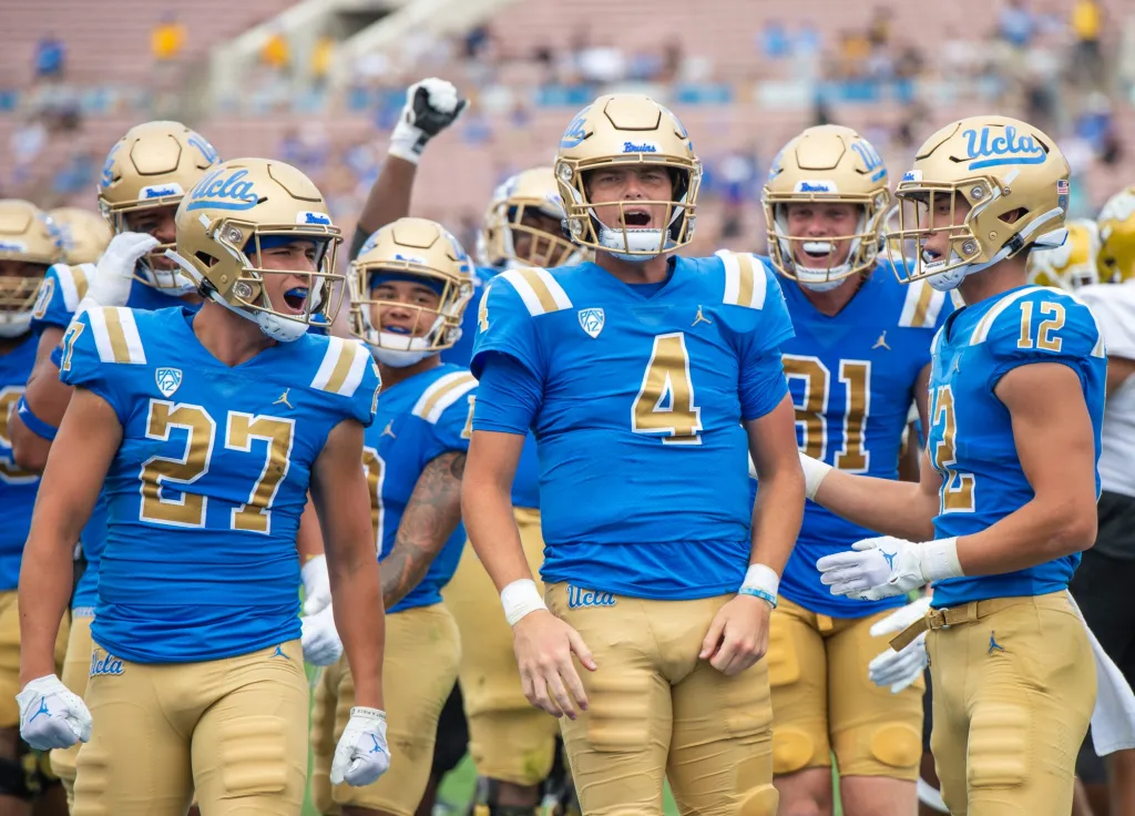
The current layout of gold shoulder stripes trimmed in white showed up in 1971 with plain yellow numbers, later trimmed in dark blue. It wasn’t until the mid-1970’s that the now-famous UCLA script logo appeared on their helmets.
The peculiar Clarendon font for the player numbers was used briefly in the 1960’s and then showed up fully in 1995, with an even larger dark blue drop shadow. This look was dropped in 2003 for a more standard number font and gold/white/dark blue trim.
In 2012, they switched again to a funky modern numeral in gold with dark blue outline, then returned to Clarendon for 2014, before dropping it again for another modern look in 2016. When Under Armour took over the contract in 2017 they have settled on their current design. No Clarendon, and now the numbers are gold with white trim.
2017 was also the year the helmets switched from a dark blue logo script to the baby blue seen today.
One final note, it used to be cool how UCLA wore only dark blue on the road with no baby blue but they dropped that in 2006 (you may recall that late victory in South Bend against the Bruins) and it would be neat if they reintroduced that feature.

Are you referring to one of my favorite ND memories, complements of Quinn and Shark?
“HE’S GOING IN!”
Is that the most iconic ND football play by play call of the 21st century? Trying to think of other contenders
2012 Stanford “TAYLOR…HE’S STOPPED NOTRE DAME WINS”
Dexter Williams’s 99 yard run vs VT and game sealing catch and run in 2018 are both great too
The pure energy of thr UCLA call sells it for me.
HES GOING IN, NOTRE DAME HAS SCORED! chills up the spine every time
That 2012 stanford call though, pretty sweet too
feel like that could be a fun offseason project lol
we give him shit (not undeserved at times) but i thought baby colinsworth’s call of morrison’s pick six vs clemson to really put the nail in the coffin was quite good
I’d vote for Mike Mayock pronouncing Kerry Neal’s as “Curry”
Or maybe Flutie waxing poetic about Sam Darnold’s thighs
what is wrong with BC people
Talking up how good Sam Darnold is right before he bobbles the first snap and gets annihilated by Tevon Coney.
Ucla really has some great uniforms. The home-home usc-ucla jerseys are probably the best collective game in cfb imo.
It’s a fine look.
what a B1Gly matchup
I agree that I like UCLA’s 90’s-2000’s look better, but if you can see the multiple shades of blue and gold here, I can see UCLA thinking it’s a branding nightmare. In this era of simplified logos and branding, it may never come back.
my god those sleeves are about to sail to the New World
What’s up with the notches in the top of the 2 and the 7? I’ve never noticed it on TV but that’s weird looking, right?
Yes, that was one of the issues discussed in the article. Here’s what it looks like when they use their traditional Clarendon font:
I’m surprised you went football for iconic UCLA uniform.
You gotta stayed focused in the off-season!
https://18stripes.com/the-top-50-iconic-uniforms-in-sports-28/
Ah, good call, that’s my bad.
I wouldn’t have their football this high, but I get the UCLA colors make a good uniform.