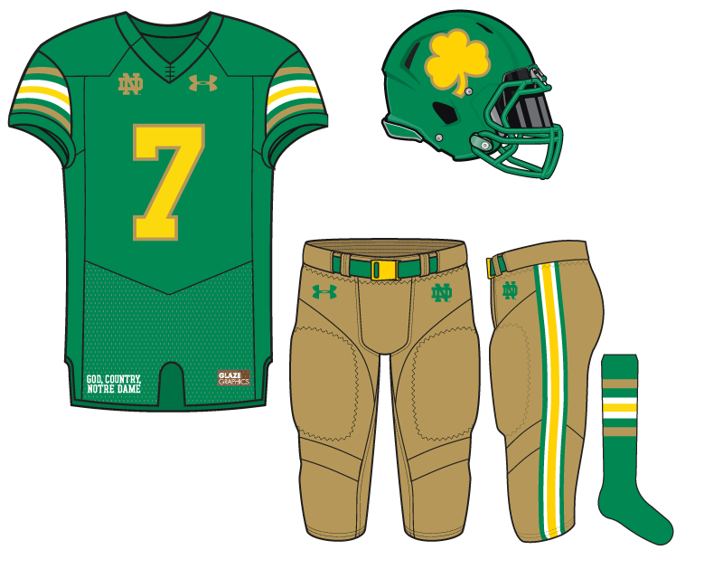
Coming off our previous black-heavy St. Patrick’s Day concept we return to the more comfortable green roots for the 37th Notre Dame concept by 18 Stripes.
Today’s effort was attempting two things. One, to put together the first green helmet in our portfolio. Two, mix green with gold and yellow. At first glance, this combination looks a little like Baylor but upon closer inspection it’s one of the more unique looks we’ve put together so far.
The lack of white is something that bothers upon reflection, only being featured in the striping on three levels of the uniform. In that vein, white pants could’ve brightened things up but also could drastically change the whole feel of this concept.
Overall, this one really grew on me particularly the darker gold pants that have an old-school feel to them.


I really like the simplicity of these. They’re in my top 5… I’ll have to go back and rank them all though. How many left?
Mmmm, tasty. I know you hate when we say “This jersey reminds me of X team” but…this really reminds me of Notre Dame.
One change I’d do is flip the white stripe with a green stripe. Yellow on white doesnt stand out well. Also a thought going forward; looking back through the Uni Concept archives, I see that only once did you drastically use a different number font. There are a couple different concepts with different-ish numbers but they’re all molded on the same college style block font. I’d be interested to see some jerseys with some font creativity mixed in.
Are you guys going to finish then set up a bracket and let us all vote on them?
Not sure yet. Maybe we will get to 50 concepts and try something .
For a tourney structure, it might be better to go with 32 or 64
Great idea!
Completely unrelated, but what an awesome article about Q. We all knew he was good, but this is one of the most gushing articles I’ve ever read about a college player.
https://www.theringer.com/2018/4/5/17200244/quenton-nelson-notre-dame-draft-prospect-top-five-pick
Somehow, not a Composite 5-star or Top 50 recruit. Easily the most no brainer offensive lineman I’ve seen come to ND.
Really good article!
I like both the primary green and gold colors. Not a big fan of white and yellow stripes next to each other. Still, these are pretty good.
I’m surprised that I like this one – not for regular wear, but for a shamrock game