Today marks our 39th uniform concept for Notre Dame football. We’re now 15 months into this project! This is just the second design so far that utilizes a gold helmet-blue jersey-white pants combination, which definitely surprised me.
This one was made so long ago I forgot if there was any inspiration for the design.
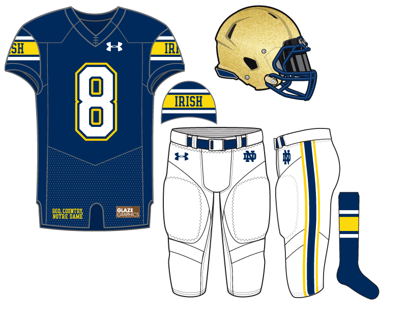
The blue is a little bit lighter than Notre Dame’s usual shade and to change things up the helmet facemask and back bumper math the jersey. The white pants offer a different look and pair well especially with the white numbers outline by blue and gold.
The bright gold is the signature of the uniform for me on the sleeves. With the script “IRISH” it creates a very 1990’s feel to the uniform concept overall.


This is a great set. Always love the blue facemask, and this has a clean retro feel to it. Fauxback for Shamrock Series?
Gimme. This has to be one of the top 3 you’ve done.
I would buy that jersey.
I like it, but is the yellow background of “Irish” and the stripe on the sock looking dangerously maize-y to anyone else?
This one is a big winner in my book