This is our 8th uniform concept this off-season and this is my least favorite that has been published so far. I must stress so far. There is a particular futuristic uniform that is coming up that I kind of loathe. But, since we finished it off we’ll put it out their for criticism all the same.
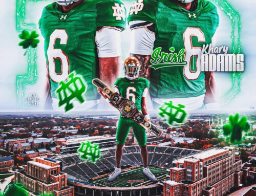
Today’s concept started out with the CFL’s Saskatchewan Eskimos on my brain as I was searching for some inspiration for a green jersey uniform. As you can see the final product didn’t really end up using that inspiration all that much.
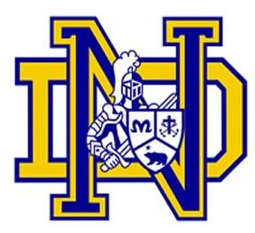
The primary reason for that is the helmet logo. I had come across one of the logos for Notre Dame High School in California (C.J. Sanders, Dayne Crist etc. former school) and wanted to try the inverted colors on the monogram.
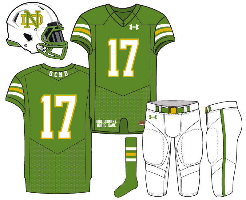
Using green and gold I preferred it on a white background so some things changed after initial renderings. The helmet and pants were switched to white.
On the back of the collar a “GCND” is added for God, Country, Notre Dame.
The rest of the uniform utilizes very simple and traditional stripes and design. It’s funny, when it was complete this felt kind of bold but after weeks of looking at it and other ideas it feels really plain. I also think it lacks some Notre Dame character and could use some tweaks especially on the jersey or pants.
Not bad…I like the white helmet and pants, helmet design, and yellow / green contrast; however, I might want the green to be a little darker
This is my thought too. I like the concept, just the green color isnt the best choice. Kind of reminds me of Army camo. Fix that, and this works for me
Things to like, but I agree least favorite so far. I think a different shade of green would help, the shade looks a little drab. The Eskimos green would have been a better choice.
I also think the GCND is a little off.
Generally, I am not a fan of white helmets. Too plain. I wonder if the leprechaun on the sides would have worked better than the logo. I do like the facemask color matching the jersey color.
If the green and yellow were fluorescent, I guarantee Adidas had something similar they tried to use before getting shot down by the administration (back in those days).
Go Fighting Sioux….I mean, Fighting Hawks….I mean….Fighting Irish…yeah, that’s it.
You mean, Bison.
North Dakota State not North Dakota.
Nope, I said what I meant. UND uses the interlocking ND logo that is similar to ours, hence the helmets looking like the Fighting SiouxHawks. Both teams wear green uniforms, though the BiZon do add yellow highlights whereas the Fighting SiouxHawks do not.
Ah, I get where you were going. North Dakota’s colors threw me off and growing up with the UND hockey power I’m still not used to them using the interlocking ND.
Pretty different than the helmet here, but I get it.
They also switched their helmets last year, too.
Yeah, I think they made the switch the same time they changed their mascot name.