Today’s post welcomes our 24th uniform concept for Notre Dame football. Only 1 out of our last 10 concepts have featured a navy blue jersey so let’s get back to the traditional home uniform right now.
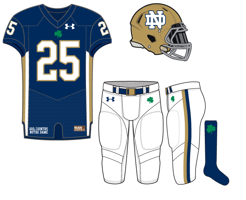
To keep something old school we went back with TV numbers on the sleeves and a pretty basic jersey overall. A green shamrock adorns the bottom of the collar–can you believe it’s been 14 seasons since an Irish jersey had this nice little touch? I wish Under Armour would bring it back.
Like last week’s concept this one also has a striping pattern down the flanks, this time gold and white.
In order to make the uniform a little different white pants were chosen with pretty standard elements. The bottom is rounded out by an all-blue sock and lone green shamrock.
The helmet is the more dull gold of yesteryear both to provide a little bit of a throwback feel but also to allow the white monogram outlined in blue some better relief.
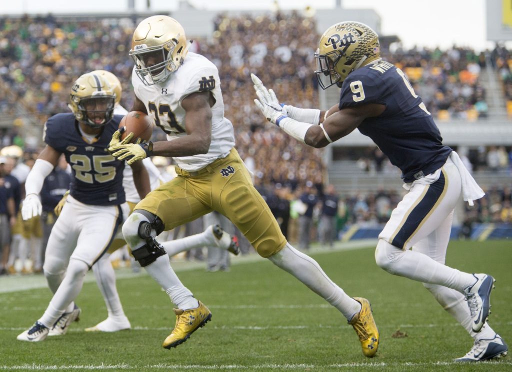
As pointed out by CW, this one does look a little like the modern-day Pitt uniforms when they’ve worn white pants. They’ve rarely gone with this look but did so during our game against them in 2015 at Heinz Field.

I like everything but the ND on the helmet. But if it helps the OL block somebody, I’d support them wearing it!
I’m a supporter of matte gold helmets, so I love that. I might tweak a couple things, but it looks okay.
Are you anti-current helmet?
anti-current helmet?
Is such a thing even possible?!?
https://encrypted-tbn0.gstatic.com/images?q=tbn:ANd9GcSv2PMEPaUfDWsafx29EU4BobhDhPz4Ct_pJJs0Pp8vrB4Dsa5h
I don’t know about anti-current helmet but I prefer the old ones.
I view the current helmets as part of the overall devils bargain that I’m generally okay with. Turf field, smoke tunnels, flashy uniforms, jumbotron, crossroads. In exchange for the 10th ranked program in “team talent” on 247. That works for me. I’m a STH and 33 Trucking hat owner and I’ll be keeping both of those.
Very interesting. Just to be clear you favored the Weis era butterscotch over the current helmet?
Like this, yeah. I’d prefer this to the sparkles of the new ones. Sparkling should be for figure skaters.
Well, if the helmets are supposed to be like the dome then they should be pretty sparkly. Although, I would admit the current helmets are a little more sparkly.
I thought the old helmets, even going back decades, looked like crap unless it was really sunny. Very dull under overcast skies and weird under lights.
I think it is sad that they don’t get to paint the helmets anymore, but I think baked on sparkly is better than painted on dullness.
Not bad – I’m a little surprised, but I like the ND logo on the helmet. The white pants are a nice tweak and I agree that the small shamrocks fit well. Good job with this one!