
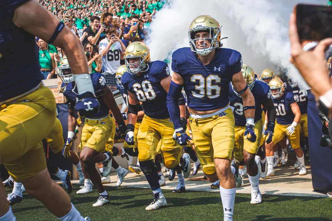
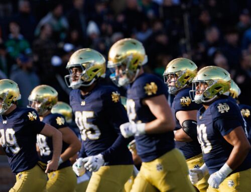
Notre Dame switched to Under Armour as the apparel outfitter ahead of the 2014 season and the tweaks and changes to the standard football have been few and far between. The subtle change to Leahy player numbers for the 2016 season is really the only semi-major update to the Irish uniforms during the Under Armour era.
It’s time for some changes!
Using a bit of Notre Dame history, I’ve compiled 15 ways Notre Dame could update the uniforms that would be familiar while freshening things up a bit.
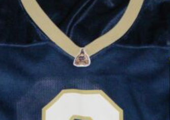
Solid White Numbers (Home Jersey)
Used on every blue jersey from 1914 through 1980, and again from 1984-85 this is an easy and effective way to give Notre Dame more of a throwback feel.
Mustache not included.
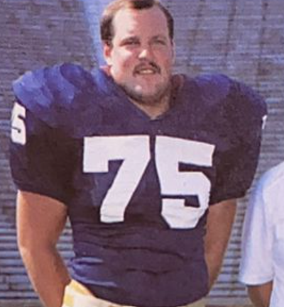
Solid Blue Numbers (Road Jersey)
Same as above, except it’s for the road white jersey. This look pops a lot more than with the home jersey and would be my preference if they were changing only one set. It’s good enough for Ross Browner and it’s good enough for me.
RIP Ross Browner.
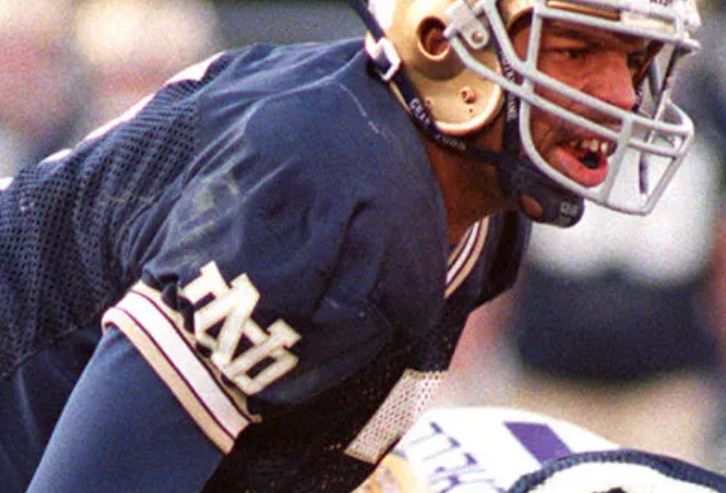
TV Numbers
This isn’t my personal favorite but it’s a different change all the same. Seen on the jerseys from 1959-1977, 1984-85, and 2004-09 it’s undeniably a quicker way to identify a player. If it’s a little boring, it does give off old-school vibes.
Big TV numbers, like Brady Quinn’s muscles.
Gold Trim
This plain gold neck and sleeve look debuted in 1992 and is associated with many good vibes from the middle Lou Holtz era. It’s a little too basic for me and you wonder how the modern gold color would look on the current jerseys.
The Brett Favre chinstrap is so old school.
Dome on the Collar
Notre Dame kept the gold trim on the collar and sleeves but added this small golden dome patch at the base of the collar for 1994-97. It’s associated with less positive vibes, including straddling the last Lou Holtz and first Bob Davie season. If it came back, maybe they could remove the monogram on the dome.
What if they painted the monogram on the actual dome, though?
Tri-Color Trim
This trim has always been incredible to me. The Irish used this for 3 seasons across 1998-2000. It stands out, it’s very identifiable, all without overwhelming the jersey too much. I’d like to see how it would look in something other than this sandstorm gold, as well.
Black chinstraps: Built different.
Shamrock on the Collar (Plus Script)
Notre Dame opened up the post-9/11 era with this uniform switch to a green shamrock on the collar with the tiny “Irish” script below (plus the American flag patch which hung around until this jersey set switched 3 years later). This look was excellent. You can also include the small white ND monogram that was at the collar for 2004-09 as another option, as well.
Should the shamrock be mandatory?
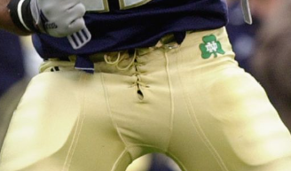
Vegas Gold Pants
Let me be clear, I am on #TeamMustardPants always and forever. However, people have been clamoring for a return to this look. Whether or not the shade of gold would need to be darkened to fit in with the current uniforms (it would) this is as much about bringing back the shiny material.
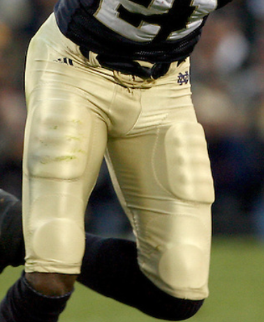
Maurice Stovall had long legs.
Shamrock on Pants
In tandem with the shamrock collars above, these pants were worn for 2001-03 and have never returned. The only other time a shamrock has been on the hip of the pants was for the 2013 Shamrock Series, and those uniforms are beloved.
That’s a strong shamrock.
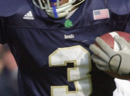
Nameplates
Some day Notre Dame can stop messing around and join the modern world. Especially in the NIL era we are being foolish.

Tyree has already switched numbers from this picture.
Shamrock Helmet
We have seen the shamrock on the helmet in a throwback capacity once in recent years, but never on the new shiny gold helmets. First worn for the Irish in 1959 (upside down) and 1960-62 (right side up) it’s a nice little touch that would be a welcome change of pace.
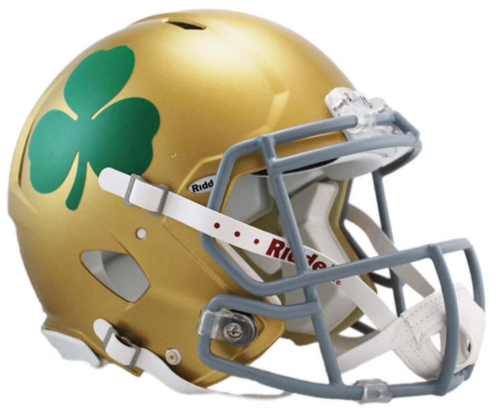
Yes.
Madonna Blue
Hey, at least it’s something different! Notre Dame wore these lighter blue jerseys with the horizontal sleeve stripes from 1981-83. I think a full-time switch back to this for a standard uniform would be a tough sell all around.
Photoshop from Collin Gallagher @cpg_95.
Full Switch to Green
What wouldn’t be a tough sell for me would be a full switch to green. The green jerseys with white numbers first debuted over 100 years ago and were worn for most of the 1940’s and 1950’s with only brief alternates in the years since. We haven’t seen this look since the early 2000’s and it is badly needed.
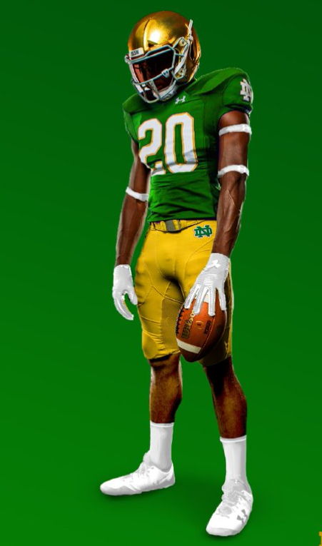
Photoshop from Collin Gallagher @cpg_95.
Full Switch to Green 70’s Style
Something more familiar for the modern-ish era would be a return to the Green Machine uniforms for the Irish. We saw these throwbacks worn during a very bad football game in 2007 but you can’t deny the team looked good. The road white with the green and gold is perhaps even fresher.

Photoshop from Collin Gallagher @cpg_95.
Switch to Green 1959 Style
What can you say?

These uniforms deserved better.
Prior to 2011 these uniforms were only mentioned briefly in passing by uniform nerds such as myself as something worth wearing. Since we’ve seen them on the field in modern times it’s hard to imagine something better.

BONUS!!!
This isn’t historical but I’m genuinely surprised Notre Dame hasn’t worn white pants on the road with the white jerseys at least semi-regularly over the last decade. It has looked great in 2013 and 2022 for the Shamrock Series and would be a refreshing change of pace to add to the uniform rotation for the future.
I’d be down for some madonna blue once a year. Some real rudy vibes going on.
But those photoshopped green unis?!?! Boy of boy thats clean. I’m having a hard time for nostalgic reasons picking between those or the Holtz era blue.
Theres some solid options here, and yes firmly on #TeamMustardPants
I see too much Pitt in those.
It would be pretty cool though if Under Armour (waves arms) did…something
Lots of Marino-era Pitt-y vibes, for sure.
I’m generally anti-green but those Photoshopped ones look pretty great. Would need to see them in person, though.
RETVRN to TV numbers on the sleeves
The Michigan 2011 uniforms and anything remotely resembling them should be incinerated and buried in the desert in Nevada.
I can only assume (/hope) you are referring only to Michigan’s uniforms, not the the ND uniforms worn while playing Michigan in 2011.
Both. I can’t even stand to look at pictures of them without feeling nauseous. I have no idea why any ND fan would want any reminder of that travesty.
Also, to the extent those ND uniforms are “throwbacks,” they’re throwbacks to quite literally the worst period in program history.
The uniforms deserve much better. We have to wear them and get rid of those memories.
Gotta assume ND would have lost by much more if they were wearing regular unis, though. Those UTL uniforms are easily +10 in ND’s favor.
They and everything about that game are cursed.
But thanks for the downvote, lurking Michigan fans. I’m glad you all had fun.
Just for the uniform hate, sweetie.
I’d like to see a dome/shamrock/ND at the base of the collar. Something that says Notre Dame with out being over bearing. TV numbers are OK, prefer the ND or stripes on the sleeve. Although the white throwbacks vs MI have both numbers and stripes, but the numbers tend to get partially hidden with the way the jersey sleeve is designed to wrap the shoulder pads.
I could take the Madonna blue for a Shamrock Series, not sure I’d want it to be part of the other 12ish games in a year.
Not mentioned here but I’ve also always been a fan of the yoke, I think it could work in multiple schemes.
I have something similar to that green jersey signed by Johnny Lattner. Really awesome, it’s like more of a hockey jersey in design and cut than what we associate with football.
That Colin Gallagher photoshop of the modernized Devine-era green jerseys (with Leahy numbers) continues to be among the most beautiful sights that have graced my eyes. We need to move to those as the standard green jersey – if not the standard jersey, period – freaking immediately.
My brother brought up regarding the current green jerseys theyve worn: blue outline around the numbers. These photoshops ones have gold, and it really is a subtle change for BIG effect
Agree. How would one go about getting this message to Jack swarbucks?
When it comes to usage on green jerseys (and also Michigan in general: Down with blue!
Do we think Marcus Freeman feteshizes blue collar ideals? Because I don’t think those nameplates are coming any time soon….
There’s definitely a Lou Holtz blue collar fetishizing video shown to all new football staff upon their hire.
We may need the NCAA to take action on this one. Maybe ND would put blue lettering on the blue jersey in protest like the Maple Leafs did in 1978 when the NHL mandated nameplates.
They stuck names on the green jerseys last year for no real reason, so I don’t think Freeman is necessarily opposed to the idea.
The 2011 Michigan game uniform was, by far, the greatest ND uniform of all time and they should wear it and its inverse for every game. Period, full stop, no debate necessary.
So it is written.
Great suggestions, especially the solid color numbers; they looked great against Wisconsin in the shamrock series. Personally, I’d like slightly bigger numbers, pants monogram without the border trim, black socks with black and white shoes (for some reason it seems more intimidating to me), slightly darker blue home jersey, and pants color from the 2012 and 2013 seasons (somewhere between the vegas gold and the current yellow mustard). If they end up with Nike, I’d trust their design decisions; more often than not Nike hits the mark. I could make a separate long comment for my ideas for alternate unis hahaha .. Eh, my two cents anyway; no biggie, just thought I’d share and put it out there lol
Oh and quick second comment: not a fan of the blue numbers with gold trim on the green jerseys.
I would love to see the Holtz era gold pants come back with the blue leggings and white socks. No gold trim around the collars and sleeves only around the numbers. It would again have to be the Holtz era gold and not that baby poo poo mustard yellow. As far as a shamrock in the helmet. I would be fine with it but it would not work on the HGI gold helmets. They have a texture and the decals would not look good.They would have to go back to the old South Bend gold helmets for that to work.
To follow up, the vegas pants will never comeback because they would not match the HGI helmet finish. Honestly I don’t think they could effectively match the pants with the helmets now.