
Writing about 20 underrated sports uniforms from college football, NFL, MLB, NHL, and NBA. One uniform at a time.
Things haven’t been going very well for the Philadelphia 76ers. From trusting The Process, to becoming a perennial top team in the East, they imploded to a 24-58 record last year. Woof! Outside of a brief foray into a black/gold/red color scheme from 1997-2009 the franchise has used red, white, and blue colors going all the way back to their days as the Syracuse Nets beginning in 1949.
I think the Sixers uniforms have ranged from basic solid to extremely cool and a little funky. Remember the swooping stars and stripes uniforms in white and red from the early 1990’s? When the team reverted back to the red, white, and blue for 2009-10 they were basic and fine–neither standing out nor offensive.
For the 2015-16 season, the Sixers released a modern throwback uniform set that has been among the NBA’s best.

Might as well look good if you’re bad at basketball again.
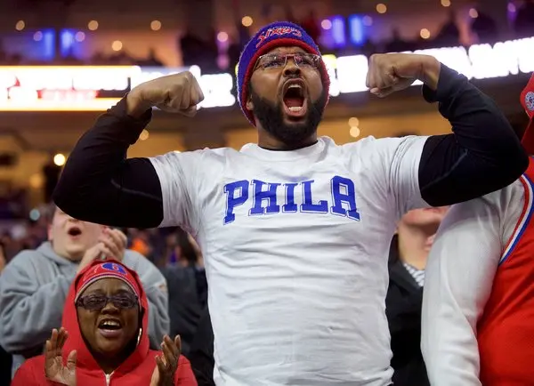
When the franchise moved to Philadelphia in 1963 the “Phila” branding was used on the jerseys along with star motifs. Both of those were used in the Sixers latest uniform redesign. In the decade since the switch, only small tweaks have been made. Block shadow was added to the name and numbers in 2017-18 and the full basketball logo was replaced on the front of the shorts with the simpler interior branding from the same logo.
The white uniform is really sharp, too. I prefer the blue uniform by just a touch, and like many NBA teams in recent years, Philadelphia has been wearing the blue at home often anyway. While the “Phila” branding is great, the one change I might make is to put the “Sixers” across the chest of the white jersey so both styles are used.


I know the theme is uniforms but talking sports constantly with my nine year old and it has me thinking a lot about team nicknames. Most of our major sports have legendary team nicknames that really work (nba: celtics, lakers, knick’s, 76ers, pistons, suns and I think good nicknames like spurs, magic, clippers, rockets, warriors, bullets (rip); baseball had yankees, mets, red sox, phillies, expos (rip), brewers, cardinals, cubs, dodgers, astros, mariners; nhl has a ton pretty much every canadian team had a good nickname. but man the nfl nickname stink, they are mostly animals irrelevant to the city. great one are steelers and packers, cowboys and raiders pretty good but from there just a bunch of animals.
Just ranting, thanks for indulging
Bad NFL team names:
Texans
Jaguars
Panthers
Titans (terrible branding)
Commanders
Cardinals
Bills
Eagles
Counterpoint: Eagles as the mascot for Philly is solid. America’s bird for America’s birthplace! And even our drunkest fans can spell it most days!
Now imagining if Ben Franklin had prevailed in making the turkey the official bird of America…
I agree with most of this list, but will push back on the Cardinals. I used to not care for it, but I recently learned about the origin of the Cardinals name. Apparently they started in Chicago and got their uniforms second-hand from the U of Chicago. Those second-hand faded uniforms were cardinal in color, and hence the name
Obviously i’m partial to the cardinals and live in az too. I think my issue with some names is they aren’t synonymous with a city, or just don’t make sense. chargers/rams don’t feel like LA and I promise cardinals in az doesn’t make sense. Jazz in utah shouldn’t really work, and lakers in LA but I guess enough time has passed for them to work with the city