
Writing about 20 underrated sports uniforms from college football, NFL, MLB, NHL, and NBA. One uniform at a time.
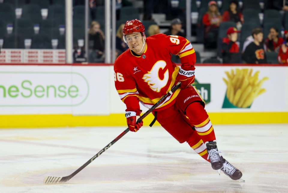
Many are aware of the Flames who began their story in Atlanta for 8 seasons and then moved 2,300 miles to the north across the Canadian border to Calgary for the start of the 1980-81 season. They kept the team colors of red and yellow and only updated the logo while bringing over the same design elements of the jerseys.
In the delayed lockout year of 1994-95 the Flames debuted a considerable amount of black as an accent color (black pants especially) with a wild vertically slanted stripe running through the horizontal stripe on the front of the jerseys. Over the years, Calgary adopted more and more black while even introducing a black jersey with a flaming horse head.
Back in 2021, the franchise adopted the original uniform design where they’ve stood ever since.
Fire.
The decision was popular, these jerseys are some of the most underrated in the hockey world. Typically when a franchise keeps the team name following a move it doesn’t work out well or eventually gets changed. With the Flames, it’s worked so well and the iconic “C” logo with the trailing fire was even a huge upgrade over the logo used in Atlanta.
I don’t even like red and I adore these uniforms. For me, they are quintessential western Canada.


The Guy Fieri of uniforms.
I have a small problem with these uniforms, similar to the same problem I have with the Chiefs uniforms. They look old or faded. The coloring looks like someone left the uniforms out in the sun too long or left in storage from 1978. This really shows up to me in the Chiefs helmets.