

Writing about 20 underrated sports uniforms from college football, NFL, MLB, NHL, and NBA. One uniform at a time.
Portland is really going through it right now in basketball. Since being swept in the Western Conference Finals to conclude the 2018-19 season it’s been the stuff of horrors for the Trail Blazers. They’ve been under .500 in 5 out of the last 6 seasons and haven’t made the playoffs in the last 4 seasons, either.
Whenever I see the best uniforms in the NBA ranked I always keep an eye out for Portland. Most of the time they are middle of the pack and often ignored. I’ve seen some say these are bad uniforms. That is straight up heresy.
They’ve made the sash work.
Portland had a couple of different funky and very 70’s uniforms when the franchise was created in 1970 as an expansion franchise. Then ahead of the 1977-78 season they debuted new uniforms with the diagonal sash stripes. Amazing. They even switched the road uniforms to black, but then reverted back to red from 1979 to 1985.
Things stayed pretty consistent until 1991 when the chest script colors were inverted. On the white jersey to black outlined in red and on the black jersey to white outlines in red. In the 1992 NBA Finals against the Bulls, the team had already switched the white jerseys back to red script outlined in black.
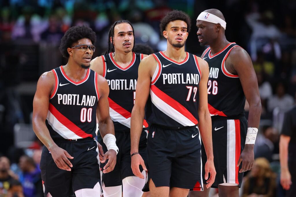
The team has made a couple subtle changes in modern times. For 2002, the white jersey switched to black lettering outlined in silver and silver also became a new part of the sash striping. A few years later, the black jersey switched from “Blazer” to say “Portland” instead. It’s been that way ever since. In 2017, they minimalized both uniforms with basic black script (white jersey) and white script (black jersey).
They just released new uniforms for 2025-26 a little over a week ago, too. All arm striping is removed and the silver accents, including within the sash, are gone. It’s a downgrade. I liked the silver on the black jerseys and wish the franchise would return to “Blazers” on both sets of uniforms.


