
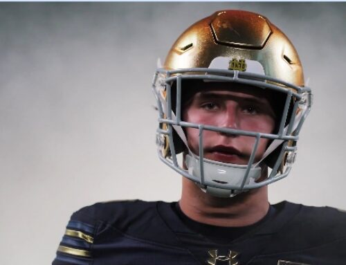
What is this? We’re ranking the Notre Dame blue home uniforms from best to worst. For reference, check out the introduction post below to find out how we’re grading each set and how we came to determine what is good and bad in Irish sartorial history.
Ranking Notre Dame Football’s Home Blue Uniforms: An Intro
Starting out today we have an older uniform, plus several from this century to kick off the worst home blue uniforms in modern Fighting Irish history.
#15 Early 1980’s
Tradition (3): 0.4
Style (2): 0.9
Success (1): 0.1
Package (3): 1.2
Total Score: 2.6
You knew it was coming, I knew it was coming, everyone knew this was coming. In a vacuum the Gerry Faust “Madonna” blue uniforms don’t look terrible if you ignore Irish football history. So the story goes, Faust found something in the archives that convinced himself that the team should wear this lighter shade of blue when in reality he was pretty much trying to mimic the colors from Moeller High School where he left to take this job.
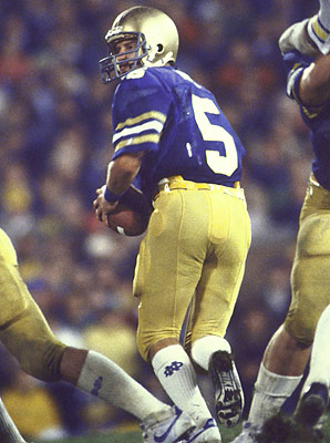
The late Blair Kiel in the first-ever home night game.
Of course, Notre Dame underachieved during this era about as bad as any in Notre Dame history so these uniforms were killed even more in the public eye. Add in the white cleats from this era (plus nameplates, the horror!) and this is really the only time in modern program history that Notre Dame didn’t look quite like Notre Dame.
#14 2004-09
Tradition (3): 2.9
Style (2): 0.2
Success (1): 0.1
Package (3): 1.6
Total Score: 4.8
Some people love these uniforms and I just do not get it at all. In fact, I bet some think these are the best uniforms in this series. Those people would be very wrong, of course. The best I can say is that they adhered to a very strict traditional sense of a Notre Dame uniform and get high marks in that department: Black cleats, long blue socks, a very basic jersey and not a lot of frills.
The numbers can be detached and used as a blanket for the family.
This was a period when the uniform showed signs of deteriorating with fleshy colored pants, dull uninspired helmet, and achingly boring jersey with only a tiny white monogram at the collar for a bit of joy. The gigantic over-sized jersey numbers remain hilarious in a way that suggests someone believed football games could be won if Notre Dame’s numbers were larger than the other team. There were some good times in 2005-06 in these sets but mostly a whole lot of frustration over their 6 years on the field.
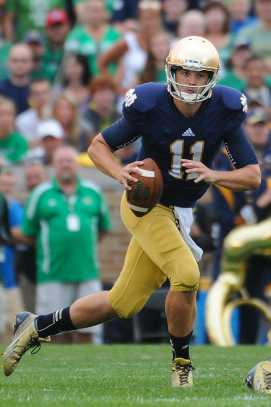
#13 2011
Tradition (3): 2.3
Style (2): 0.4
Success (1): 0.2
Package (3): 1.4
Total Score: 4.3
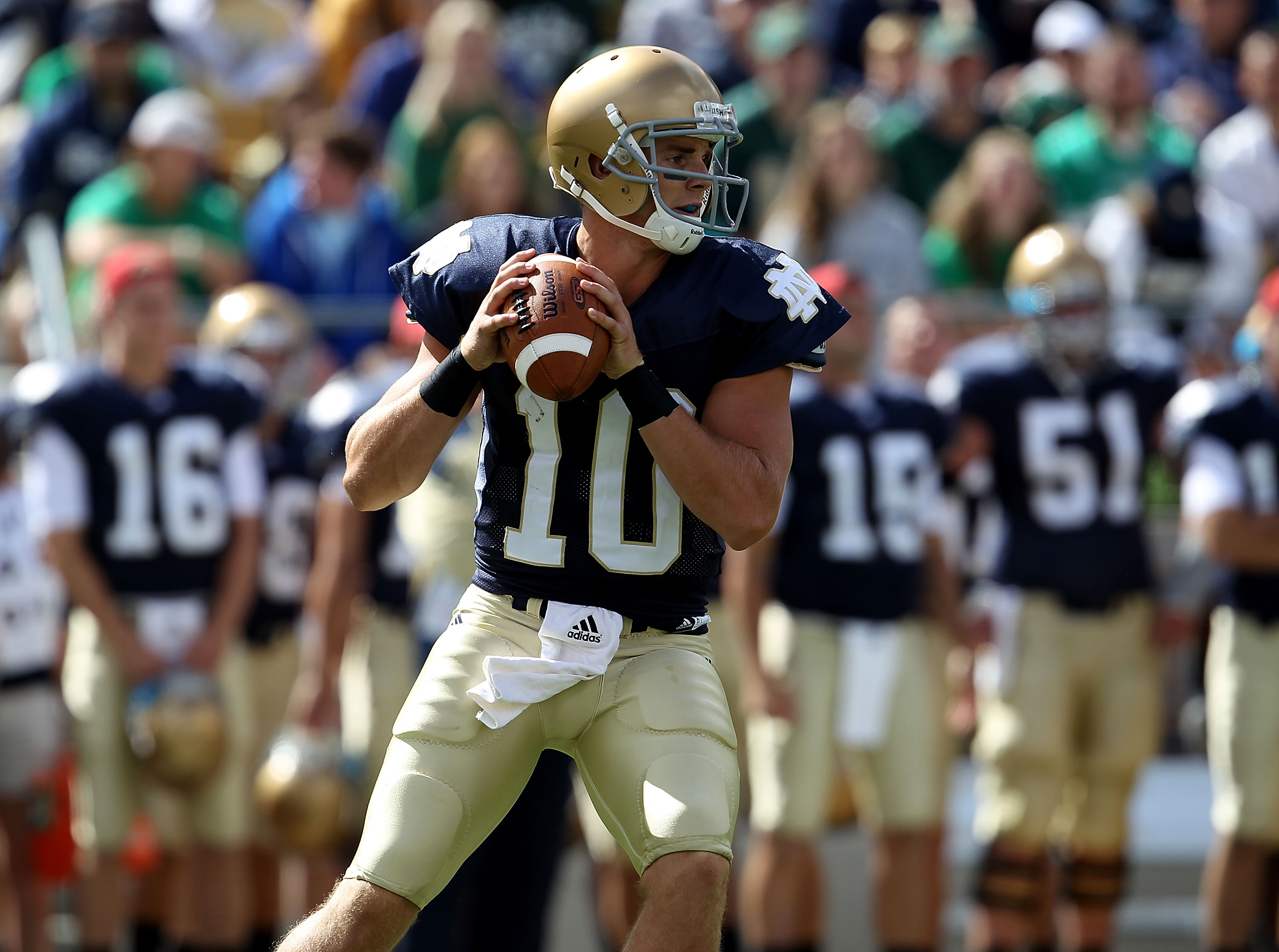
Looking back at the early Kelly uniforms it’s like watching a pre-teen try to get comfortable and find the right style without much success. This uniform from 2011 was memorable for the switch to sandstorm pants that were featured for this season only and the debut of the new gold helmets mid-season against USC.
The late George Atkinson III in a bright moment from 2011.
Prior to the new helmets, this uniform was a tough one to look at for me. They also started introducing gold and blue colors to the cleats which looked awkward and would take several years of tinkering to finally look good.
#12 2010
Tradition (3): 2.7
Style (2): 0.7
Success (1): 0.3
Package (3): 1.3
Total Score: 5.0
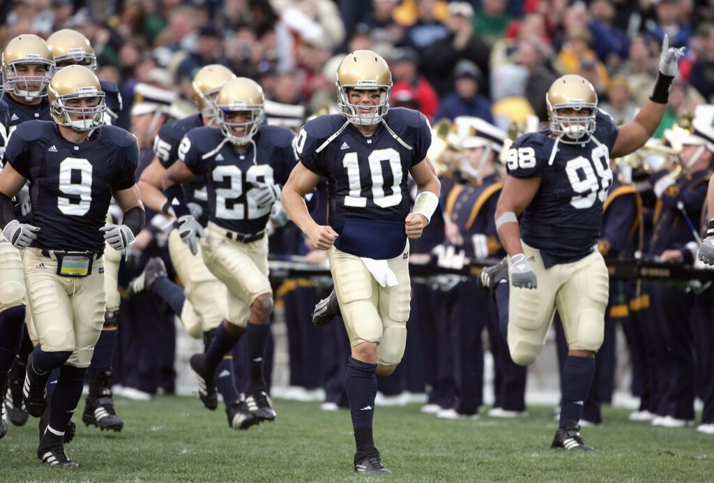
The beginning of the modern changes we see today but it was a clunky process out of the gate. For one reason, the team switched jerseys half way through the season. When the Irish debuted under Brian Kelly in 2010 they had ordered similar uniforms to the previous year, except the monogram replaced the numerals on the sleeves. This led to a weird look for quarterback Dayne Crist who apparently didn’t love the sleeves.
Notre Dame’s jersey’s got real tight in 2010 (eventually).
When the team came out against Western Michigan in the 7th game of 2010, they were wearing much tighter and streamlined jerseys, featuring much smaller numbers. However, they kept the strange monogram on the sleeves without space in the middle of the letters to create a visually difficult to see logo.
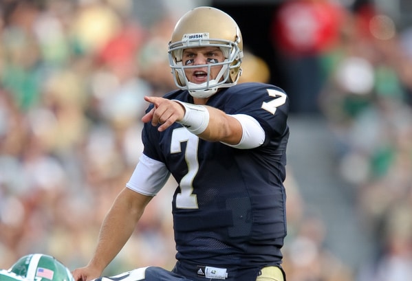
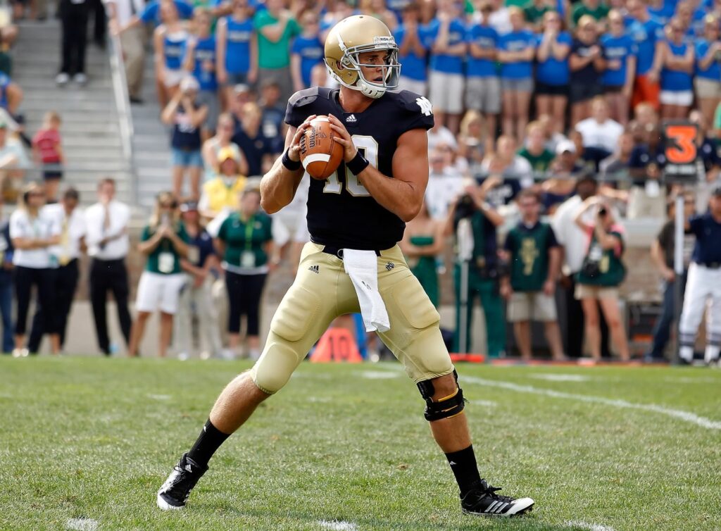
#11 2013
Tradition (3): 2.2
Style (2): 1.8
Success (1): 0.2
Package (3): 1.1
Total Score: 5.3
The opener against Temple in 2013 wasn’t very memorable except I can remember many comments about this weird pattern on Notre Dame’s jersey. Some thought it looked like feathers, or tire marks, or a waffle iron. The new TechFit jerseys Adidas unveiled across the nation were super unpopular.
Adidas last offering for Notre Dame.
The good news is that the pattern was basically invisible until the cameras were on top of the players. Also, this uniform set as a whole had a lot going for it (newer mustard pants, new shiny helmets, modern base layers with script on the arms) but the largely flat gold cleats and blue blue socks left a lot to be desired.
Actually, I agree with your assessments. Strange, I know 😉
Are we best friends now?
Gingerly
I would put the 2010, ’11 and ’13 uniforms below 2004-09. I was, admittedly, attached to a lot of things from the Weis era that I probably ought not have been, though.
We may need a therapy session 🙂
I liked the Weis era jerseys at the time, but now that we’re 15 years removed I couldn’t agree more.
2009 BC game was the best Weis look and I would love to see a return to this especially with the new helmets and the mustard pants. I personally love the white spat and/or the 2 tone socks with the white bottom, navy top.
Early Kelly was a weird time all the way around. Trying to move on from the past, but at a slow enough pace to not upset anyone or make anything noticeable. Just kind of blah for me.
Oh man, I absolutely love the pro-style socks. So good. I wonder if they even have the socks anymore? So many players wear tights it would be tough to pull of nowadays.
I agree, it won’t look nearly as good with the tights. It could come back though, everything’s cyclical.
I saw someone on the last jersey post say they didn’t like Wu’s baggy long sleeve undershirt. I love that look personally, and I’d be fine if more moved to it and away from the tight UA. Something about it reminds of playing in HS and just grabbing a long sleeve shirt to wear for cold games. I do prefer if Wu would do blue on blue, but don’t hate the white undershirt on blue.
For reasons relating to “that’s when I was in school”, every blue uniform that is not the 2004-09 blue uniform feels very off to me. I like the big numbers!
COUNTERPOINT the opener against temple in 2013 was the best game ever because it’s the only ND Home game I’ve ever been to lol
I’m 2010 and I love the new yellow pants. I don’t understand the people that loathe them and long for the pale, tan, sandy ones.
If we wanted khaki we’d hire Jim Harbaugh