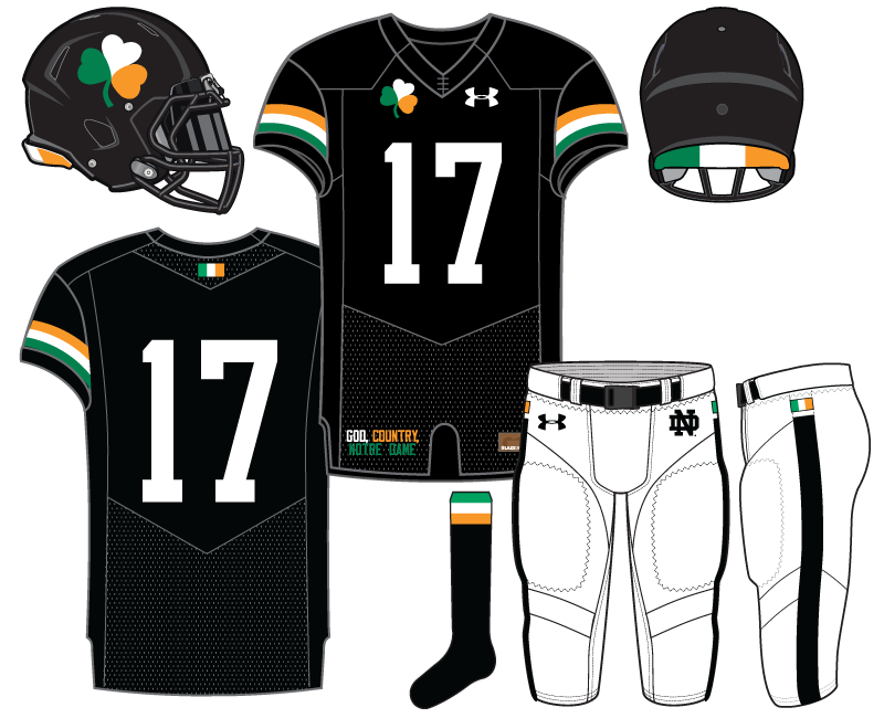
We’re now on our 4th uniform concept of the off-season and we’ve quickly arrived at the darkest of shade as part of the design. Yes, it’s our first black uniform concept. Before discussing the actual design it’s important to lay down some ground rules for now and the future.
Black for Black’s Sake
We’re not doing this against our will but rather to appease the masses. Wearing black probably peaked several years ago and frankly isn’t that cool anymore. So many teams across all variety of sports have gone BFBS that its effect has been severely muted for a program like Notre Dame.
That being said, black can look very cool. There’s nothing inherently bad about black it’s just something that has become almost boring in sports uniforms. Yet, some people love nothing more than a black uniform. Well, consider this and further black concepts a bone thrown to you black sports uniform lover.
Football Leotard
Another reason why black uniforms are often unable to live up to their potential, besides the sheer volume of their use, is that football teams often pair a black jersey with black pants and black socks to create the leotard effect. This almost never looks good. Very few football teams can pull this look off, if at all. The skin tight football uniform really doesn’t flatter the male physique.
Today, we won’t employ the leotard effect.
For me personally, I would never actually suggest Notre Dame wear any uniform that had the same color jersey and pants–and not just for black either. However, we will occasionally break this rule for future concepts but not very often.
Black & Notre Dame
The problem with black and Notre Dame is that the traditional Fighting Irish colors don’t mesh well on such a dark background. It can be really tricky to get things right, both in attempting to make a uniform that has some Notre Dame feel to it and to create something that has enough vibrancy so that you aren’t staring at too much plain black.
Heavily mixing black and gold is so tied to Purdue that it’s not even worth attempting. Heavily mixing black and navy blue is a little more manageable but can be difficult to spot important things such as numbers and logos. Obviously, using green and/or green and gold is the best route to mix with black if you’re Notre Dame. In the future we’ll be attempting a variety of black plus different Notre Dame color schemes.
Irish Nights
If you’ve paid attention to my uniform criticisms in recent years you know how much I loathe the lack of white used, at minimum, as a trim color.
15 Sports Uniforms Trends that Drive Fans Nuts
The above link is a great collection of some of the worst uniform trends lately and #16 for me would be the lack of white trim relief. For example, the last 3 Shamrock Series uniforms have all featured ZERO white. It’s a really silly trend that does nothing but make uniforms look worse and more difficult to see.
Our first black uniform started with the idea that white would be used for the numbers and pants. I eventually stumbled upon the Celtic FC away kit from 2012-13 and used that as inspiration for today’s concept. The thought here is that the uniform could be worn in a one-off game in Ireland whenever the Fighting Irish return to the Emerald Isle.


Dig it; quietly inventive.
Thanks!
I agree on the overuse of black uniforms. However, it really works well here with the use of the colors from the Irish flag. Kind of like a special edition can of Guinness.
And the white pants with the black stripes, black logos and just that tiny splash of color? Maybe my favorite single item from your mock-ups yet.
Thanks, it’s probably my favorite too…that we’ve published so far.
These look awesome.
Well put, and I agree. This is definitely my favorite concept yet of the series so far (though I suspect a green design probably wins for me whenever we get to that point). Love the orange and green to go along with the black.
I am a big member of the anti-BFBS fan club. That said, this design for a one off in Ireland would work.